
本教学为翻译教学,转载请注明来自aboutcg.net,以及注明翻译者
原教学出自Skymedias网站,原始链接如下:
http://en.9jcg.com/comm_pages/blog_content-art-147.htm
作者:Alessandro Baldasseroni
使用软件:3dsmax
翻译:CWWS (aboutcg.net)
Making of “The Hunter”
地狱之门中“猎人”职业角色的制作流程
1. Modeling
1,建模
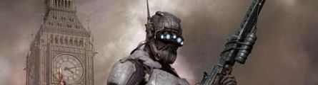
The Hunter model was made for the Hellgate London cinematic, by Blur Studio. Later on I decided to make an illustration for my own fun, using some additional models I had done previously. Hellgate London is developed by Flagship Studio.
这个猎人模型是由Blur工作室为地狱之门-伦敦的片头电影制作的,晚些时候,我决定为兴趣自己做一张插画,使用一些实现准备好的附加的模型,另外,地狱之门-伦敦这款游戏由旗舰工作室开发。
I tried to stay as close as possible to the given reference…nothing orthographic, just a 3/4 sketch depicting the main proportions, some details here and there and the color scheme for texturing. Not having a hyper-detailed sketch works to my advantage, since it leaves some kind of room for personal touch and pushes me to figure out visual and mechanical detailing solutions while still keeping the overall feeling unaltered.
我试着尽量接近已有的素材……绝不出一点错,就是一张3/4的草图来描述大致的身体结构,这儿那儿的一些细节,以及上些颜色确定材质的整体色调,不拥有一张超级详细的草图对我来说是有利的,因为它给我留下了一些个人创作的空间,推动我解决视觉上和机械上的细节方案,同时,还能保持最终成品整体参照原始的设计。

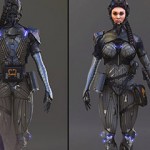
I immediately recognized three kinds of elements I had to deal with a generic male body covered with a dark grey undersuit, a dark blue light-weight rubber armour and a metallic light blue heavy armour, so my modelling workflow was basically bound to these priorities. The body first sets the figure’s proportions, and later the armour plates would wrap around the body shape.
我立刻意识到我要处理覆盖在身体上的三种元素,一套覆盖整个男性身体的暗灰色防护服,一套暗蓝色轻橡胶材质的盔甲和一套金属亮蓝色的重盔甲,因此我的建模流程基本上是围绕这些重点展开,首先设置人体的均衡比例,然后盔甲板材会围绕身体形状弯曲。
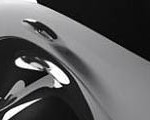
Now due due to the tight deadlines (and also because the body doesn’t have a very specific anatomic definition), I took a generic male model done previously and started changing his proportions with free form deformation box and soft selections. As you can see I left the facial features and most of muscle definition undefined, because those parts were supposed to be covered by the armour. Soft selection (see figure) is an extremely valuable tool for quickly tweaking proportions, just be sure to flag also “edge distance” with an appropriate value into its rollout to have a very localized control of the falloff.
现在由于很紧迫的最后期限,(同样也因为身体没有一个非常明确的解剖结构的定义),我采用了之间制作的一个常规的男性模型,然后使用free form调整器和软选择功能来改变他的比例,如你所见,我将面部细节和大多数肌肉都变得非常粗略,并不精确定义,因为这些部分将来都要覆盖在盔甲下面的,Soft selection(软选择)(看附图)对于快速调整比例来说,是一个超级有价值的工具,只要确定你在卷展栏也给”edge distance”(边距离)选择了一个正确的值,来获得一个适当的衰减控制值就好。

As you can notice in the stack figure, I also made a big use of the symmetry modifier during the modeling process, and turbosmooth with 2 levels of subdivision was constantly put at the top of the stack. By assigning a short cut to the “show end result on/off” button, you can easily model at step zero and immediately see the overall smoothed result by pressing that shortcut button (in this case, I used the space bar).
同样你可以在调整器卷展栏注意到,我在整个建模过程中,还使用了大量的 symmetry modifier(对称调整器),以及在调整器堆栈顶端一直放一个设置到2级细分程度的turbosmooth调整器,那么只要通过快捷键启动”show end result on/off”(显示最终结果开启/关闭)按钮,你可以从第0步的模型一下子看到完整的平滑的建模结果,只要点击一下快捷键哦(在这里,我设置空格键作为启动的快捷键。)

Once I’m satisfied with the general proportions of the body under the armor, it’s time to proceed covering it with the metal plaques. Naturally, the dark blue goes first, since they’re the closest to the body, and then the light blue ones.
一旦我对盔甲下面的身体比例感到满意了,那么给身体包裹金属板材的时候就到了,通常的,暗蓝色部分第一个做,因为他们理身体最近,然后是亮蓝色的盔甲。
There are no special techniques here….once again the modeling is in subdivision with the very same stack as shown above. I usually start with a single quad, then I extrude edges all around, trying to stay close in volume and shape to the given reference … lot of turning around the meshes, you need to observe the volumes from almost every possible point of view to be sure that the volumes and shapes are solid, and of course keeping an eye to not go too far from the underneath body.When I’m satisfied with the general volume a shell modifier helps me to give thickness to the piece. In this phase, I don’t usually bother that much about every single rivet, hole or cut, I just try to develop a good quad topology of the main volumes. Of course the topology is done by taking count of the main cuts and holes, but the rest can be done easily with a normal or bump map. It’s up to you to decide how much a single detail is worth to be modeled or can it be put into a bump map. I usually adopt a “comfortable” criteria…it means that if something looks tricky to me to be carved or extruded into an existing geometry I usually put it into a normal map. When you make something for production, you don’t usually have much time to model everything, so you need to set priorities.
这里没有采用什么特殊的技巧,就是使用上面的修改器组合,来进行 subdivision细分建模。我一般从一个简单的四边形开始,而后我对周围的边不断采用extrude(挤出),试着尽量符合设定上的体积感和形状……围绕着模型做很多的细挑,你需要从几乎每一个可能的角度来观察模型,确保体积感和形状是坚实的,同时还要注意确保盔甲不要和下面的身体离得太远。当我对整个盔甲的体积感满意之后,一个shell修改器就可以帮我给整个盔甲添加厚度,在这个阶段,我通常不会考虑太多那些细小的铆钉,洞眼或者切边,我只是给整个的模型确立一个好的四边形拓扑结构,当然拓扑是通过重视主要的切割和打洞来形成的,但其余那些细小的部分可以用一个normal 或者bump贴图很容易地模拟出来,这由你来决定到底一个细节是值得建模还是放到一个bump贴图里面,我通常采用一个“舒服”的标准,也就是说,如果有什么东西对我来说,在已有模型上再挤出或者开洞是非常麻烦的,那么我就通过Normal贴图来表现,而当你为商业生产制作模型时,你通常都没有足够的时间来把任何东西都建出来,因此你需要设置重点。


As you can see in the picture a lot of cuts are not currently modeled, they are done with a bump map.
如你所见,很多的切割和凹槽都没有实际上建出来,它们通过一张bump(凹凸)贴图来表现。
So basically all the modeling followed this workflow, most of the detailing as you can see has been left to my imagination, and it has been a lot of fun! After modeling all the armor, I modeled in subdivision some folds too in the underbody, just in those areas where they were more visible like the middle of the arms and the back of the knees.
因此基本上所有的建模都遵循这个流程,大多数你可以看到的细节,都被保留在我的想象中,因此这会有很多乐趣,当建完所有的盔甲,我还在身体上做了一些细分建模,就是没有被盔甲覆盖的暴露部位,比如手臂的中间,和膝盖的背面。

These presentation renderings are done in mental ray…the material is a simple mental ray SSS fast skin material while the lighting is just a couple of photometric area lights and a back omni light with final gather on.
这些提交的测试渲染图是在mental ray里面完成的,材质是一个简单的mental ray SSS fast skin(MR 3S快速皮肤)材质,同时灯光是一些photometric area lights(光度区域光),和一盏背后的点光源,同时开启了final gather。

2. Texturing (materials)
2,贴图和材质
Basically, texturing-wise, I divided the mesh by material .That means that every material share this unique texture sheet with very few exceptions. Every piece of mesh needs to be UV-edited to achieve this –I found a very convenient and fast use of pelt mapping, cause complex shapes like these ones are the best choice for it. After the UV-editing I usually render a template of the UV (after subdividing the mesh by at least step 1) so that I have a base to paint over the diffuse texture).
基本上,要聪明地贴图,我通过材质来分开模型,那意味着每一个材质都通过非常少的规则来共享这个贴图,每一个模型部件都需要被编辑UV以达到这个条件-我发现一个非常快速便捷的贴图处理方法,因为类似于这样的复杂形状,这个方法的最好的选择。
Here in the example, the rendered texture sheet for the metal armour material and the rubber armour material.
在这里,是金属盔甲材质和橡胶盔甲材质的贴图结构渲染图。

The diffuse texture is a mix of photorealistic metal textures and painted rust/dirt . I used a free brush collection made by Andreas Bystrom:
>> Andreas Bystrom Brush Collection >>
diffuse texture(漫反射贴图)是照片金属贴图和手绘添加锈斑/污渍的混合,我使用了Andreas Bystrom制作的一个免费的Photoshop笔刷库,链接如下:
http://www.ericknelson.com/wurp/dirtbrushes.abr

hese brushes are simply great to create variations of dirt and rust, and having the UV template in a underlying layer helps me to place the dirt, scratches, decals and everything else exactly where I want it.
这些笔刷对于创建变化多端的锈斑和污渍来说非常棒, 将UV展开图作为模板放在底层作为参考,能帮我按照自己的意愿安排不知这些锈渍,刮痕,和花纹。

Material-wise take in example of the light blue heavy armour, the other few materials are similar with few exceptions like the leather undersuit and some chromed parts.
明智地使用材质包括亮蓝色重盔甲的例子,其它一些材质也与此相似,只有很少部分是例外,比如皮革内衣和一些铬材质的部件。
Basically it’s a max blend material, the idea behind it is to blend 2 different materials with the same diffuse map but with different specular properties. This gave the idea that the scratched areas of the armor has a different more shiny metal underneath.
基本上它是Max的blend(混合)材质,关于混合的概念就是把两个不同的材质混合成一个漫反射贴图,但是各自带着不同的反射属性,这就能实现类似于盔甲有刮痕的区域,会显示一个更加明亮闪耀的金属底层。
You can also choose to have a totally different material sharing a different metal diffuse map as underlying metal, but in this case I just decided I was comfortable enough with the same diffuse texture. To blend the 2 different specular properties materials, I used a grey scale mask where the darkest parts would have shown the more shiny underneath material.
你还可以选择rang完全不同的材质共享一张不用的金属diffuse(漫反射)贴图,但在这个项目里我觉得使用同一张贴图已经够让我满意的了。要混合两种不同反射属性的材质,我使用一张灰色的Mask作为遮罩,在这里最暗的部分会显示更多的底层的闪亮材质。

Here again to paint the mask, I used custom jagged brushes to get a natural feeling of random scratches.
这里需要再一次绘制Mask遮罩,我使用自定义的锯齿状的笔刷来获得一种天然的刮痕的感觉。
Specular maps are derived from the diffuse map, I usually put a hue saturation regulation level on top of the diffuse map, bringing the saturation slide to zero so that the picture results in gray scale. At this point I put another brightness/contrast regulation level on top to regulate the intensity of the specular parts.
Specular(高光)贴图源自于diffuse(漫反射)贴图,我通常在diffuse(漫反射)贴图上面放置一个hue saturation控制层(在Photoshop里面),把饱和度值设置为零,这样就得到了灰色的图像,然后我再在顶层放置一个 brightness/contrast控制层,来调节高光贴图的强度。
Having both regulation levels into a folder and saving the psd document allows me to quickly change paramethers for fine tuning of the specular and it’s also interesting the possibility to drag/copy this specular folder on top of a different diffuse map, so as to maintain the same specular values.
把包含两个调整层的整个文件夹存成PSD格式,可以让我在将来需要的时候,快速调整参数来修改高光贴图的效果,想象一下把这个高光调整文件夹直接拖拽/复制一个不同的漫反射材质上,这样就可以保持所有的漫反射材质拥有相同的高光设置,这种可能性也是非常有意思的。


he leather material is just a simple max material with a rather high specularity.
皮革材质只是设置了很高的specularity数值的一个简单的Max材质
Cables are chromed material reflecting a hdri map and glows are just self-illuminated standard materials. Some sample materials:
铬合物电缆的材质反射了一张hdri贴图,它的glows(辉光)效果只是一个标准的自发光材质,下面是一些材质的例图:


The render is done in Brazil with a simple spot light and a very low intensity global illumination.
渲染是在Brazil渲染器里面完成的,包括一个简单的聚光灯和一个非常低亮度的全局光照设置

3. The illustration
3,插画部分
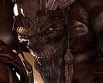
Already having a monster model I did sometime back for the game itself, the intention was to put both the Hunter and the monster (Karnagor) into a nice composition showing both of them in a sort of relationship, moreover everything should offer some hint that the scene took place in London itself. The monster model was made in subdivision and most of his detail is by normal mapping (sculpting done in 3rd party app).
我已经有了一个早些时候为游戏本身制作的怪物模型,并试图把猎人和怪兽合成到一个漂亮的场景里面,来显示它们之间的关系,另外所有的部分都必须暗示这个场景在伦敦内部。怪兽模型是通过细分建模完成的,它的细节靠Normal贴图的生成(在第三方软件中雕刻出来)。

I asked an artist friend of mine Antonio Mossucca if he was interested in helping me with the composition, I briefly explained to him what I wanted to achieve and he came out with these nice sketches which are pretty close in terms of composition to the final picture:
我问我的一位艺术家朋友Antonio Mossucca他是否愿意帮我完成这个合成作品,我简短地向他解释了我想要达到的效果,然后他就画出了这些非常棒的草图,基本上和最终的作品非常相似了。

The only element I was missing was the Big Bang tower model, so I decided to make a low poly version…not highly detailed because it was supposed to be a background element, most of the detail would have been given by a texture. I missed also a sort of weapon and a terrain. For the weapon I wanted something used by snipers…with a scope and something not really futuristic, but in the end I preferred something more roughly adapted to be used as a flamethrower.
我唯一缺损少的就是大本钟塔模型,因此我决定制作一个低多边形的版本……没有很多的细节,因为它只是被当作一个背景元素,绝大多数的细节将由贴图来表现,我还缺少一把短的武器和一个地面,对于武器我希望他拿着阻击手的那种类型的枪……,有一个瞄准镜,和一些并非很新潮的元素,不过最后我倾向于这把枪大致上拥有更类似火焰喷射器那样的用途。
So I collected some rifle references here and there and I came out with this thing:
因此我从这里那里搜集了一些步枪的参考资料,并做出了这把武器。

First thing I did was put the Hunter in pose, I honestly didn’t make any skeleton, I just used soft selection and free form deformations to do it, and it worked pretty well. Same for the monster in the background. The terrain was relatively easy to model…a grid plane cut savagely to get some nice cracks, with some geometric rocks scattered here and there, no subdivision at all involved.
首先我要做的是摆好猎人的姿势,我实际上没有做任何的骨骼设置,而是只使用了软选择和free form(自由变形)来摆姿势,工作起来还挺顺手的。背景的怪兽也如法炮制,而地面是非常容易建模的……一个网格平面野蛮地切几刀,做出很好的破裂的感觉,然后到处放置一些岩石模型,完全不需要细分。

So when all the desired elements were textured and put into scene it was time for lighting and rendering! Let’s say I didn’t want to achieve anything photorealistic, but giving istead a painterly feeling. To achieve this, particularly when dealing with 3D images, the post process done in a 2D application is crucial. So in this case (and for the things I like to do most) it’s often a waste of mine to spend a lot of time in realistic and complicated shaders…most of their properties will be washed out during the post process work, so better is to be plain with materials and lighting.
现在所有想要的元素都画好了贴图并放到场景中相应的位置上了,是时候开始做灯光和渲染工作。我并不希望得到任何照片真实度的结果,而是希望获得一种绘画的感觉。要达到这个目的,特别是对于三维图片来说,最终在2D软件里面的后期处理是至关重要的。因此在这个项目(以及一般我最喜欢做的事情),我经常花了很多的时间来制作真实的和结构复杂的材质…大多数这些材质的效果都会在后期里被处理掉,因此最好事先对材质和灯光有所计划。
The basic light setup consists of a main spot light (better if it’s not much coloured) and a back omni light. Place a few omni lights for the glowing parts here and there. I didn’t involve any global illumination, just a plain scanline render because another pass of ambient occlusion will be involved later.
基本的灯光设置包括一个主聚光灯(如果它不包含那么丰富的色彩,那就更好)和一盏背光灯,对于有光晕的地方放置一些omni(点光源),我没有加入全局照明,只是一个简单的扫描线渲染,因为另外的ambient occlusion(环境遮挡)渲染层会在晚些时候被包括进来。


Later on I made an ambient occlusion pass to be composited later , to obtain it in Brazil there’s a very simple way using the render pass control and the white plaster materials.
然后我只做了一个环境遮挡渲染层用于最终的合成,使用巴西渲染器,白色塑料材质和分层渲染设置,就很容易得到你想要的效果。

Then it’s time for heavy post processing!
接下来就是繁重的合成处理了

Let’s open Photoshop …I usually start with fixing a mood … a color scheme. The base render did not have much of a dominant colour on purpose, I prefer to have much more control in post with this, I love flexibility. In this case I wanted some warm tones, so I started painting the background clouds with brown/red tones…nothing much extreme in saturation.
让我们打开Photoshop …我通常从修正情绪…..色彩主题开始,基本的渲染并不拥有计划中的那种主要色调,我个人倾向于在后期里修正,我喜欢很大的可控性,在这个作品里我希望一些暖色调,因此我开始使用棕/红色调来绘制背景的云彩,……没有非常饱和的色彩。

Put the ambient occlusion layer in MULTIPLY mode…opacity of the level around 20 per cent…i also put a hue saturation level connected to this layer in order to shift the hue of the figures to brown/reddish tones to match the lighting of the background. As you can see the rendered Big Ben has been put in a layer behind the main figures and colour shifted too.
把ambient occlusion layer(环境遮挡层)的叠加模式改为MULTIPLY(加深),透明度的数值是20%左右,我还给这个层添加了一个hue saturation(色相饱和度)颜色控制,希望把身体上的棕/红色调匹配背景的灯光,如你所见,背景的大本钟被放在主要角色后面一层,也经过了颜色修正。
Painted some smoke in the foreground in a separated layer with a soft edged brush with low opacity.
使用一个低透明度的软边笔刷在前景的几个分开的层上面绘制一些烟雾效果,

Time to add some fire here and there on another layer! I made an extensive use of some real footage fire pictures collected on a black background sometime back, when I bought a cd called Pyromania full of these pictures, they’re pretty easy to composite in hard light mode (since the black goes away) and only the flames remains. I also painted a yellow highlight in soft light mode over the leg of the monster , because I expect some light of the fire over it.
Tim新建了一个层,在各个地方加了一些火焰,我广泛地使用一些真实的实拍素材,比如在黑色背景上的火焰的照片,之前我买过一张素材CD,叫做Pyromania,里面满是这些素材图片,他们非常容易被合成到图像里,使用hard light层叠模式,黑色的背景就会被去除,只留下火焰,同时我还能得到一些期望的火焰产生的灯光效果。

Time to add some smoke on a new layer — I wanted the smoke to move in the direction of the composition, painting it is rather simple, a round hard edged brush first. For midtones and shadows, then it’s a matter of blending the “blob” together with the smudge tool leaving the hard edges in the areas where the light source is supposed to hit.
是时候新建一层添加一些烟雾了-我希望这些烟雾沿着合成画面的构图方向移动,绘制本身很简单,首先选择一个圆形的硬边笔刷,绘制中间调和阴影,然后把这些原点用smudge tool(涂抹工具)混合在一起,但保留光源直接照射部分的硬边。
The burn tool at this point helps to enhance the brightest parts of the smoke.
The burn tool(焦化工具)在这里可以帮你增强烟雾的最亮的部分。
I introduced some painted sparks close to the fire and some debris floating around in the air too. They give a “chaotic” feeling to the picture and helps it look less static.
在接近火焰的地方,我加入了一些手绘的火花,和一些散落在空气中的碎片,他们烘托出一种“混乱”的感觉,这有助于去除画面的呆板。

Time for a colour balance, things were going to be a little monochromatic, so I introduced some blueish tones in the background and in the shadows through the colour balance tool (ctrl-b), I also noticed that at high resolutions some textures were going to loose definition. A quick trick to reduce this effect is to put a grayscale high resolution sample of a similar texture in overlay mode over the interested areas.
现在来调整一下整体色彩平衡,色彩感觉有一点单调,因此我使用balance tool (ctrl-b)(色彩平衡)工具在背景和阴影处加入了一些蓝色调,我还注意到,在高分辨率下,很多的材质不够清晰。一个解决的快速方法是在要修改的地方,覆盖一层高清晰度的黑白的纹理,然后采用Overlay(叠加)层叠模式。
the final picture…as you can see, I made the tones even warmer and saturated by adding a general orange soft light layer. Some fog has been added in the background to give the scene a little more depth. I added some blood painted blotches on the monster and brightened some areas of the Hunter to make him pop up more from the rest of the image. The lamp in the background is a paintover of a real London lamp.
最终图像,如你所见,我把色调改得更加的暖,并增加了一个整体的橙色的叠加为soft light的颜色层,来调整饱和度,一些雾效也被加到背景上,来给场景增加一些深度。我给怪兽增加了一些血迹和红斑,提亮了猎人的一些区域,使他在整个图像里更趋突出,背景的街灯是取自于真实的伦敦街灯。
Thank you for reading!
感谢你的阅读!
本教程完,谢谢大家


推荐相关中文教程

3DSMAX动力学特效实战教学
本套教学将通过24章实例教学,来向你详细讲解3DSMAX的动力学特效在电视包装与广告中的应用。3DSMAX国外粒子案例效果解析
本教学通过27个实战案例,教您如何用3DSMAX结合ParticleFlow本身以及扩展的ParticleFlow Box 1、Box 2、Box 3、功能包,结合Vray渲染器,来制作流行的广告和电视包装中的粒子特效效果。无论是常见的粒子聚合,分散,动态粒子替换,粒子矩阵,粒子动力学,本套教学都有相应的案例。3DSMAX国外流体案例效果解析
本教学通过20个实战案例,教您如何用3DSMAX结合Realflow,FumeFX, ParticleFlow插件,来制作流行的广告和电视包装中的流体效果。无论是常见的液体,烟雾,流体碰撞,沙粒变化,水墨表现,本套教学都有相应的案例。2.5D商业游戏场景制作教程 进阶篇
在本教程中,Freeyy老师将从零开始,向你讲解如何根据确定的主题进行前期准备,随后建模,绘制贴图,制作材质,最后再进行细节调整,完成一个商业游戏级别的2.5D场景画面。Mentalray for max实战教程
本教程共包含超过42小时以上的视频教学内容,共18章 132课,通过大量实例,详细讲解了3ds Max平台下的Mental Ray1渲染器的使用基础和实战方法。是一部非常完整详细的3dsMax版的Mental Ray渲染器的教学.网游角色制作女精灵实战教学
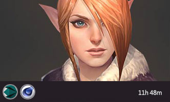
本教学以一个AAA级网游女精灵角色为案例,向您展示如何完成她的模型,UV,和贴图绘制。教学使用的软件主要是3ds max和 bodypaint, 其中建模和UV使用3ds max完成,贴图绘制在bodypaint和 PS中完成。

推荐课程


推荐教程
1回复地狱之门“猎人”角色制作"