
本教学为翻译教学,转载请注明来自aboutcg.net,以及注明翻译者
原始链接如下:
http://circleboxblog.com/2009/tutorials/how-to-create-a-retro-hippy-van-poster-in-photoshop/
作者: Callum Chapman
翻译: lala_p
请尊重互联网道德,转载请注明转载出处和翻译者,谢谢!
How to Create a Retro Hippy Van Poster in Photoshop
怎样在ps中创建一个火箭嬉皮士货车海报
In this tutorial you’ll be learning several Photoshop tools and techniques, as well as a couple of Illustrator techniques to create a trendy, retro/abstract style Hippy Van poster from scratch.
在这个教学中你将学到几种ps工具和ps的使用小技巧, 也有ai的使用技巧去创建流行元素,从涂画中得到一个嬉皮货车海报的抽象风格。
I use my Hippy Van Vector in this tutorial, which you can make yourself by following a tutorial I wrote a few weeks back called ‘How to Create a Hippy Van Vector in Illustrator‘. If you’re looking for some Hippy Van inspiration, check out my photos from Bug Jam 23. I also use several textures in this tutorial, so head over to my other blog Circlebox Textures or Lost + Taken to download some awesome textures.
在这个教学中我使用了我的嬉皮士货车矢量图,你可以通过我前几个礼拜制作的“怎样用ai创建一个嬉皮士货车”教学制作你自己的矢量图,如果想要找其他的嬉皮士灵感,看我来自BJ23的图片。我在这个教学中也用了几张材质贴图,可以去我另一个博客下载。
Lets get straight to work. Before opening Photoshop, or any other piece of digital software for that matter, grab a pen and a notebook. As followers of Circlebox will know, I turn to the notepad for almost any project of any form or size – it’s a great way to brainstorm and get some ideas down on paper without spending too much time on it …or staring at a blank canvas in Photoshop, which can be quite daunting with so many tools at your disposal!
让我们开始干活吧,在打开ps之前,或者其他任何电脑软件,抓纸笔来。我打开笔记本因为通常任何形式或尺寸的项目,灵感的来源都是在纸上,都不用花太多时间在电脑上,或者在ps的空白画布中开始,使用太多的工具只能让你越来越沮丧。
This is the kind of look I want to go for (excuse the drawing – I did say I don’t spend to much time on it!):
这是我想要着手的效果,(原谅我的潦草吧,我不是说过我没或太多时间吗)

With some rough ideas in your head, head over to Photoshop. Open a new document, I’m not planning on printing mine so I’m just opening a simple screen document (72dpi RGB). If you’re planning on printing in large scales, you’ll probably want to set up bleeds, use a Resolution above 300dpi and use CMYK instead of RGB. I’ve used an A4 size document.
用一些你脑中大概的想法,再打开ps。创建一个新文档,我没打算用大尺寸,所以我创建了72分辨率。如果你想要大的尺寸,你可以大放血,用300分辨率的CMYK模式替代RGB。我用的是A4尺寸。
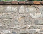
Before I start anything else, I’m going to use a nice paper texture to give myself something to start with. Download a nice simple texture, I’m using one of my Red & Yellow Dyed Paper Textures. Fill the background with a creamy colour (I used #F2EBD7), and place (File > Place) your texture on top. Resize and move your texture into a suitable place and then desaturate it. Change the blending mode of your texture layer to overlay.
在我开始任何工作之前,我要去找一张好看的纸张材质贴图,让我好开始工作。下载一张简单好看的材质,我用的是我Red & Yellow Dyed Paper Textures里的。用一种奶油色填充背景,(我用的是#F2EBD7)然后置入你的材质在上面一层。重新调整尺寸然后把你的贴图移动到适合的位置覆盖背景。

Locate your hippy van (or any other object your planning on using) and place it in your document. Resize, rotate and move it into a place you’re happy with. Remember it can be moved later!
找到你的嬉皮士货车(或者其他你想要用的素材),然后置入到文档中,重新设置尺寸,旋转移动到你想要的位置。记住之后你也可以移动它!

With our vector placed, duplicate the layer. Hide the bottom one and rasterize the top one. This way, incase there are any problems, you always have a duplicate layer to work on underneath.
复制这个矢量图层,把它藏在下面。然后重新定义上面那层的尺寸。这种方法,是怕万一出了什么问题,你还可以使用藏在下面的复制图层。
Grab the Burn Tool, and on our rasterized van, add some custom shadows round the bottom of the van. Do the same to the paper texture and background colour directly beneath the van – don’t over do it though! You can reverse the effect of the Burn Tool with the Dodge Tool.
用加深工具在我们重新定义尺寸的货车图层上添加一些随意的阴影,在货车的底部周围。在纸张和背景颜色图层上都这么干,要在货车后面,不要涂到货车前!

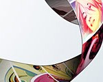
Already our hippy van is looking more involved with the background. Grab another texture, and place it on top of all other layers. I used one of my own Grunge Watercolour Textures. Hold Cmnd (or Ctrl on a PC) and click the thumbnail image of our Hippy Van in the layers palette. Select the inverse of the selection and hit delete to remove any texture outside the van.
我们的嬉皮士货车看起来和背景更加融合了。找另外一张材质贴图,然后把它放在所有图层的上面。我用的是我自己的Grunge Watercolour Textures里面的。
按住ctrl然后单击嬉皮士货车所在的图层面板,选择相反的区域,然后点击删除,这样就把货车之外的材质删除掉了。


Desaturate the new texture layer, change the blending mode to overlay and lower the opacity to about 50%.
降低新的材质贴图的饱和度,改变叠加模式为overlay然后把透明度降低到50%。

Repeat the step we took before with the Burn Tool, but this time only burning some areas of the most recent texture.
Open up Illustrator and create 4 25×25px squares placed directly next to each other. Change each square to a different colour, something you think will match your poster.
重复我们之前使用加深工具的步骤,但是这次只是使用在新的材质图层。
打开ai然后创建25*25像素彼此沿直线紧紧相连的小方格。每个格子用不同的颜色,你觉得适合你的海报的颜色就可以。

Select all your squares and create a new Art Brush by clicking the New button in the Brushes palette. Name it a suitable name and make sure the Direction is either heading up or down.
Grab the Pen Tool and make an interesting line. With your line selected, select the Art Brush we just made. Repeat the process to make another pattern.
选择你所有的格子,然后创建一个新的艺术笔刷通过点击在笔刷面板中的新按钮。给它一个合适的命名,然后确定方向是从上到下。
用钢笔工具创建一段有趣的线段,确定你的线段是被选中,选择我们刚才创建的艺术笔刷。重复这个过程用来创作其他的图案。

Select both objects, copy and paste them into your Photoshop document as a Smart Object. As they’re smart objects, it allows us to resize and stretch them without being distorted. Once your lines are in place, make sure you rasterize them to turn them into pixels.
选择这两个物体,把他们黏贴到ps的文档中,作为一个漂亮的元素。在不被扭曲的情况下可以被我们重新定义尺寸和伸展。一旦你的线段们的位置适当,那你就要确定他们已经被像素化。

Duplicate your straight line. Rotate one of them, and place it above the original, set it to Difference and lower the opacity to 25%.
复制你的直线,旋转它,然后把它放在最上一层,图层混合设置为Difference,透明度为25%。

Select the Elliptical Marquee Tool and draw a circle whilst holding the shift key. Fill it with the same colour you used on your outer line of the art brush. Place the circle below your other straight line and merge the two layers together. Set its Blending Mode to Colour Burn.
选择椭圆选择工具,画一个圈,同时按住shift。填充和你艺术笔刷直线最外一层相同的颜色。把它放在你的艺术笔刷直线图层的下面,然后合并两个图层。设置叠加模式为Color Burn.

Duplicate the straight line once again but this time leaving it in place. Lower the Opacity to 50%. All this does is makes the colours a little more intense.
再复制直线图层一次,但是这次把它留在原来的位置。透明度改为50%。这么做是为了让颜色开起来更强烈一些。

Select the curvy line layer. Using the Polygonal Lasso Tool, delete some areas of the end of the line. You might decide, like me, to move the line a little. Use a soft eraser to get rid of any areas you don’t want.
选择曲线层,用多边形索套工具,删除一些线段尾部的部分,你应该想我这样选择删除线段的一小部分。用一个边缘柔软的橡皮擦去掉任何你不想要的部分。

Repeat the process we took with the circle on the straight line to produce some ‘filler’ shapes. I call them this because they’re main purpose, other than looking cool, is to fill in some empty space. Try removing some areas inside the circles for an even cooler shape. You can of course use Illustrator to do this if you wish. You can also use gradients on circles, or a soft brush, to create lighter looking shapes.
用我们在直线图层使用过的椭圆工具再创建一些填充物。我这么称呼他们因为他们的主要目的是让画面看起来更酷,中间也要有些空的部分。为了得到更酷的形状可以尝试移动一下圆形中间的部分。如果你想你当然可以用ai完成这部分工作。你也可以创建一些渐变的感觉,或者用柔软的笔刷创建一些明亮的形状。

Set the blending mode of the new texture to Overlay and decrease the opacity to 50%. Merge it down to the curvy line layer. Duplicate the now combined layer. Move the bottom curvy line to somewhere else on the screen and set it to overlay. Now set the top curvy line to Linear Burn.
把新的材质贴图的叠加模式改为Overly降低透明度到50%。和下面的曲线图层合并。复制现在的合并图层,移动下面一层的曲线图层,放到屏幕的其他地方,把叠加模式改为Linear Burn。

Make a new layer and fill it with a colour using a soft brush that goes with your design.
创建一个新图层,用一个柔软的笔刷为你的设计填充一个颜色。

Go to Filter > Noise > Add Noise. Make sure Monochromatic is ticked and add some noise to your newly painted layer – I used 35%. Set the layer to Overlay, and with a soft brush, erase some areas of the noise. Lower the opacity to 50%.
打开滤镜面板,杂色,添加杂色。确定单色勾选,然后为你的新图层添加一个杂色,我选择35%。设置这个图层的叠加模式为Overly,然后用一个柔软边缘的笔刷,擦掉一部分的杂色。降低透明度为50%。

Duplicate the hippy van, and on the lower layer go to Filter > Blur > Motion Blur. Use settings that best suit your piece.
复制这个嬉皮士货车,然后选中下面的一层,去滤镜面板,模糊,动态模糊。用使用一个最适合你口味的数值。

Once again grab the eraser tool, using a large soft brush, delete some areas you don’t need.
再一次选择橡皮擦工具,用一个大尺寸的柔软边缘笔刷,擦除一些你不需要的部分。

The post is getting there. Select a soft brush and open the Brush Panel. Select scattering, and change the scatter percentage, as well as the count. I used 1000% for scatter, 1 for count, and 60% for count jitter. Make sure your brush is white, and on a new layer brush over your canvas. Make a new layer and repeat the process a couple of times with different brush sizes.
选择边缘柔软的笔刷,然后打开画笔面板,选择散布,改变散布数值,我使用的数值1000%,数量是1,数量抖动是60%。确定你笔刷的颜色是白色。然后在最上面创建一个新图层,用不同的笔刷尺寸图画。

Change the blending modes and opacities of your new layers. I used Overlay at 45% for one, and Soft Light at 65% for the other.
改变叠加模式为Overlay,透明度45%,其他的是Soft Light模式,透明度65%。

If you feel it’ll improve your work, you can repeat the process again using different shaped brushes at different sizes, different colours and different blending modes.
如果你想要提高你的作品,你可以用不同形状的笔刷设置不同的尺寸,不同的颜色,不同的叠加模式,重复上面的过程。


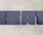
I want a little bit of text in my poster – I’m just going to use the words ‘Retro Van’. Select the text tool and type your words. Select a font that goes with your poster, I used ‘Steiner’. I used a mid-dark red colour from my poster that I selected using the eyedropper tool.
我想要有一点文字在我的海报上,我要写“Retro Van”。选择文字工具,打好你的文字。选择一种适合你的海报的字体。我的是“Steiner”我用了一种中间黑度的红色,通过使用吸管工具。

Duplicate your text layer, and resize the text on the bottom text layer so that it’s bigger than the original text. Select another colour thats been used in your design, I went for a lighter yellow this time. Reposition the text and select a different blending mode: I used overlay.
复制你的文字图层,重新定义尺寸,放大一下放在原有文字图层下面。用你设计中用过的其他颜色填充,我用的是一种明亮的黄色。改叠加模式为 Overlay。

I repeated the previous step again using the same size text and a blue which I took from the hippy van.
我重复了之前的步骤创建了蓝色的同尺寸文字层。

Time for some finishing touches. Make another new layer, and select a large soft brush. Select a colour from your design using the eyedropper tool and brush over some areas on your screen. Create another layer, and do the same again with a different colour. Repeat the process until you have something that looks like this:
结束部分的质感。建一个新图层,选择一个大的边缘柔然的笔刷,,用吸管工具选择一个你设计中用过的颜色涂画。创建另外一个图层,用不同颜色重复涂画。不停的重复,直到你有了一种这样的外观:

Change the blending modes and opacities of each layer to something different. Make sure to experiment, as different blending modes on different layers will give you different effects. This is how mine turned out using a combination of overlays, hard lights, soft lights and vivid lights:
改变为不同的叠加模式,Overlay,Hard Lights,Soft Lights 还有Vivid lights。

Make yet another new layer, and select a dark blue soft brush. Brush round the edges of your poster so you have something that looks like this:
创建一个新图层,用边缘柔软的深色大笔刷画你的海报边缘,就像这样:

Change the blending mode to Colour Burn and lower the opacity to about 7%.
改变叠加模式为Color Burn ,透明度为7%。

Repeat the process with a smaller black brush, this time using the blending mode darken set to about 10%.
重复涂画,用小的黑色笔刷,这次叠加模式为Daeken,透明度10%。

Enhance your image a little by increasing the contrast, and save! Here’s my final result:
提高对比度,然后保存!这就是我们的最终效果:


推荐相关中文教程

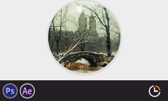
电影MATTER PAINTING基础实战案例教学
马良老师将通过一个精美的实例,来教你如何使用Photoshop结合After Effects软件完成动态Matter Painting场景的制作,从而带你踏入专业MP行业的大门。构图绘画完全教学
本套课程的内容重点是学习绘画艺术的构图规律和方法。在绘画学习过程中,构图是一个重要的组成部分,学习它对于提高绘画练习和创作水平有显著的促进作用。特指纯艺和插画,海报。艺用人体解剖实用教学 下集 四肢篇
本套“四肢篇”教学是王九斤老师的《艺用人体解剖使用教学》系列教程中的下集部分,主要讲解了四肢的结构绘画要点,以及部分人体动态的基础讲解。艺用人体解剖实用教学 上集 躯干篇
本套“躯干篇”教学是王九斤老师的《艺用人体解剖使用教学》系列教程中的上集部分,主要讲解了躯干的结构绘画要点,以及部分人体动态的基础讲解。

推荐课程


推荐教程
0回复如何创建嬉皮士货车海报"