

Making of Black Bashi – Bazoukby George Patsouras, USA
黑人土耳其雇佣军的绘制流程
原文链接:http://www.cgarena.com/freestuff/tut…hi/index3.html
作者信息:
George Patsouras, USA
http://www.yuchenghong.com/
翻译:CWWS(aboutcg.net)转载请注明出处。

Introduction
简介
In this tutorial, I will go about how I painted a Master Copy of Gerome Jean Leon’s “Black Bashi-Bazouk”. As an artist, I feel like I can learn a lot by doing studies of the works of Old Masters, especially in terms of color. It’s important to note that when you’re doing Master studies, you shouldn’t just mindlessly copy a painting; Put thought into what you’re doing – ask yourself why did this artist choose this color as opposed to another, and so forth.
在这个教学中,我将展示我是如何临摹Gerome Jean Leon的“黑色土耳其雇佣军”这幅作品的,作为一名艺术家,我觉得能从研究过去的大师的作品中学到许多,特别是颜色方面,当你尝试做大师的学生时,你必 须注意到你不能单纯地复制画作,而是将思考注入其中,问问你自己为什么艺术家选择这种颜色,而不是另一种,以及更多此类的问题。
Initial Sketch
最初的素描
Since we are doing a Master Copy, it’s essential we nail the proportions of the image we’re trying to recreate. To do this, I use a grid to get the proportions as accurate as possible. To do this, create a grid over the reference image. Then re open the file, fill the canvas with a fairly light gray color, and begin sketching box to box. Try to make it as accurate as possible, as this step is crucial. Depending on how you draw, you should get a fairly clean result. If not, lower the opacity of the sketch layer (around 40% should be good), create a new layer, and trace over it for a cleaner look. Here is my result:
由于我们是在临摹大师的作品,我们必须严格遵守我们试图重建的画面的比例,为了达到这个目的,我使用了一个网 格参照来让比例尽可能的准确。我们可以在参考图像上面覆盖一层网格,然后重新建立一个文件,在画布上填充淡灰色,并开始按照一个个格子绘画,试着达到尽可 能的准确,这个步骤是至关重要的,取决于你如何绘画,你需要得到非常清楚地结果,如果结果比较乱,那么降低草图层的透明度,(大约40%差不多),再新建 一个层,在这个层上再描出你之前创建草图的清晰版本。这里是我的结果:

Working in Values
绘制影调
Once that’s done, the next step should be to establish a strong value composition. Working in grayscale allows us to concentrate strictly on values, without worrying about colors.
一旦确立了比例,下一步要做的就是建立强烈的明暗关系的构图。聚焦于黑白关系让我们专注营造立体感,而不用担心颜色。
In my opinion, a successful painting needs to have a good value composition. You can use any color scheme you want, but if the values aren’t working, the painting won’t be successful. The first thing we must do is go to Image > Mode > Grayscale. At this point, you should also have your grayscale slider turned on under the ‘colors’ menu (Window > Color). Do all your value work using this slider. Do not sample values from the reference, as you won’t learn anything from this, and could lead to an unwanted crutch as well.
我个人觉得,一幅成功的绘画需要有一个好的明暗构图。你可以使用任何色彩主题,但如果明暗不对,作品是不会成 功的。我们要做的第一件事就是选择Image > Mode > Grayscale,而且,你还要打开你的‘colors’菜单(Window > Color)下的grayscale(灰度)滑动条。在这个滑动条里取你需要的所有色值,而不是直接从参考图像里取色,因为这么做你无法学到任何东西,而 且会让你获得学习时不应该有的辅助。

Start off simple first – use relatively large brushes for the early stages to avoid getting caught up in details. Work in the darker values before making your way to the lighter ones. Make sure everything is treated with the same amount of detail at the early stages. Have the Size Jitter turned off under ‘Pen Pressure’ during the initial phase to avoid getting caught up in details. In other words, don’t overwork the face and keep the rest of the image loose, you’re just going to end up struggling at later stages.
从简单开始,在早期阶段使用相对较大的笔刷,避免过早地陷入到对细节的纠缠中。从暗到亮铺排颜色,确保在早 期,所有部分都具有同等程度的细节。在最初阶段,关闭笔刷的‘Pen Pressure’(压感)功能,来防止笔刷忽大忽小,从而避免获得细节。还句话说,别在脸部花太多精力,并保持作品的其他部分松弛,这些都是你要在最后 阶段奋斗的。
For the blending process, I generally use a hard edged brush and speckled one to blend, with lower opacities for smoother transitions (anywhere from 25%-50% under opacity). You don’t need a lot of layers for this stage; One for the background and one for the figure should be fine. Keep things simple. When you’re happy with the values you set up, you can now turn on Size Jitter turned off under ‘Pen Pressure’ and start working in the details. Create new layers and constantly merge them with the base layer to keep things under control.
对于过渡处理,我一般采用硬边的笔刷绘制散点来混合,并使用较低的透明度让转换更加自然,(主要使用 25%-50%一下的透明度),对于这个阶段,你并不需要很多的层,背景一层,角色一层就足够了,让事情保持简单状态,当你对设置好的影调表示满意,你可 以打开笔刷工具的‘Pen Pressure’(压感设置),这可以让你控制笔触的大小,并易于绘制细节。建立一个新层,并经常和基本层合并,始终保持项目在控制之中。
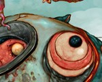
Here is the finished grayscale painting. Even in grayscale, the painting looks ‘complete’. It’s a good idea to have your painting as refined as possible before adding colors. This will make the color process that much easier.
这里是完成的灰调图像,即使只是黑白的,这幅画看上去完成度也很高了。在上色之前,尽量和参考图像精确地匹配是个好主意。

Adding Colors
上色
When we have a decent painting in grayscale completed, it’s time to think about colors. Since this is a Master Copy, a good idea is to step back from our painting for a bit and carefully observe the colors in the original painting. Make sure the HSB slider is turned on at this stage, under the colors menu. With the original painting open, select the Eyedropper tool and carefully observe the color transitions throughout the painting. Do this for a couple of minutes and try to process how the artist went about colors.
当我在完成了一幅不错的黑白作品之后,是时候考虑色彩了,因为这是一个学习临摹作品,那么一个好主意就是尽量 去掉我们自己绘画的想法,而仔细观察原始作品的颜色,确认你打开了colors面板下的HSB调色面板,同时打开原始的画作,选择习惯工具,并仔细观察整 幅画作色彩的转换,持续做这个工作十几分钟,尝试了解原作艺术家是如何处理色彩的。
In this case, the main color scheme is that of a fairly saturated red/orange. The darkest areas are that of a very saturated red, and the lighter tones shift more towards an orange/yellow hue. With that in mind, we’re now ready to start adding color to our painting. Since we’ve worked with the grayscale mode, it’s time to change it to the RGB mode. Select Image > Mode > RGB.
在这幅画中,主要的色彩主题是相当饱和的红/橙色,暗部区域是非常深的红色,同时亮色调往橙/黄色偏移,把这 个记在心里,我们就准备开始给我们的作品上色了,因为我们是在灰色调作品的基础上加颜色,因此现在需要把画面的模式通过选择菜单下的Image > Mode > RGB,改变为RGB彩色模式。
Since we spent the time observing the main color scheme, the first thing we do is create a new layer above the base layer and set it to ‘color’. Select a fairly red/orange mid tone for the base, since this is the main color theme, and merge it. Create another layer, this time for the skin. Observe the shifts in color from the reference photo and try to replicate it. The shadows on the face, for instance, has very saturated red tones, while the highlights are that of an orange/yellow tone. Do your best to replicate that while choosing your colors from the HSB sliders. Now merge. Repeat this process over and over again to build up your colors.
因为我们已经仔细研究了主色调,因此我们要做的第一件事就是在基础层上面创建一个新的层,把它的层叠模式设置 为‘color'(颜色模式),选择一种清晰地红/黄中间调作为基础,这是我们的主题色调,然后合并它,创建另一个层,这次是为皮肤上色,观察才参考作品 图片上颜色的过渡变化,并尝试重现出来。比如说,脸上的暗部阴影区,是非常饱和的红色调,而亮部则是一种橙/黄色调。尽你所能地使用HSB颜色滑块选择颜 色并重现原作的色彩,现在再次合并层。就这么一直重复下去,直到完成你的上色工作。

Refinement and Detail
精修与细节
During the color process, don’t be afraid to continue refining the painting; Although you might have a strong base at this point, adding to it will only make your painting that much better. Don’t be afraid of the zoom tool, it can be your friend; Zoom in very closely to bring out further details, especially those located at the focal point. In this case, I want to bring attention to the face, so I make sure that’s the most detailed part of the painting.
在上色过程中,别害怕对画面继续调整,虽然此刻你的作品或许已经有了很好的基础,但是增加必要的修改只会让你 的作品更加出色。别畏视图惧缩放工具,它将会变成你的朋友,尽量放大会带给你进一步的细节,特别是处于焦点位置上的,目前我想集中注意力于脸部,我确信这 是绘画中最需要精雕细琢的部分。


ope you like this making, if you have any critiques and comments then please email me.
希望你喜欢这个绘制教学,如果你有任何评论或意见,请给我发邮件,


推荐相关中文教程

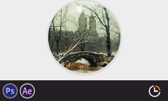
电影MATTER PAINTING基础实战案例教学
马良老师将通过一个精美的实例,来教你如何使用Photoshop结合After Effects软件完成动态Matter Painting场景的制作,从而带你踏入专业MP行业的大门。构图绘画完全教学
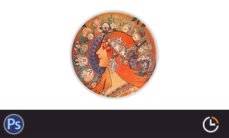
本套课程的内容重点是学习绘画艺术的构图规律和方法。在绘画学习过程中,构图是一个重要的组成部分,学习它对于提高绘画练习和创作水平有显著的促进作用。特指纯艺和插画,海报。艺用人体解剖实用教学 下集 四肢篇
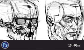
本套“四肢篇”教学是王九斤老师的《艺用人体解剖使用教学》系列教程中的下集部分,主要讲解了四肢的结构绘画要点,以及部分人体动态的基础讲解。艺用人体解剖实用教学 上集 躯干篇
本套“躯干篇”教学是王九斤老师的《艺用人体解剖使用教学》系列教程中的上集部分,主要讲解了躯干的结构绘画要点,以及部分人体动态的基础讲解。

推荐课程


推荐教程
0回复黑人土耳其雇佣军的绘制流程"