

本教学为翻译教学,转载请注明来自aboutcg.net,以及注明翻译者
原教学出自pixologic网站,原始链接如下:
http://www.henningludvigsen.com/inde…_painting_gold
作者: Henning Ludvigsen
网站:http://www.henningludvigsen.com/
翻译:KanyaYan (www.aboutcg.net)
转载请写明出处和翻译者为KanyaYan,谢谢。

Painting gold.
绘画黄金
When working digitally there are too many short cuts to making things look like metal, and I believe it’s a good thing to avoid using custom made filters and still find a simple solution on how to do this from scratch on your own.
当工作中遇到有太多的需要处理像金属外观的事物,我认为避免使用定制的过滤器是一件好事,反而是你自己从头开始画来的简单。
Start off by outlining the object and add an in-between medium dark base colour so that you can easily add shadows and high lights out from this base.
The next step is defining and understanding the shapes, so that it’s easier to apply the real shadows, reflections, and highlights according to the direction of the light in the scene.
At the end, add reflections and shadows. Also, add a soft glow to the brightest highlighted spots with a large soft brush to make it look a bit more believable.
开始先勾出对象的外轮廓,并在里面添加一个中间色调的基础色,让你可以方便地在这个基础上添加阴影和高光。
下一步是定义和了解形状,使它能更容易地根据场景中光的方向表现出真实的阴影,反射和高光。
最后,加上反射和阴影。此外,用大的软笔刷添加一个柔和的辉光来提出最亮的位置,使它看起来更可信一点。

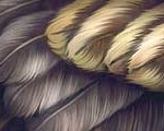
It’s common to make especially golden items too monochromatic. If you look closely at a golden surface, you will see that the golden colour includes a lot of different values. Try to capture the colours, and carefully mix them all together. I suggest using hits of colours varying from yellow, green, grey, red and blue. If you have a surface with a different colour reflecting on the golden surface, this colour should be mixed into the reflected area, introducing more colours.
尤其是这样制作黄金是常见的,太单调了。如果你凑近了去看一个金色的表面,你会看到金色的颜色包括了许多不同 的变化。尝试捕捉色彩,和它们仔细混合在一起。我建议使用黄色,绿色,灰色,红色和蓝色。如果有一个不同于黄金表面颜色的反射颜色,这个颜色应该是混入反 映面积,引进更多的色彩。
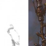
Step 1 – Standard base
第1步 – 标准基地

First, start with a basic outlined version of the element that you want to paint. Also, make sure the background is filled with a medium dark basic colour to make it easier for you to add shadows and highlights.
首先,画出你要绘制物体的外轮廓。此外,务必背景填充为一个较暗的基本颜色,使你更容易添加阴影和高光
Step 2 – Define shapes
第2步 – 定义形状

Now the fun starts. Use your favourite brush (I prefer a hard edged one), and carefully give shape to the different parts. The more a surface is facing you, the brighter it should be, and darker when facing away from you. See the smooth transition on the pipe-line illustrated here.
现在,有趣的开始了。使用你喜欢的笔刷(我喜欢使用硬边一),并仔细地勾勒出不同形状部分。越是面对你的表面,它应该是越亮,而越是离你远得表面就越是暗。注意这里弧形部位的柔和过渡。
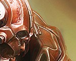
Step 3 – Light source direction, and high lights
第3步 – 光源方向和高光

Map out where the light is coming from. The surfaces pointing towards the light source should be brighter, and the one facing away from the light should be darker. Use normal paint-brush when doing this. At the end, use the dodge tool and set the range to “Highlights” (exposure around 5%) to make the high lighted areas look metallic.
标出光线是从什么地方照射的。表面朝向光源方向应该更亮,远离光源的应该更暗。这些是使用普通笔刷完成的。最后,使用dodge工具,并设置为“Highlights”(约5%左右)的范围,使高光区域更像金属。
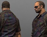
Step 4 – Reflections and shadows
第4步 – 反射与阴影

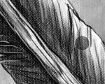
Understanding reflections takes some time and practice, but a simple way to emulate simple reflections, is to mirror highlights onto the reflecting surface. It doesn’t have to be 100% identical, just a hint that something is being reflected. See how the skin colour gets reflected on the right side of the gauntlet. Also add some shadows to help the shape. Tip: add a thin brighter outline at the negative side of a shape.
理解反射是需要一些时间思考和实践的,但一个简单的方法来模拟简单的反射,在反射表面上镜像高光。它不是100%相同,只是暗示是有些东西被反射了。看看手臂右侧肤色受到了反射。同时添加一些阴影以体现形状。提示:在外形的另一侧添加一点光亮的轮廓。


推荐课程


推荐教程
1回复绘制黄金"