

本教学为翻译教学,转载请注明来自aboutcg.net,以及注明翻译者
原教学出自3dtotal网站,原始链接如下:
作者: Gábor Miklós
翻译:purpelsun ( 翻译中有错误之处请谅解,并请帮忙指出!谢谢!)
转载请写明出处和翻译者为purpelsun,谢谢。

Software Used :使用软件
3ds Max
As I am a great music lover and I love lots of different musical styles, I decided to create a musical instrument. At first, I didn’t know which one I was going to choose to recreate, but I liked the sound of making a guitar and so I decided to give it a go.
因为我是个狂热的音乐发烧友,我喜欢许多不同风格的音乐。所以我决定创建一个乐器。一开始,我并不知道该创建什么,但是我喜欢吉他的声音,就这样,我决定试试做把吉他。
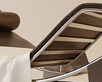
The first idea was to put inlays and ornaments on it. I didn’t just want to make an ordinary guitar; I wanted to create a gentle instrument.
首先的想法便是给它一些修饰。我不想创建一把普普通通的吉他;我想要的是一把高雅的乐器。(Fig.00).

Fig.00
Modelling建模 :
I used several different ways to model the various parts of the guitar, with the main two being box modeling and patch modeling. Patch modeling is a very good way to make curved surfaces, like the body of the guitar or guitar neck, because it gives you an accurately curved mesh.
我使用不同的方法来创建吉他的不同部位,最主要用到的技法是box modeling 和patch modeling。Patch modeling是创建曲面的非常好的方法。比如吉他的面板和neck,,因为它会让你创建精确的曲面。
The whole mesh was MeshSmooth capable and it was about 128,532 polygons and 94,000 vertices (what a nice, round number!) Of course these figures are for the model without any MS on it. For those renders you have to kick up the MeshSmooth and the poly count jumps to about 300,000.
整个模型都是可以光滑,整个模型有128,532个多边形和94,000个顶点(完美的整数)当然这些数字是没有执行网格平滑的数字。渲染的时候你需要执行网格平滑,而这时的模型面数奖达到300.000左右。
Here are a few screenshots from the wireframe of the guitar (Fig.01 – Fig.10).

Fig.01

Fig.02

Fig.03

Fig.04

Fig.05

Fig.06

Fig.07

Fig.08

Fig.09

Fig.10
The Wooden Material:木纹材质
I used only procedural maps for the wood material. Wood is a special material; every millimeter inside and out looks different. The look of a piece of wood depends on where you cut it and this basically determines the look of the whole material.
木纹材质的表现上我只用了程序纹理。木纹石一种特殊的材质;材质的里里外外每个地方都不一样。一块木纹的外观取决于你在何处砍下去。同时也决定了整个材质的外观。
There are two ways to create the wooden material for a guitar’s neck (or for anything else really). The first way is to flatten the UV Map and texture it with real wood textures, but on a curved shape like the guitar neck, it’s not very easy to do this, or very accurate.
有两种方法来为吉他的neck创建木纹材质(或者是用在任何其他地方)。首先是展平UV然后贴上真实的木纹贴图。但是在曲弧形形状的地方比如吉他的neck位置,就不是很容易做。或者结果不是很精确。
The second method is to use procedural maps, which is much easier and means you don’t have to flatten the UVs. It will also spare the system memory while rendering, it has nearly unlimited resolution so it won’t be pixilated in greater resolutions and it looks good too! Oh and have I forgotten to mention that it’s more accurate than simple textures and spares a lot of time? So it has a lot of advantages and I bet you can guess which method I used!
第二种方法是使用程序纹理,程序纹理更简单并且你也不用编辑UV,另外在渲染的时候使用程序纹理会更节省系统资源。它几乎可以提供无限大精度的贴图结果,就是说即使你使用的巨大的分辨率你也看到像素点,而且效果也不错。噢。我是不是忘了提到它比一张真实的纹理更精确,并且节省时间吗?所以它有很多有点,我想你现在也能猜到我将使用哪种方法了。
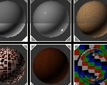
There were three parts to the wooden material I used (Fig.11):
在表现这个木纹材质的的时候我用到了三个部分(Fig.11):
• The main annual rings (darker and lighter)
• 主要的年轮(暗色和亮色)
• Splinters inside the wood that are in-line with the annual rings
• 直的年轮里面的小杂点
• A few speckles that make the wooden material a little bit more inhomogeneous
• 一些让木纹材质看起来更加无序的斑点

Fig.11
A few corrections were needed to get a correct result. The first thing was to set the direction of the annual rings and the splinters. To do that I tried to guess how the annual rings and splinters became parallel. Fig.12 and Fig.13 show the coordinates of the splinters, and Fig.14 shows the coordinates of the wood map. With these settings the two types of maps were parallel and they were also in-line with the Z-axis of the object.
为了得到正确的结果需要经过多次调节。首先要做的是设置圆形的年轮和竖着的年轮的方向,为了达到目的,我尝试着猜测年轮里面的纹理是如何平行的。Fig.12 和Fig.13显示了下杂点的坐标设置。Fig.14显示木纹纹理的坐标设置。使用这些参数设置,两种类型的纹理就平行了,同时纹理也和物体的Z方向一致。

Fig.12

Fig.13

Fig.14
If you want to know more about how this material works then you can download it by clicking here.
如果你想更多的了解这个材质是如何工作的,你可以在这里下载。
Textures 纹理:
Okay, here are the specific textures I used for this image. I used CorelDRAW to make them (Fig.15).
The strings have an over-tiled Gradient Ramp texture on them and it’s fully procedural of course (Fig.16).
好了,下面就是我使用的特殊的纹理,使用CorelDRAW来完成的(Fig.15).琴弦使用的是平铺的Ramp纹理,当然,它完全是程序纹理。

Fig.15
Fig.16
Lighting灯光 :
First I wanted to create a scene, but I changed my mind after I’d finished the guitar. Since I wanted to show you every part of it, I didn’t feel necessary to create an entire scene. Alright, but what could I do instead? Should I create an ordinary blue-orange studio scene? No, it was too boring. Should I use HDRI? No, never, I hate it – it doesn’t give accurate results as it hasn’t got distance from the objects. How about using original lights? Maybe … but how?
一开始我想创建一个场景,但后来当我把吉他建造完成后我改变了主意。因为我想向大家展示吉他的每一个部分。我觉得没有必要创建整个场景。好了,但是我要使用什么方法来替代呢?我应该创建一个普通的蓝色-橙色的studio场景吗?不,这太无聊了。我应该使用HDRI吗?不,我讨厌这玩意儿—HDRI不能提供精确的结果因为他无法得到到物体的精确距离。使用常规的灯光如何?或许何以……但是怎么做呢?
After a little thinking, I Googled for some real studio lighting pictures. I was lucky and found quite a few. I then created two new types of light sources for myself. (I just wanted to prevent the hard edges on the reflections generated by simple VRayLights) (Fig.17).
小想一会儿后。我在Google上搜索了一些真实的studio lighting图片。我很幸运找到了不少类似的图片。然后我就创造了两种新的类型的光源。(我只是想防止VRayLights产生反射的硬边。) (Fig.17).

Fig.17
Here are a few things about lighting that I’d just like to mention at this point:
下面是一些打灯时我想提醒大家的一些要点:
• For diffuse light it is better to use a desaturated light blue color, and for directional it is better to use a yellow one.
• 漫反射灯光最好使用低饱和度的蓝颜色。方向灯最好是使用黄色。
• Turn off the “Affect reflection” and “Affect specular” buttons.
• 关掉“影响反射”和“影响高光”按钮
• The directional light needs to look at the object you wish to light, and needs to be double-sided. The diffuse needs to be looking at the hemisphere and the double-sided option should be off… (You can, of course, use caustics with type 1 lights too. It depends on which is better for your scene).
• 方向灯需要指向你想要照亮的物体,并且需要勾选双面。漫反射灯光需要指向半球,并且关掉双面(当然,你也可以在灯光类型1上使用焦散。这取决于那种效果在你的场景中最好)
• The most important thing of all is to exclude all other objects on the Diffuse light option except the light hemisphere (Don’t exclude if using Type 2 light)
• 最重要的是在漫反射灯光的属性中排除了除半球以外的所有物体(在类型2中的灯光不需要排除)
The next thing now was to put the lights in the correct places in my image. The lights that I wanted to see from the reflections were diffuse lights (I tried to find a place and size where I could see them from the reflections). The directional light was a good choice to generate nice, smooth shadows and caustics. I put them beside the model, or more then 45 degrees from perpendicular, and it gave a very nice result, as you can see in Fig.18.
接下来要做的就是在场景中正确的放置这些灯光。我想在反射中能看到的灯光师漫反射灯光(我尝试着在反射可见的区域找到一个合适的位置和大小)。方向灯时很好的产生漂亮和柔和的阴影和焦散的灯光。我把他放置模型的旁边,或者和水平面的夹角超过45度。这样就可以得到非常好的记过,如你在Fig.18见到的一样。

Fig.18
I want to point out one thing at this point: to get a realistic look for reflections it’s a good idea to use 5-10 light sources and try to cover more than 50-60% of the places where there is no light. With this method there will only be a few percent of dark places on the reflections, which is just as much as it really needs.
在这里我想要指出一点:为了得到真实的反射效果,使用5到10盏灯光并且覆盖没有灯光的照射的50-60%的地方是个不错的方法。使用这种方法,只有很少一部分的黑色的区域出现在反射里,这就是它实际需要的。
You can also use other shapes to make a nice, realistic reflection. If you changed to a flat shape then you can easily simulate a wall or something else … you can make a plane and light it from the bottom edge or you could put two or more lights aside so that it looks like a window from the reflections.
你也可以使用其他的形状来创建漂亮真实的反射,如果你选择一个平的形状你就可以很容易的模拟一堵墙或者其他类似的……你可以创建一个平面然后在它的底部照明或者你可以使用两盏或者多盏灯光放置在它的旁边,这样在反射你看起来就像窗户一样。
Here is the lighting combination that I used for my rendered scene (Fig.19).
下面是我的场景中的灯光组合(Fig.19).

Fig.19
post Processing 后期处理:
I used HDRI to save the raw renders. It’s the best format to save your images in because it has 32bits/channel information from your renders. Of course it gives you a little bit of an interesting result when you load it into Photoshop, but that’s quite easy to prevent. Sadly Photoshop can’t make any procedures with this format so you have to change the color depth to 16bits/channel. With this method you still have 65536 colors/channel so you get very, very good gradients.
我使用 HDRI来保存原始的渲染。这是保存图片的最好的格式,因为他包含了从你渲染得到的每通道32位色的信息。当然,当你在Photoshop中导入它是也会有趣的多。遗憾的是Photoshop不能操作这类型的图片,所以你不得不改变图片的色深为美通道16色。使用这种方法,你仍然可以得到没通道65536 种颜色,非常丰富的色彩了。
The next step was to correct the colors and make the picture natural. I used exposure and Blending methods to accomplish this, mostly Multiply, Overlay and Scene. I rendered down the ZDepth pass in 3ds Max and then I used Lens Blur to make DOF. I put Chromatic Aberration on to the picture with great care – you just have to feel it and not see it. I also put a very fine glow on to the highlighted places and some color correction.
下一步就是调整颜色使得图片看起来更加自然,我使用exposure 和Blending的方法来实现它。大部分使用Multiply, Overlay 和Scene。我在3ds Max中渲染出Z通道,然后是镜头模糊来创建景深效果。我对图像小心的校色,你必须去感觉它而不是看他。我也在高亮的地方放置了一些辉光并调色。
That’s all you have to know about this picture! I hope you enjoyed this Making Of and found it useful (Fig.20).
这就是创建这个作品所有你所需要知道的。我希望大家喜欢这个制作过程并且对你有所帮助(Fig.20).

Fig.20
有问题可以参与答疑


推荐相关中文教程

Vray for maya高级案例商业渲染流程教学
本套教程是vray的全案例流程教学,教程使用三个具有代表性的案例演示了vray的渲染参数设置经验和技巧,同时讲解了如何在实际的工作中使用这些参数来进行渲染的优化和质量的平衡。教程的内容从实际工作经验出发,详细的演示了:合理光源的布置原理,多光源合并调节,多通道渲染与合成,多象限UV的设置与渲染等高级技巧。Vray for Maya完全教学
本套教学选择最重要和最常用的核心功能作为讲解对象,所有内容占到了vray for maya全部功能的80%—90%以上。教学的目的是让学员能够加深对vray的理解,熟悉常用的vray渲染技巧,而不仅仅是记几个常用的参数。教学中很多软件原理和技巧应该是首次在vray for maya中文版教学中披露,而这些东西在帮助文档上是没有的,各位学完之后应该会打下较为扎实的软件使用基础。3DSMAX动力学特效实战教学
本套教学将通过24章实例教学,来向你详细讲解3DSMAX的动力学特效在电视包装与广告中的应用。3DSMAX国外粒子案例效果解析
本教学通过27个实战案例,教您如何用3DSMAX结合ParticleFlow本身以及扩展的ParticleFlow Box 1、Box 2、Box 3、功能包,结合Vray渲染器,来制作流行的广告和电视包装中的粒子特效效果。无论是常见的粒子聚合,分散,动态粒子替换,粒子矩阵,粒子动力学,本套教学都有相应的案例。3DSMAX国外流体案例效果解析
本教学通过20个实战案例,教您如何用3DSMAX结合Realflow,FumeFX, ParticleFlow插件,来制作流行的广告和电视包装中的流体效果。无论是常见的液体,烟雾,流体碰撞,沙粒变化,水墨表现,本套教学都有相应的案例。2.5D商业游戏场景制作教程 进阶篇
在本教程中,Freeyy老师将从零开始,向你讲解如何根据确定的主题进行前期准备,随后建模,绘制贴图,制作材质,最后再进行细节调整,完成一个商业游戏级别的2.5D场景画面。Mentalray for max实战教程
本教程共包含超过42小时以上的视频教学内容,共18章 132课,通过大量实例,详细讲解了3ds Max平台下的Mental Ray1渲染器的使用基础和实战方法。是一部非常完整详细的3dsMax版的Mental Ray渲染器的教学.网游角色制作女精灵实战教学
本教学以一个AAA级网游女精灵角色为案例,向您展示如何完成她的模型,UV,和贴图绘制。教学使用的软件主要是3ds max和 bodypaint, 其中建模和UV使用3ds max完成,贴图绘制在bodypaint和 PS中完成。


推荐课程


推荐教程
2回复如何创建漂亮的吉他"