本教学为翻译教学,转载请注明来自aboutcg.net,以及注明翻译者
原始链接如下:
http://abduzeedo.com/zee-logo-illustrator
作者:Fabio Sasso
翻译: lala_p
请尊重互联网道德,转载请注明转载出处和翻译者,谢谢!
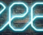
Zee Logo in Illustrator
如何用Ai制作ZEE标志

A few weeks ago we decided to redesign the Zee logo. When companies redesign their logos, that means, most of the time, that they are changing something in their business, it can be a new strategy, new products, etc… But it’s pretty much sure that something is new behind the logo. In our case it’s not different, we’ve changed our business model and decided to create a new logo.
几个礼拜之前我们决定重新设计Zee的标志,当公司重新设计他们的标志后,也就意味着,大部分时间,他们在业务上做了一些改变。可以是新的策略,新的产品等等。但那足以确定在标志背后有些新东西。在我们的案例中这没有不同,我们已经改变了我们的的商业样式然后决定去做一个新的标志。
With the idea of “Stay in the Loop”, I decided to play in Illustrator to create a custom font for it. Also I wanted to make the logo resemble a bit of the Abduzeedo logo. We’re still working on the logo and the tag line, but the concept is this one that I will show you here.
So in this tutorial I will show you how I created the logo in Illustrator and the splash in Photoshop.
基于停留在循环中的想法,我决定用ai创建一个自由的字体。我也想要做一个标志有一点类似Abduzeedo的标志。我们仍然把工作放在标志和标签线上,但是我在这里会给你展示这个概念。
Step 1
Open Illustrator and create a new document. Then go to View>Show Grid and then go to View>Snap to Grid. These 2 presets will be very important for us to design the font for the logo.
打开ai创建一个新的文档,然后打开视图面板勾选显示网格然后勾选视图面板对齐网格。这两步将会为我们后面的标志字体设计帮大忙。

Step 2
With the Rectangle Tool (M) create a rectangle using the grid.
用矩形工具沿着网格创建一个矩形。

Step 3
With the Pen Tool (P) add 4 new points on each segment of the rectangle. After that with the Direct Selection Tool (A) select each one of this points and move them um module of the grid away to create a chamfered corner.
用钢笔工具在每个矩形的节点增加新点共4个,这之后用直接选择工具分别选中节点然后移动到网格点创建一个矩形的切边。

Step 4
Lets start creating the Z. Still with the Direct Selection Tool (A), select the segment of the left side of the rectangle and delete it.
让我们开始创建字母Z。继续使用直接选择工具选择矩形的左边的直线部分然后删除它。

Step 5
Delete the righ side now still with the Direct Selection Tool (A). Pretty much the whole process will be with the Direct Selection Tool (A) and the Pen Tool (P).
仍然用直接选择工具选中然后删除右边的直线。在整个过程中将会大量使用到直接选择工具和钢笔工具。

Step 6
Now with the Pen Tool (P) click on the point 1 and then on the point 2 to create a diagonal segment. Our Z will be done.
现在使用钢笔工具从1点到2点创建一个对角线,我们的Z就快制作完毕了。

Step 7
To create the E will be the same process. First let’s delete the right segment of our chamfered rectangle using the Direct Selection Tool (A).
创建字母E也使用相同的手法。首先让我们删除切边矩形的右边部分,记得使用直接选择工具。

Step 8
With the Pen Tool (P) click on the point 1 then holding SHIFT click a few modules down in the grid (point 2). The click again now one module left and dow to create a chamfered corner (point 3).
用钢笔工具点击点1然后按住Shift向下几个网格点击点2,.然后在下面的几个网格左侧点击点3.

Step 9
Still with the Pen Tool (P) create the segment 1 and the chamfered corner 2. Hold SHIFT to make sure that you’re creating straight lines, even though we have activated the Snap to Grid option. After that our E will be done.
仍然使用钢笔工具创建第1部分和切边2。按住Shift这样可以确保你创建的线条都是直的。在我们激活锁定网格的情况下也可以。这样我们的E就完成了。

Step 10
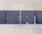
Now just duplicate the E and we will have the word ZEE.
现在我们只要复制E,标志ZEE就可以完成了。

Step 11
Go to Effect>Stylize>Round Corners. Use 5 points for the Radius or try different values to increase or reduce the round corners effect. However I didn’t like the result I wanted something more stylized.
打开效果面板,风格化,圆角,设置半径为5或者尝试不同的半径值,降低或者增加圆角的效果。

Step 12
So I decided to increase in 2 modules the chamfer effect.
所以我决定增加两个网格的切边效果。

Step 13
Now apply the Round Corner effect to the new logo, I still used 5 points for the Radius. The result is much better, it is much more like what I was looking for. But now I need to create a connection between the characters to give the idea of loop.
现在给我们的新logo增加圆角效果。我仍然选择半径值为5。现在的样子好多了,和我想要的效果差不多了。但是现在我需要在文字和循环灵感之间创建联系。

Step 14
To do that it’s quite easy. With the Pen Tool (P) create the the segments to connect the Z to the E (1-2) and the E to the other E (3-4).
其实这很简单,用钢笔工具创建这个部分,从Z的1到E的2,从E的3到E的4。

Step 15
Now just increase the stroke size. I’m using 8 points for the stroke. The logo is done. It resembles those subway maps and has this idea of loop, exactly what I wanted.
现在增加字体的磅值。我用8磅。这个logo就完成了。这有点像地铁交通图,就是我期待的循环的灵感。

Step 16
Now let’s open Photoshop and create a new document. I used 1024×768 pixels for the size. Fill the background layer with a very light blue (#dde9f5).
现在让我们打开ps然后创建一个新文档。我是用的尺寸是1024*768。用一个非常浅的蓝色(#dde9f5)填充这个背景。

Step 17
Copy the logo from Illustrator and paste it in the Photoshop document.
从ai中黏贴我们的logo到ps。

Step 18
Go to Layer>Layer Style>Color Overlay. Use #5d87b6 for the Color and Normal for the Blend Mode.
打开涂层面板,图层样式,颜色叠加。用#5d87b6这个颜色和正常完成这个模式叠加。

Step 19
Now go to Layer>Layer Style>Inner Shadow. Use Multiply for the Blend Mode, black for the color, 40% for the Opacity, 120º for the Angle, 1 pixel for the Distance, 0 for the Choke and 1 pixel for the Size.
现在打开图层面板,图层样式,内阴影,选择blend mode 黑色,40%透明度,120º角,
1像素距离,0阻塞,1大小。

Step 20
Now go to Layer>Layer Style>Drop Shadow. Use Color Dodge for the Blend Mode, white for the color, 100% for the Opacity, 90º for the Angle, 1 pixel for the Distance, 1 pixel for the Spread, 0 pixel for the Size.
现在打开图层面板,图层样式,投影。混合模式选择Blend Mode,颜色白色。100%透明度,90 º一像素距离,1扩展,0大小。

Step 21
This is the effect you will have gotten so far.
这就是我们现在已经得到的效果。

Step 22
Create a new layer and with the Rectangular Marquee Tool (M) create a rectangle selection and fill it with a white to black gradient with the Gradient Tool (G). Use the image below for reference.
创建一个图层用矩形选框工具创建一个矩形,然后用渐变白色到黑色填充。在下面的关联中将使用到。

Step 23
Duplicate the rectangle and go to Edit>Transform>Flip Horizontal. Move it so it will be on the other side of the segment of the E (1-2). Duplicate those 2 layers and move to create the same effect on other E (3-4).
复制这个矩形,打开编辑面板,变换,水平翻转。把它移动到E的另一边,图中12。然后复制这两层,移动到另一个E的34。

Step 24
Select the 4 gradient layers and group them. Them holding the Command key on a MAC or the Control key on a PC, click on the thumbnail of the Zee layer in the Layers Panel to create a marquee selection of the Zee logo. After that select the group with the gradient rectangles and go to Layer>Layer Mask>Reveal Selection.
选择这4个图层然后群组他们。按住Ctrl点击ZEE图层,然后单击渐变图层,按住Ctrl+Shift+I然后删除。

Step 25
Reduce the Opacity of the group with the gradients to 40%. That will make the effect much more subtle.
降低群组层的透明度到40%,这样效果看起来更精致。

Step 26
Duplicate all layers and merge the copies to a single layer. Then go to Filter>Noise>Add Noise. Use 1.4% for the Amount and select Gaussian for the Distribution and Monochromatic.
复制所有图层然后把复制的图层合成一个单独层,然后打开滤镜面板,杂色,添加杂色。数量1.4%,高斯分布,单色。

Conclusion
That’s it, we have a nice splash.
结果
这就是了,我们有了一个很好的喷溅效果。


推荐课程


推荐教程
0回复如何用Ai制作ZEE标志"