
本教学为翻译教学,转载请注明来自aboutcg.net,以及注明翻译者
原教学出自www.free3dtutorials.com网站,
原始链接如下:
http://www.free3dtutorials.com/model…ial.php?page=1
作者: Jason Godbey
翻译:freeyy
关于译者:

转载请写明出处和翻译者,请遵守最起码的网络道德!
“Invisible Tutorial ” by Jason Godbey
“宁静场景练习”by Jason Godbey
In this tutorial I’ll explain how I did the modeling, texturing, lighting, rendering, and post-work for the image “Invisible”.
在这个练习里我将讲解我如何进行建模、材质、照明、渲染以及“无形”作品的后期处理。


Modeling
建模
Overall, I kept the modeling rather basic. For the models that were simple, such as the flowers pots or small stool, I didn’t use any reference, but for more complex things, like the clock or the flower cart, I always try to get a few good reference pictures to go on. Even then I’ll usually deviate from the reference just to see what I can come up with on my own. To me, that’s the really fun part, being able to put my own ideas into whatever it is I’m working on. I box modeled all the props using the Edit Poly modifier. I chamfered all the edges on the props to give the objects a smoother feel.
总的来说,我一直保持基础的建模。为了使模型简单,类似花瓣或者小凳子这些东西,我都没有使用 任何的参考资料,不过对于一些复杂的事情,比如钟座或者花车,我总是会尝试获取一些不错的参考图片来进行制作。尽管如此我通常不会照搬参考资料,而是通过 提示来看看我自己会得到什么。对我来说,这是非常有趣的部分,通过表达我自己的想法到整个画面上,这才是我要做的事情。我用 Box 透过 Edit Poly 修改器建模了所有的道具。我对在道具上的所有边线进行了倒角,让物体据有一种平滑的感觉。

For the plants and trees I used Xfrog models and some free models found on the web and just made texture modifications to them and built my own props for them.
对于植物和树木,我使用了 Xfrog 模型以及一些在网络上的自由下载模型,并且仅仅修改了它们的纹理,好让它们成为我自己的道具。
Flower cart:
花车:


Ivy plant:
藤蔓植物:


Here’s the reference picture I used for the clock.
这里我创建钟座参考了图片。


For the fence I used Lines with the initial type smooth checked. The shape for this fence just came off the top of my head, no referenced was used, though it might have been helpful since the design isn’t the most elegant. 
对于栅栏我使用了Lines,在 initial type (卷展)打开了 smooth。 这个栅栏的形状仅来自于我的脑海,没有使用参考资料,尽管它可能会有些用处,但是设计的并不是很雅致。


For the fruit I used simple shapes like spheres and cylinders and modified them with the Edit Poly modifer. I scaled two or three pieces of fruit and then instanced them in the crates to give more variation.
对于水果我使用了简单的物体,比如球形以及圆柱,然后用 Edit Poly 修改器编辑了它们。我缩放了水果中的两个或者三个,然后以 instanced 形式复制到箱子里让它们具有更多的变化。


Textures
纹理
For the textures I mainly used textures from sites like CgTextures and used the Blend function in 3ds Max to give more variation to the textures.
对于纹理我主要使用了比如 CgTextures 网站等处得到的纹理,然后使用了 3ds Max 内部的混合功能让纹理获得更多的变化。
This is the texture I used for the clock.
这是我用于钟座的纹理。

I went further to add another Blend function inside the current Blend I already had and used a black and white dirt mask for the blending effect.
我在当前的 Blend 着色器里进一步的添加了另外一个 Blend,然后我又为混合效果添加了一张黑白的污垢遮罩图。

Here are the textures I used for the green paint on the clock:
这是我用于钟座上的绿色油漆纹理:
These were the first two color maps I blended:
在这里我首先混合了两种色彩贴图:


This is the dirt mask I used for the blending.
这是我为混合而是用的污垢遮罩。

Then on top of that I added another texture and dirt mask for blending:
然后在它们上面我为混合效果又添加了另一张纹理与污垢遮罩图:

Color map:
色彩贴图:

Dirt mask:
污垢遮罩:

This is what the Blend process looks like:
这里的混合过程看上去像这样:


Once I get all my textures in place I go in and add a bump map to all my textures. I’ll either take the color maps and desaturate them in Photoshop or just put the color map in the bump map slot. Depending on the type of texture I will usually leave the bump intensity setting at 30 or take it up to around 65.
一旦我把我所有的纹理放到的合适的地方,我就会继续并且为所有的纹理添加凹凸贴图。我任意的采 用色彩贴图然后在Photoshop里降低它们的饱和度,或者仅仅是把色彩贴图放置到凹凸贴图通道里。依赖于纹理的类型,我通常把凹凸的强度设置在 30 或者增加到 65 之间。
Lighting/Rendering
照明/渲染
I kept the lighting simple as well. I used one directional light for the sun and rendered with Vray with global illumination.
我保持光照也同样的简单。为了表现阳光我使用一个平行光源,然后我用打开了全局光照的 Vray 来进行渲染。
I enabled Vray Shadows and gave the light a slight yellowish tint.
我使用了 Vray Shadows 并且让光源呈现轻微的黄色。

Also, I made sure the Light Cone encompassed all the geometry in the scene.
同样,我确保灯光椎体包括了场景中的所有几何体。

And enabled Area Shadows.
然后打开了体积阴影。

I left most render settings at their default values. I will highlight the settings I adjusted.
我应用了大部分的渲染设置的默认值。我将标注我调整过的设置。
I uncheck Default lights and checked the On button to enable GI under the Indirect Illumination tab.
我关闭了 Default lights (缺省照明)然后在 Indirect Illumination (间接照明)标签下打开了 On 按钮以允许 GI。
Reflection options : Be sure to check the Reflective option on under GI caustics in the Indirect Illumination tab and add color to the Reflection/refraction environment override option so that anything with reflective qualities will show up.
反射选项:确保 Indirect Illumination 标签里的 GI caustics 勾选了 Reflective 选项。并且为 Reflection/refraction environment override(反射/折射环境覆盖)选项添加了颜色,隐藏所有物体的反射特性将会显现出来。
Color mapping : I tend to use Linear color mapping for outdoor scenes and Exponential or HSV Exponential color mapping for my indoor scenes.
染色贴图:我趋向于为室外场景使用 Linear color mapping(线性色彩贴图),然后用 Exponential(指数)或者 HSV Exponential(HSV 指数)色彩贴图来作为我的室内场景选择。
Test rendering : When I want to see what I have quickly I’ll set the Adaptive Subdivision (under the Antialiasing tab) at : Min: -1 Max: +2 , for Irradiance Map settings: under Basic Parameters, I set the Min rate at -3 and Max rate at -3 . The HSph. SubDivisions on: 30 and Interp. Samples: 20 .
测试渲染:当我想快速的查看时,我会把 Adaptive Subdivision(Antialiasing 标签下)设置为Min: -1 Max: +2,为在基本参数下的 Irradiance Map 设置:Min rate 为 -3 然后 Max rate 为 -3。 HSph. SubDivisions 为: 30 并且 Interp. Samples: 20。
Final rendering : For the best quality I adjust the Irradiance map settings according to the size of the render. For example, a render at 640×480 : under the Basic Parameters I make the Min rate -3 and Max rate -1 . For double that size, I take the numbers down by one. So the Min and Max rate for a 1280×960 render would be -4 and -2 respectively. Double that size again, 2560×1920, and I take the numbers down by one again on the Min and Max rate (-5, -3) , and so on and so on for every time I double the size of my render. I take the Adaptive Subdivision Antialiasing Min and Max rate to 0 and 2 respectively for the final render. For the HSph. SubDivisions I will set it to around 60 and set the Interp. Samples to around 50 .
最终渲染:为了更好的质量按照不同的渲染尺寸我调整了 Irradiance map 设置。举例来说,640×480 的渲染:在基础参数下我修改了 Min rate -3 并且 Max rate -1。对于两倍的尺寸,我把参数下降了一个数值。因此对于 1280×960 的渲染来说Min 与 Max rate 各自为-4和-2,再次的双倍尺寸,2560×1920, 我同样把参数下降了一个数值 Min 与 Max rate为(-5, -3),以此类推在所有时候我都为我的渲染进行两倍尺寸的设置。为了最终的渲染我把 Adaptive Subdivision Antialiasing 的 Min 与 Max rate分别设置为 0 和 2。HSph. SubDivisions 我将设置在 60 左右并且把 Interp. Samples 设置在 50 左右。


Post-work
后期处理
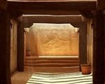
Here’s the image right after rendering it in Vray. It’s a little too dark and flat for my taste so I’ll take it into Photoshop and touch it up a little.
这里的图像在 Vray 里渲染完成之后,在我看来它显得有点暗并且平淡,因此我将把它放到 Photoshop 里然后进行少许的调整。

The first thing I do is adjust the Levels. This is going to be different for every image since it depends on how dark the render is. For this image I adjusted the right Input level from 255 to 180.
第一件事情我调整了 Levels(级别)。对于每幅图片来说这里都会有些不同,因为它依赖于渲染时会有多暗淡。对于这幅图像来说我调整了右边的级别(译者:即图像的白场),由 255 到 180。


Then I add more contrast to the image by adjusting the Brightness/Contrast values. For this image I increased the contrast to 7.
然后我通过调整 Brightness/Contrast 的值来为图像添加更多的对比。对于这幅图像我增加了对比度到 7。


Then to give the image a warmer feel I adjusted the yellow midtones to -8 using the Color Balance tool.
然后为了使图片具有一种温暖的感觉,我通过利用 Color Balance 工具调整黄色中间调到 -8。


The last thing I do is use Neil Blevins’ specular bloom method to add an even more dramatic effect to the lighting. The tutorial for this can be found here:
最后我使用了 Neil Blevins 的高光润饰的方法来为照明添加了更加戏剧性的效果。这个练习可以在这里找到:
http://www.neilblevins.com/cg_education/specular_bloom/specular_bloom.htm
(译者:地址里的教程就一个 max 效果:blur 效果~超级简单~,在 PS 里也能轻松达到同样的效果,看下文。)
I will outline it quickly here too. The first thing to do is to duplicate the Background Layer. Then add an extreme amount of contrast to the image and lower the brightness. For this image I raised the contrast to 90 and lowered the brightness to around -100. This will differ for each image. Basically what you see highlighted will received the bloom effect. When your contrast and brightness values are less extreme more of the scene will receive the bloom. In some cases this may not be what is wanted since it can wash out the image overall.
我也将在这里快速的说一下他的方法。第一件事情是复制背景图层。然后为图像添加一个极端数值的 对比度同时降低亮度。对于这幅图像我提高对比度到 90 然后把亮度降低到了 -100 左右。对于每幅图像来说这里会稍有不同。基本上来说当你看到高光处出现了辉光效果就可以了。当你的对比度和亮度值已经少许过度的时候场景将产生辉光。在一 些情况下这里可能什么也不会看到,因为它可以冲抵掉整幅图像。
Duplicate the Background layer
复制背景图层

Adjust Brightness and Contrast to extremes
调整亮度对比度到极端状态

The next step is to desaturate the layer that will take on the bloom effect. Then add a Gaussian blur filter to the layer. I usually adjust the setting to around 15 pixels.
下一步是对图层进行去饱和,图层将获得辉光效果。然后为图层添加一个高斯模糊滤镜。我通常调整设置到 15 个像素左右。
Desaturate the layer.
图层去饱和

And add a Gaussian Blur effect.
然后添加高斯模糊效果


Then change the layer setting to linear dodge . The lighting should look blown out now so we’ll need to lower the opacity . I usually set it around 10-15%.
然后调整图层模式为 linear dodge。光线现在应该强烈的出现了,然后我们将需要降低它的透明度,我通常设置在10-15%左右。


And that’s it!
就是这样了!


推荐相关中文教程

3DSMAX动力学特效实战教学
本套教学将通过24章实例教学,来向你详细讲解3DSMAX的动力学特效在电视包装与广告中的应用。3DSMAX国外粒子案例效果解析
本教学通过27个实战案例,教您如何用3DSMAX结合ParticleFlow本身以及扩展的ParticleFlow Box 1、Box 2、Box 3、功能包,结合Vray渲染器,来制作流行的广告和电视包装中的粒子特效效果。无论是常见的粒子聚合,分散,动态粒子替换,粒子矩阵,粒子动力学,本套教学都有相应的案例。3DSMAX国外流体案例效果解析
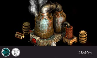
本教学通过20个实战案例,教您如何用3DSMAX结合Realflow,FumeFX, ParticleFlow插件,来制作流行的广告和电视包装中的流体效果。无论是常见的液体,烟雾,流体碰撞,沙粒变化,水墨表现,本套教学都有相应的案例。2.5D商业游戏场景制作教程 进阶篇
在本教程中,Freeyy老师将从零开始,向你讲解如何根据确定的主题进行前期准备,随后建模,绘制贴图,制作材质,最后再进行细节调整,完成一个商业游戏级别的2.5D场景画面。Mentalray for max实战教程
本教程共包含超过42小时以上的视频教学内容,共18章 132课,通过大量实例,详细讲解了3ds Max平台下的Mental Ray1渲染器的使用基础和实战方法。是一部非常完整详细的3dsMax版的Mental Ray渲染器的教学.网游角色制作女精灵实战教学
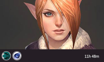
本教学以一个AAA级网游女精灵角色为案例,向您展示如何完成她的模型,UV,和贴图绘制。教学使用的软件主要是3ds max和 bodypaint, 其中建模和UV使用3ds max完成,贴图绘制在bodypaint和 PS中完成。


推荐课程


推荐教程
0回复“宁静”场景创作过程"