

原文地址 http://ae.tutsplus.com/tutorials/motion-graphics/create-harry-potter-titles/
Create Harry Potter Titles
《哈利波特》伪片头

Aug 24th in Motion Graphics by Robert Holtby
You don’t have to be a graduate of Hogwarts to create cool titles! In this tutorial you will learn the simplicity of creating an amazing looking Harry Potter “The Half-Blood Prince” introduction, using only four photographs and the power of After Effects. So quit your Quidditch and have a seat. It’s gonna be magical!
Author: Robert Holtby
I am a 19 year old student from England who studies Media by day and After Effects by night. I have been using Adobe Photoshop and 3DS Max since the year 2001, and After Effects Since 2007. I am self-taught in all of these applications.
这人是一个十九岁的学生,英国人。上大学,白天学传媒,晚上练AE。注意人家自从01年开始ps和3dmax,07年学AE,全是自学。
解说人:小池,也是学生,比作者大一岁。多啰嗦几句,从这个作者的经历可以看出,只要爱好就可以取得成功,呵呵。这个教程我并没有跟着做,就先发一下。后天开学再做。
这个教程,你需要先了解一下AE,最起码知道什么是蒙版,什么是羽化,然后还要会用AE做一张图片飞进来……就这些……囧一下
File size 2.3MB
如果预览不能用,那就在这儿预览豪华版:http://www.vimeo.com/6169841
开始之前
We are going to start by making the text. Firstly download the “Harry Potter Cover Font” from HERE. Once you have downloaded and installed the font we can begin.
先创建文字,上面的那个here链接就是字体。
The photographs I have used I have taken myself, you should be able to find suitable images from a reputable stock site.
后面要用到的照片是作者自己拍的,不存在版权问题。
第一步
Make a new composition with your desired aspect ratio and 1 frame duration ( as we’re creating a still image ). However, the width will need to be around or larger than 3000 pixels (so that when the text comes past the camera some of the quality is maintained)
新建一个composition,分辨率、制式等等都随意,时长为一帧。当然,宽度的大于3000像素。为什么?因为静态的图像,我们尽量大一些,而且后来摄像机还要推到字跟前的。

第二步
In this new composition create a new text layer and type in your desired text. Make this text grey and large enough to fill the entire composition.
在这个composition里,新建一个文字图层,打上字。字是灰色的,要足够大,最好填满屏幕。

第三步
Select the Text layer and go to LAYER – LAYER STYLES – BEVEL AND EMBOSS. Change the “Technique” to “Chisel Hard”. The “Depth” to 150, or whatever looks best. Change the “Size” to 50 (or again, whatever looks best for you) and then Soften it between 1 and 2.
选中文字图层,然后 LAYER – LAYER STYLES – BEVEL AND EMBOSS (倒角与等高线)。按图改参。

第四步
Now it’s time to add the texture, for this you will need a “grunge” texture (you can use any you have on your computer), which is easily obtained through a stock image site such as SXC Stock Images. Once you have downloaded the texture that you like, import it into after effects.
添加纹理。需要“grunge”(就是脏兮兮的东西——解说者)的纹理(别的也成),可以从一些图片网站下载,上面的绿字就是链接。不过还是随便找一些吧,呵呵。

第五步
Duplicate the text layer, and insert the grunge texture between the two(if the texture is too small, scale it up until it fits), change the TRKMAT of the texture to the duplicated text layer ALPHA. Then set the Texture layer to OVERLAY.
复制文字层。将“grunge”置于两层之间,更改纹理层的trkmat为alpha,然后将纹理层的图层混色置为overlay。

第六步
Now select your Grunge texture layer and choose EFFECT – COLOUR CORRECTION – HUE/SATURATION and reduce the saturation of the texture by 100. Also add EFFECT – COLOUR CORRECTION – LEVELS and adjust the levels until your texture has a deeper contrast to it.
选中纹理层,EFFECT – COLOUR CORRECTION – HUE/SATURATION ,然后减少此层的饱和度(saturation)100 。EFFECT – COLOUR CORRECTION – LEVELS (色阶)也要降低,直到能看得清楚纹理。

第七步
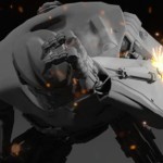
At this point, your text should look something similar to this. Which means you are now ready to save. Go to COMPOSITION – ADD TO RENDER QUEUE. Click “Output Module” and change the format to “PNG Sequence” and change the “Channels” to “RGB+Alpha”. Choose “OK” and render this file out. Then we can begin to create the background!
到此为止,效果应该和下图差不多,如果不是,请反省人品,然后从头来一遍。呃……总之……保存。然后COMPOSITION – ADD TO RENDER QUEUE (渲染) 。渲染要注意:”Output Module(输出)” 将格式改为PNG Sequence (png序列),将”Channels” 改为 “RGB+Alpha”. 点ok就ok了,等着机子渲呀渲。然后就要做背景了。

第八步
Make a new composition at your desired resolution and make the duration 15 seconds.
新建一个composition,分辨率随意,时长15秒。这一步好简单呀啦啦啦

第九步
Create a new camera by going to LAYER – NEW – CAMERA and apply these settings;
点LAYER – NEW – CAMERA新建一个camera(摄像机)。设置如下

第十步
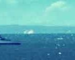
Import the picture that you want to use for your main background into the composition (ill be using a mainly overcast sky to create a solid background), make it a 3d layer and make the position 320, 180, 20000 and then scale it until it fills the entire composition.
导入你的那个白云图片(其实是黑云的说),这就是我们的静态背景了。把它变成一个3d层,然后设置位置为320, 180, 20000,(位置的涵义就是把图片推远,放在中间)现在它是不是很小了,是了,为什么?因为远嘛……然后放大它,大到充满整个composition。


第十一步
Now we’re ready to import our main clouds, the ones that are going to add detail and movement to the background, for this i’ve used clouds which are being hit from the side by the sun. Once you have imported them, mask out the undesired areas and feather the mask to a level of 200+. Set this to a 3D layer and set the position to somewhere similar to the example image.
然后导入那个白白的云彩(好像又很黑),这个(以及随后的云彩)就是那些会在后面往中间抖的云彩了。
什么?云彩图片有一个四四方方的边缘,用蒙版蒙住,不要忘记羽化边缘。置为3d层,至于位置么,下面有示范。


第十二步
Now duplicate this cloud layer and rotate it aboout 180 degrees on the Z axis and move to the Right side of the screen. Place this slightly closer to the camera this time as outlined in the image(s).
复制云彩层,在Z轴上旋转半圈,移到画面的右侧。这次离摄像机近点。


第十三步
Once again you must duplicate this layer and rotate it till it is flat against the bottom of the composition, this time, like last, move it even closer to the camera, this time, scale the image down slightly, as outlined in the image(s)
再复制一次云彩层,这次弄到画面底部,离摄像机更近一些。可能需要缩小点。


第十四步
Now repeat this process until you’re happy with how it looks. (Remember the more you add, the longer the rendering time will be! But the better it will look!). I’ve added one more layer of clouds to the top and left it there. Your composition and timeline should now look similar to mine.
一片两片三四片,五六七八九十片,总之这种方法可以弄很多片云。云彩越多,后期的渲染就会越慢,但应该会越漂亮。本文的作者这一步又弄了两个。


第十五步
This is an optional stage. At this point you may be looking at your composition and thinking “it doesn’t really blend together as well as the example looks” so Don’t be afraid to add “Brightness and Contrast” or “Levels” adjustments to the cloud layers to make them blend better. I can’t tell you what settings to use, because everyones clouds will be different. But please take this opportunity to play around and change the settings to make it look better.
咦,这一步没有图片呢……不是被我偷吃了,好像,本来,他就没有图片。因为——大家听好——这一步是可选的,可有可无。
不排除人品问题——人品潜水的同学,会发现自己的没有作者上一步的示例图片漂亮……这是正常的,因为我想我也会这样的,给云彩层添加明暗对比度色阶等等的调整,调不好看就从头再来。总之,人品不负有心人呐。
第十六步
We’re now at the point to start animating the camera, this is a relatively simple and quick stage, so lets get on with it!
Take your Camera Layer and press “P” and make sure you’re at frame 0. Next to where it says Position there should be a clock symbol, click that, then go to the last frame of the composition, and move your camera towards the background layer either by typing in the position value directly, or using the camera tool with the mouse (By Pressing C) (Track Z camera tool). Don’t forget, my examples are a guideline, dont forget to do what looks best for your individual scene.
MAKE SURE YOUR CAMERAS POINT OF INTEREST IS SET TO AROUND 20000
激动人心!激动人心!到了摄像机动画的时候了。但其实很简单。
选中摄像机图层,摁一下屁,哦……是键盘上的“P”,就是位置,position,确保你在第0帧,然后点position前面的钟表按钮,然后移到最后一帧,让摄像机靠近背景层。方法可以是直接输入数字,也可以先摁C,用TrackZ工具拖呀拖。
在这里作者还很谦虚的说(黑体字部分):我的只是一个示例,你自己的片子,要有你自己的风格和美感。
注意:摄像机的焦点要基本上在20000左右(这好像是个病句的说,如果大家看出来了,请跟帖说明,答对有奖……………………………………吗?)


第十七步
Now we have the basic composition ready. So it’s time to create the lightning. For this section, you’ll need a photograph of sun behind clouds, giving an illuminated edge to them. Make this composition as large as your photograph is and about one second in duration. Once you’ve imported the photo to this comp, you need to mask out the undesired areas, and you’ll be left with an image like this.
基本的composition到这就做好了,用小霸王学习机的同学不要忘记保存。然后就是做光了,神说要有光,于是就有了光。这里,你不是神,所以我们首先要有一幅太阳被乌云遮住,露出半张脸的图片(好像基本上没脸了)。给这幅图片来个illuminated edge(发光的边缘),怎么做呢?这个composition你要弄得足够大——说到这里,好像忘记说要新建一个composition,不怨我,作者也没说——大的和你的图片一样,时长一秒钟。然后导入图片,蒙版蒙住边缘,应该和下面的一样了。
大家仔细看哦,能看到这个作者的上边缘没有蒙好,侯哈哈哈。


第十八步
The next step is to animate the opacity of this layer. This is straghtforward. Open the opacity tab of the layer (Press “T”) Next to where it says Opacity, press the clock symbol. At frame 0 set the opacity to 0, go forward 4 frames, and set the opacity to 50, forward another 3 frames, and set the opacity to 20, forward 6 frames and set the opacity to 90. then go to the last frame of the comp (1 second) and set the opacity to 0 again. This should create a nice lightning esque effect. However this is not strict and you can time this to behave however you like.
然后是用这个层的opacity(不透明度)做动画。摁T打开不透明度面板——写到这,您不觉得别扭吗?“不透明度”四个字呢,要不咱们打个商量,这里只有我写,你看,我们俩就来个缩写,我以后就写“显度”好不好呢?——接着摁下那个小钟钟。在第0帧,显度置0,第四帧,显度50,再前进3帧,显度20,再6帧,90,然后最后一帧(不要忘记我们的时长1s),显度为0 。
哈哈,你知道为什么大炮打不到捂着脸的太阳吗?因为太阳会“闪”吗。当然,怎么闪,帧数怎么定,全由您。再多闪几下,也不会有人有意见。

第十九步
This step will require you to use your imagination. You now have the composition with your background and the composition with your lightning, drag the lightning composition into your background composition and make it a 3d layer. Now you can duplicate this as many times as you like and place it wherever you like to in the composition and choose the time the lightning strikes. This part is entirely your descicion, so have fun with it! You may want to change the blending mode to “add” or “screen”. At this point i’ve also added an adjustment layer with a “levels” modifier to make the scene a bit darker.
这一步骤需要想象力。当然我们知道,人品是第一生产力,人品在一定的条件下可以转化成生产力。
把那个“闪”的composition拖到背景上,然后在哪儿闪,何时闪全由您定,好玩吧。好玩那就好好玩吧。提醒下,那个图层混合模式(blending mode)可以变成add和screen的,试试,很好用的。作者还在添加了一个色阶层让屏幕更暗一点。


第二十步
At this point you’re probably thinking, “theres something missing!” Well you’re right, now we’re going to use the text we made right at the beginning of this tutorial. So import that into after effects and drag it into your background composition, then turn it to a 3d layer and place it about halfway between your camera start point and the furthest image (on the Z axis). Scrub through your video and make sure the logo is aligned correctly with the camera to pass through in between the two words.
到了这,你会觉得还欠点什么。恭喜你,你都学会抢答了。缺字呀。
放进去放进去。变成3d层,然后放在摄像机和最远的图片之间,对好位置。


第二十一步
Now we are nearly at the final stage. Up to this point, you should have created the Text, the 3d environment with a camera, and included the lightning and text into the scene. All this leaves is the colour correction! So make a new adjustment layer and add EFFECTS – COLOUR CORRECTION – HUE/SATURATION. Reduce the saturation to about -75 or lower.
个人以为,下面的就不要解释了。因为大家都知道该怎么做了。不过……
还没有colour correction!呢,感叹号属于原作者,可见其重要程度。这就是传说中的色彩校正!。添加一个调整层,EFFECTS – COLOUR CORRECTION – HUE/SATURATION 。将饱和度-75或者更低
第二十二步
Using the same adjustment layer that you just created add EFFECTS – COLOUR CORRECTION – COLOUR BALANCE. Now once again let your creativity take over and you decide the best colour for your personal use. I’d personally increase the blue shadows and the blue midtones.
再一个EFFECTS – COLOUR CORRECTION – COLOUR BALANCE (色彩平衡)。没有示例参数,再次发挥想象力吧,爆发吧小宇宙。作者是增加了暗调和中间调的蓝色。
第二十三步
Finally add another adjustment layer and add EFFECT – COLOUR CORRECTION – LEVELS. After you’ve added this, either lighten or darken it until it looks right for you. At this point you’ll have a result something like this.
最后一个调整层了。EFFECT – COLOUR CORRECTION – LEVELS 。色阶吗,现在看你自己的片子了,暗了就调亮点,亮了,就调暗点(废话)。
调好了吗?看下图,对比人品

第二十四步
Now all there is left to do is to render and amaze your friends!
Finally! Well done if you stuck through this tutorial, as it is my first!
I hope you’ve enjoyed it and found it helpful. I hope that some of the tips and creative ideas i’ve shown you help you in future projects of your own.
现在,渲染,完了跟你的街坊邻居谝谝吧。
坚持到了这里说明你是一个有毅力的人,
有毅力的人一定会找到一个漂亮而温柔的女朋友或者成熟稳重大气幽默有人缘又不花心的优雅帅气酷酷的男朋友。
咳,咳,注意作者的创造思路,主要是背景的云彩的动感和“闪”的感觉。
Over。谢谢


推荐课程


推荐教程
0回复如何制作《哈利波特》伪片头"