
本教学由雏田本教学由翻译
关于译者:

这个是在2Dartist上看到的
官方网站是http://www.2dartistmag.com/
还有一个3DCreative是http://www.3dcreativemag.com/
Hi everybody!
I’ve been following this monthly contest for a long time, but I haven’t managed to make up my mind to participate in one so far, although there have been some interesting topics.Finally,the scarecrow topic encouraged me enough and here I am with my first”making of”. I hope it helps somebody, somehow.
嗨,大家好! 我已经从事这个月的竞赛了很长一段时间,但我并没有下决心去参加这个竞赛,虽然出现了一些有趣的话题.最终 ,稻草人专题给我足够的鼓励,我在这里我讲述我的第一个“制作” 。我希望它有助于其他人,
Step1
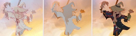
When thinking about this topic,the first ideas that I had was to provide it with dynamism, because scarecrows themselves are very static.I wanted to draw a very frightening scarecrow,but one that wasn’t frightening due to its look, but to the circumstances at that moment.
当思考这个主题的时候,第一个想法,我是为它提供动力, 因为稻草人本身非常安静.我想去画一个非常可怕的稻草人,但这个是不可怕,因为它的外观,而且在这种情况下这个时候。
What usually happens to me is that when I’m drawing a scene,I imagine a situation and I like to think of it as a photograph that captures the characters at the precise moment.With this in mind.I chose to draw a gnawed, worn-out, scarecrow on a somewhat broken piece of wood, pushed into that position due to a gusty wind and scaring the crows that happened to be at it’s feet at that particular moment.I also decided to used a low angle – the point of view of scarecrow came across as much more daunting(Flg.01)
当我画一个场景的时候通常会发生什么,我设想一个环境,我喜欢把它作为一个在确切时间抓拍的图片.记在心里. 我选择画被啃咬的,破旧的,稻草人在一块有点破的木头上,在风的带动下吓唬正好出现在它脚下的乌鸦.我还决定以各底的角度——使稻草人更加让人畏惧(看图 Flg.01 )

Step2
Once I had my idea, I intended to draw it with a pencil,because I like the texture of pencil on paper very much and I wanted to take advantage of the pencil line, and later, colouring it with Photoshop(Flg.o2a).Afterwards,I realise that it seemed dirty and that is why I change to a line made with Flash(Flg.02b).which is clearer.I kept the pencil drawing to use later to give texture.
一旦我有我的想法,我会用铅笔把它画下来,因为我喜欢铅笔在纸上画的纹理,我非常希望利用铅笔线,然后,用Photoshop 给它上色( 看图o2a ) 。此后,我意识到,它看起来是脏的,这就是为什么我用flash改变线(看图.02b ) 。这样更清楚,我一直使用铅笔然后再去上材质。

The next stage was to paint the backgroud .My first intention was to show a nocturnal scene,with the scarecrow as a fierce aspect against the moonlight.But then I realised that crows don’t go out at night, and so I tried the same lighting with a sunset instead.I think it was the better choice because this way the darkness of the scarecrow stands out in the calm and light of the sunset(Flg.03)
下一阶段是画背景。我的第一个目的是要表明,夜间背景,做一个背对月光凶狠的稻草人.但另一方面我意识到,乌鸦在晚上不出门,所以我试图用日落代替.由于漆黑的稻草人站立在亮而平静的傍晚,我认为这是更好的选择(看图.03 )
What has had the most profound impact on the people who have seen this drawing has been the background because it seems to be a watercolour.To achieve this,I chose a granulated brush with 30% opacity,and wet edges to provide different textures , and then, with the smudge tool.I blurred the areas I liked.Overlapping several layers I got a great variety of colours and a gentle shift of shades from the sky to the clouds. I always use soft brushes for large, blurred surfaces, and keep the hard ones to polish up final details and more definite areas.
对在这样环境下看到这样的画的人是多大的冲击阿,因为它像一幅水彩画.实现这一目标,我选择了颗粒状笔刷30 %透明度,和湿边缘提供不同的纹理,然后,用涂抹工具.我模糊了我想模糊的区域.重叠几层我得到了不同类型的色彩和柔和的色调变化从天空到云层。我总是用 大号软笔刷,模糊表面,并用硬笔刷改善最后的细节和更明确的领域。
It can be noticed in the picture that at the beginning the colour was paler, and to boost it I added a gradient from orange to a purplish shade and applied a focus light layer superposition(this layer mode provides very nice colours for the backgrounds).
图中可以发现开始的颜色是苍白的,去改善它,我加了从橙色到紫色色调的渐变和应用的重点叠加光层(这里我不太明白是什么意思)(这一层模式提供了很好的背景颜色) 。

Step 4
For the figure of the scarecrow I took advantage of the gaps created by the Flash line to paint by areas. I first applied a background colour and later added details to define
volumes (the check shirt, lighting, the various planes of the character).What seemed most important to me was to give the drawing good lighting,so once the colours had been selected.I took up defining light and shadows areas(Flg.04)
对于稻草人的体态我利用所造成的差距的Flash线画的地区。我第一次采用了背景颜色,后来补充细节,以确定体积(检查衬衫,明暗,各方面特征) 。一旦颜色已经选定,对我最重要的就是给与画良好的照明。我继续定义灯光和阴影区( Flg.04 )

Step5
Once all the details of the drawing were finished,I realised that closest and farthest
planes had yet to be marked out. I wanted to take advantage of the lighting of the sky coming up from the horizon, to create a beam and give the arm a different, less saturated, shade and thus detaching it from the body(Flg.o5)
一旦画的细节被绘制完成后,我才发觉最进的和最远的还没有得到明显的区分。我想利用即将从地平线上来的天光,创建一个光束,并给予不同的手臂,减低饱和度,遮荫,从而将它从身体分离出来了( 看图.o5 )

Step6
To finish the drawing, I polished some light and shining details, defined dark areas to give it more contrast, added some blades of grass to obtain more dynamism and added some parts such as the barn and the straw, which helped to give me the sense of depth I wanted to reach(Flg.06)
完成这幅画,我加了一些光辉的细节,界定暗区,给它更多的对比,增加了一些叶片获得更多的活力和增加了一些部件如谷仓和稻草,这有助于给我我想要的效果。
Finally, I would like to thank everyone who voted for me in this contest and I hope to be able to go on taking part and learning from everyone else out there.See you!
最后,我要感谢这次比赛给我投票的人,我希望可以继续参加,也要向其他人学习.再见!


推荐相关中文教程

场景美术绘画进阶教程 光影渲染篇
本教程作为场景概念设计绘画方面的进阶教程,着重讲解了如何应用自定义的Photoshop笔刷和素材,讲解照明与场景绘画的关系,光线的反射定律,场景构图的固定模式,如何使用进行概念设计的创意思路方法,以及使用案例来讲解如何按照游戏项目的需求完成一个场景的绘画过程。电影MATTER PAINTING基础实战案例教学
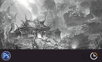
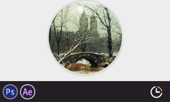
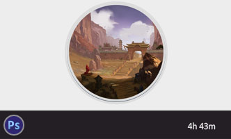
马良老师将通过一个精美的实例,来教你如何使用Photoshop结合After Effects软件完成动态Matter Painting场景的制作,从而带你踏入专业MP行业的大门。场景概念设计实战教学之玉门关场景绘制
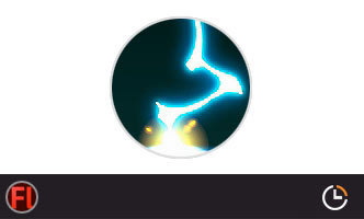
本教学将通过一个从零开始的玉门关场景绘制案例,带你了解如何进行场景概念设计。手绘游戏特效制作实用案例教程 闪电篇
本套教学使用具体的案例,演示了多个闪电类手绘特效的绘制流程,专门针对手游,2D游戏,手绘影视动画的液体特效制作需求设计.场景美术绘画基础教程 中国建筑篇
场景绘画和设计是漫画绘画,游戏设计生产环节中不可或缺的一环,本教学将从最基础的原理开始,教授用户如何理解和学习场景绘画,如果把握场景绘制的设计技巧,讲解场景如何控制透视,从基础的几何体开始学习空间的管理和建筑的摆放。人物角色表情表现绘画教程
本套教程从人类基础的简单表情入手,讲解不同种类的笑容,焦虑,生气,愤怒,咀嚼,吃惊,惊恐,沮丧,哭泣等等不同的表情是如何表现的,帮助学习者能够通过夸张生动的表情变化理解人类丰富的表情绘画所能传达出来的含义。构图绘画完全教学
本套课程的内容重点是学习绘画艺术的构图规律和方法。在绘画学习过程中,构图是一个重要的组成部分,学习它对于提高绘画练习和创作水平有显著的促进作用。特指纯艺和插画,海报。艺用人体解剖实用教学 下集 四肢篇
本套“四肢篇”教学是王九斤老师的《艺用人体解剖使用教学》系列教程中的下集部分,主要讲解了四肢的结构绘画要点,以及部分人体动态的基础讲解。

推荐课程


推荐教程
0回复如何用ps绘制稻草人1"