

原文链接:http://forums.cgsociety.org/showthre…_source=cgtalk
作者信息:
Michael Duffy
Blog + Website = www.mduffor.com
翻译:StoneBird(aboutcg.net)转载请注明出处。
关于译者:

Ten Things to Make Your Renders Suck Less
十个要点让你的渲染不那么扯淡(译注:本质还是扯淡的?囧……)
1) Motivate your lights – As much as possible, every light in your scene should have a logical source to it. Is your key light coming from a lamp? a window? the sun? Sure you’ll wind up cheating the position and intensity of lights a bit for a better look, but try to keep them logically consistent
1、合理布置灯光。越合理越好,场景中每个灯光都应该能代表现实中一个合理的光源。主光源代表一盏灯?一扇窗的透射?还是太阳?当然你或许会在灯光位置和强度上添加一点不合理性,以便得到更好的效果。但无论如何,要尽量保证这种性质在逻辑上是连贯的。
2) Don’t be afraid of the dark – Too much CG is over-lit (high key lighting). Let parts of the scene be under-lit, or drop into near black. You still want some shape in your dark areas/shadows, but it can be just the suggestion of forms. If you know an area will always be in near darkness, this is also an opportunity to save some time an not model/texture everything in this area to a detailed level.
2、不要惧怕黑暗。太多的 CG 作品主光源都爆掉了。试着让场景的一部分得不到足够的光照,或干脆让之接近黑色。但暗处依然需要表现出一些轮廓才行,只是为了表现那里还有东西。如果你认为某个区域始终是在暗处的,你就可以在建模的时候少一点细节,节省一些时间。
3) Dark scenes do not mean under-exposed scenes – If you have a night-time scene or a dark interior scene, don’t just turn down the intensity of all the lights and call it a day. Drop the intensity of your fill, and even cool your fills off with a blue tint, but keep some elements of your scene properly lit. A character that is lit from the side (or slightly from behind) with a full intensity key and then darker fills will look better than a character that is more front lit but with the key turned way down in intensity
3、黑暗的场景不等于昏暗的场景。如果你渲染一张夜景或是昏暗的室内场景,别只把灯光强度调小就完事儿了。降低填充光强度,甚至加一层蓝色给它降温,这都行。但别忘了给场景中某些元素足够的光照。用100%光照强度的主光源从侧面照一个角色(或者从后方微微透出来光亮),然后用较深的填充光填充整个躯体。这样做要比正面打弱光效果好得多。
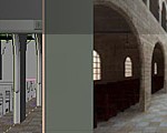
4) Depth of Field – We are used to looking at images taken by a camera, and camera lenses are unable to keep everything in focus at once. Items that are too near or too far from the focal point have softer focus. This can be done in 3D (slow to calculate) or 2D (faster, but with more artifacts that have to be worked around). Also remember that you need to use a circle/bokeh blur, not a gaussian blur if you are doing this in comp.
4、使用景深。我们习惯于看相机照出来的相片,而相机每次是不能将所有东西抓到焦距之内的。离焦点太近或太远的物体会更模糊。景深效果可以用3D(较慢)或2D(较快,但更假,得花更多功夫修改)来实现。别忘了要用散景模糊,而不是高斯模糊。(译注:关于散景,Bokeh,可参考这里)
5) Keep your light sets separate – In real life, you often have to light your actors/subjects with at least some of the same lights that light your environment. But as a result you wind up having to set up all sorts of flags, diffusers, barn doors, scrims, etc. in order to keep the light at one intensity for one object in frame, and another intensity for other objects in the frame. If you separate out your environment and your subject where possible and light them with different sets of light, then you have more control over the lighting of each element. Each of your characters can be lit with their own set of lights as well. Most CG films I’ve worked on have a set of lights (key, fill, a couple of rim lights) for each character, and these lights are constrained to the center of gravity/placer of the character and move with that character (but don’t rotate.. they stay aligned to world space). This gives you a lot of control over each character’s lighting, and you can adjust one character without affecting the others. Also by rendering characters separately, you save a lot of time when you are tweaking lights. Then the characters are put together in the compositing program to create the final image.
5、将你的灯光设置分开。平时,人们一般会用一组同样的光源去照场景中的一堆人物/物体。但用这种方法,你必须为每一个灯光设置好种类,色散强度,照射目标,遮光幕什么的,才能保证每帧打到每个物体的灯光性质统一。如果你把整个场景(和各种物体,如果可能的话)分开,对它们分别设置光照,你就能对每个元素的光照有更好的把握。每个角色接受的光照都来自于单独为它配置的光源。我参与制作的 CG 电影中,每个角色都有独有的光照设置(主光,填充光,和一些背光)。这些光被限制朝向角色的重要部分,并且和角色一起移动(但不旋转,它们相对全局坐标保持朝向一致)。这样你就能更好控制每个角色的打光,调整其中一个也不会影响到另一个。而且,分开渲染也让你剩下不少调整灯光的时间。之后用合成软件把它们合起来就行了。
6) Learn to use a compositor – Whether you are using Photoshop/Gimp for still images or Nuke/Shake/After Effects for image sequences, you should learn to use a compositing program. It is much faster to make color corrections, blur edges, fix render artifacts, adjust fog/atmosphere/fx-levels, adjust reflection amounts, etc. in 2D rather than tweaking settings in your 3D package and re-rendering. The faster you can turn around and see the results of a change/tweak, the more interations you can perform in a given amount of time. The more iterations you can pull off, the better you can make your art. This also ties into the above suggestion that you render layers separately so that a tweak that affects one element doesn’t require re-rendering them all. Don’t get caught up in trying to get perfect renders out of your 3D package. Get useable layers out of your 3D package, your 2D package, your particle engine, etc, and then blend them together in your compositor.
6、学习使用合成软件。无论你是用 PS/Gimp 处理静帧,还是用 Nuke/Shake/AE 处理图像序列,你都应该会一个合成软件。在2D环境中,调色、模糊边、调整环境雾和特效、调整反光、各种修图都要比在3D软件中直接修改再一遍遍渲染要快得多。越快地得到每一步调整的结果,意味着你能在有限的时间内同你的作品进行更多的互动。互动的越多,你的作品就越好。(译注:作者用 interation 这个词,即,不是调整的越多越好,而是调整得越到位越好。互动越多就能越到位。)我建议你进行分层渲染,这样就不用为了调整其中一个元素而重新渲染一遍。别为了得到完美的渲染效果而在3D软件里大花时间。从3D、2D和粒子引擎这些软件中提取有用的层,然后在合成软件里编辑,混合起来。
7) Linear Workflow – As others have mentioned, linear workflow is very important when you want lighting that you can control. Others have covered the how and the why of this elsewhere, so I’ll only mention it here.
7、线性工作流程。就像其他人提到的,线性工作流程在更好控制光照上很重要。另一些人也提到为什么和如何采用线性流程。我就是在这里提一下。
8) Composition – Likewise, I’ll echo the sentiments of others and stress that image composition is very important. Make the meaning of your image clear. Light and compose to focus on your subject matter. Remove distractions from elsewhere in your frame. Especially if you have moving images, and your audience can only focus on the image for the few seconds (or fraction of a second) that it is on-screen, you want to focus attention and remove distractions so that your intended message comes across.
8、合成。我同其他人的看法相同,并想再强调一次,后期合成真的很重要。让你的作品主题明确。把灯光和调整工作的重心放到主体上。去掉那些分散注意力的东西。特别是当你有一段动画的时候,观众只会把注意力放在屏幕上那么几秒钟(甚至更少)而已。你必须让他们集中注意力,去掉那些杂七杂八的东西。这样你的思想才能得到表达。
9) Calibrate your Monitor – If you have access to colorometers that can be used to adjust the color levels, brightness, and contrast of your monitor, then do it. Otherwise there are test images and procedures out there (Google is your friend), that will help you at least get your monitor somewhat close to calibrated. I’ve run across several renders that were too dark, and the reason turned out to be that the artist had the brightness on their monitor cranked soo high that they were able to see the image, but it was way too dark for everyone else.
9、校准你的显示器。如果你手边有调色器,你可以用它调整显示器的色阶、亮度和对比度。如果没有,你可以 google 一下,网上到处都是校准用的图和方法。这样至少能让你的显示器接近校准过的状态。我看过几张渲染的太暗的图,原因是原图作者显示器调的太亮了。他们能看见,但是其他人可就不一定了。
10) Atmosphere – One of the things that make CG images look very CG is that their color stays the same across vast distances. In real life (assuming you are on a decent-sized planet’s surface) you view distant objects through a lot of air. This air has color and opacity that blocks/scatters the light moving through it. So if you are looking at objects more than a few meters away, you should add some sort of atmosphere to your render (usually best done in your compositing package). Render out a depth-from-camera pass (z-depth), bring it into your comp package, adjust the values with expand/gamma/curves, multiply it by your fog color, and add it back in on top of your image. This additional atmosphere really helps to sell that your image exists in the world, and gives it a sense of depth.
10、大气。CG 图之所以一眼就被看穿的原因之一就是物体的颜色无论多远都是一样的。在现实生活中,假设你站在正常大小的星球表面,你是隔着一堆空气看远方的物体的。这些气体有颜色,有不透明度,会阻挡和打散在其内传播的光。所以如果你的物体是几米开外的,最好加一些大气的效果进去(一般在合成软件里实现是最好的方法)。渲染一张 Z-Depth 的通道,放到合成软件里,用扩展、gamma、曲线工具调整,添加上雾颜色的乘数,然后放到图像的最上层。这一层额外的大气可以显著增加作品的可信度,并且使作品产生深度感。
There, hope that helps in a constructive way. ![]()
就是这样,希望这些建议有建设性。
Cheers,
Michael
欢迎到论坛的相关帖子讨论本教学:
http://www.aboutcg.net/showthread.php?t=1028


推荐相关中文教程

《大猿王传》电影级别动画短片系列教学第二部:大猿王贴图篇
学完本套教学以后将能够理解自然界物体贴图的规律,不再局限于照片贴图的投射方式画贴图,能够高效率的完成大分辨率超多UV象限的UDIM模式贴图的绘制,制作出真正电影级别的贴图并且够理解Liner线性工作流程的原理,在工作流程灵活高效的完成贴图以及渲染工作。Maya绑定技术精解教程机器人绑定完全教学
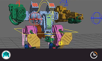
本套教学还会讲解在绑定中如何结合python,大大提高绑定效率,与人物不同,机械类的绑定往往需要联动的效果,并且四足的设置也与人物不同,需要结合多套IK的特性和设置达到最终效果Maya绑定技术精解教程进阶篇角色身体绑定
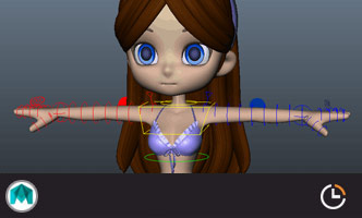
本套教学基于初级人物绑定基础上增加了IKFK拉伸,肘部锁定,IKFK共存,无缝切换等大家迫切想要了解的知识,并结合作者经验,让大家快速掌握这些非常有用的技能。Maya高精度建模全案例实战教程进阶篇
本教程是maya影视建模的实战教程,作者教授了多年的影视模型制作工作经验。使用maya的建模工具完成武器,场景,道具,角色等高精度的多边形模型的建模。这类模型的制作能力在影视制作,游戏制作中,都是必备的。也是所有CG从业者的必须技能。Vray for maya高级案例商业渲染流程教学
本套教程是vray的全案例流程教学,教程使用三个具有代表性的案例演示了vray的渲染参数设置经验和技巧,同时讲解了如何在实际的工作中使用这些参数来进行渲染的优化和质量的平衡。教程的内容从实际工作经验出发,详细的演示了:合理光源的布置原理,多光源合并调节,多通道渲染与合成,多象限UV的设置与渲染等高级技巧。Vray for Maya完全教学
本套教学选择最重要和最常用的核心功能作为讲解对象,所有内容占到了vray for maya全部功能的80%—90%以上。教学的目的是让学员能够加深对vray的理解,熟悉常用的vray渲染技巧,而不仅仅是记几个常用的参数。教学中很多软件原理和技巧应该是首次在vray for maya中文版教学中披露,而这些东西在帮助文档上是没有的,各位学完之后应该会打下较为扎实的软件使用基础。写实女性角色制作全流程高级案例教程
本教程是超高质量的写实角色肖像制作完全流程,教程从基础模型搭建开始,演示了一个写实欧美女性的制作全流程,教程保留了所有技巧的关键节点,全面呈现制作这种写实类型角色的技巧和流程。希望制作写实角色肖像的用户将从中学习到大量的高级技巧。超写实角色《剑圣》全流程实战教学
本教学将带你进入超写实CG角色的世界,石磊老师通过一个剑圣的角色头部制作,教你完成照片级别角色的完整流程,从此,超写实CG角色不再高不可攀,你也可以做到!


推荐课程


推荐教程
3回复十个要点让你的渲染变得更好"