
台北的画师,介绍了他的作品“刑天”的制作流程。
软件:Photoshop,Maya
aboutcg.net上有另一篇他作品的教程:Lida绘制流程
原文链接:http://features.cgsociety.org/story_…?story_id=5304
作者信息:
Yu Cheng Hong
http://www.yuchenghong.com/
翻译:StoneBird(aboutcg.net)转载请注明出处。
关于译者:

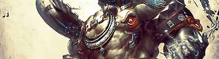
“刑天”的制作流程
My name is Yu Cheng Hong, I was born in Taipei, Taiwan in 1981. I graduated from Shih-Chien University of Communication Design. I studied graphic design, 3D animation and motion graphics in school. Currently I am working as a concept designer in games.
我叫洪于程(译注:在他个人网站介绍里洪字排前面,所以我认为他姓洪),1981年生于台湾的台北,毕业于实践大学传播设计系。在学校里我学习了图像设计,3D动画还有动态图像设计。现在我是一名游戏概念设计师。
Design and Arts takes me lots of my spare time working on personal art. For the next goal, I would push myself to give more emotion and tell more stories in my paintings.
我在 Design and Arts(译注:或许是新西兰一所大学)那里花了大量时间创作个人作品。今后我的目标就是融入更多的感情,让作品讲述更多的故事。
After posting images for years online, Hong was published in EXOTIQUE 2, then EXOTIQUE 4. He now triumphs with ‘Xing Tain’ in a double page spread in EXOTIQUE 5. Stay tuned for the release dates.
在他网上公开作品多年后,洪的作品被EXOTIQUE 2收录,之后又被EXOTIQUE 4收录。现在他带着重量级作品“刑天”出现在EXOTIQUE 5中。{广告语}
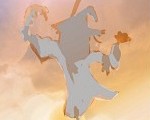
Hi there, I am so very glad to share my process of creating ‘Xing Tain’ work here. This original concept character is come from an ancient Chinese myth. When I read about him in a book, the brave warrior was defeated in battle and had his head cut off by the enemy. But his anger turns his nipples into his eyes. He stands up and continues to fight. He was symbolized as a brave, tough soldier who never gives up and of course, he was a tragic hero.
嗨大家好,我很高兴能同大家分享“刑天”的制作过程。作品的概念来自于中国古老的神话。我在一本书中读到他,他是一名勇敢的战士,打了败仗被敌人砍去了头颅。但是他的愤怒将他的乳*头(译注:行吧我怕河*蟹……)化为眼镜,让他重新站起来去战斗。他是勇敢、坚强、永不放弃的士兵的象征,是一个悲剧英雄。
I thought the description was incredible, interesting, and I started to do more research on the Web, trying to gather enough information to represent this character in a painting.
我觉得这故事有趣而且不可思议,所以上网又找了一些资料,为我的作品做充足准备。
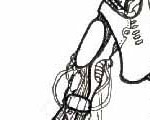
CONCEPT / SKETCHES 概念及草稿

I googled this image from the web, (and actually found the character which I thought I looked almost cute and really interesting.)
我 google 了一下找到上面这张图,觉得他好可爱啊~(译注:)
I also collected some reference that could be used. I imagined that this character didn’t have too much complex armor, and the armor shape could be simple while still looking sharp. I thought the steel riveted suit would look good for armor too.
我还收集了一些素材(下图)。我觉得这个角色没有穿重型铠甲,而且铠甲的外形应该简单但不失锋利。加上一点钢钉的元素应该会有不错的效果。

His skin looks solid. He doesn’t look too much like a boxer. Here is roughly what ‘Xing Tain’ should begin to look like.
他的皮肤很结实,不怎么像拳击手。下面是张草稿。

COLOR BLOCKING 锁色(译注:这个词不会翻译……各位看下文意会吧)
I put the sketch layer on the top set in a Multiply mode. And then set a light top down on 45 degrees in the right place. I started the Black and white values first. It’s easy for me to determine where the lighting and shadows will be placed. Sometime though, I didn’t use the Brush tool in this step. Almost the only tool I used were the Burn tool and the Dodge tool to bring the shape, light and shadows. Then I used the variety Brush tool to detail the texture and stroke.
我把草稿层放到最上面,设置成 Multiply 混合模式。之后在右上角设置了斜下45度的光照。我先从黑白开始,很容易就搞定高光和阴影的位置。这步我并不怎么用笔刷,而是用加深和减淡工具涂抹外形、高光和阴影。之后我用不同的笔刷为材质和纹理添加细节。

SKIN BRUSH 皮肤笔刷
Here is the skin brush I downloaded from the talented Chinese artist Yang Xue Guo. He has a CGSociety feature here.
The ‘Blur’s Good Brush’ you could download his brushes at the link at the end of the tutorial.
这是我从老有才的中国艺术家杨雪果那里弄到的笔刷,CGSociety上有他的一篇文章,点这里。你可以在这教程末尾下载他的“Blur’s Good Brush”笔刷组。

I used these three brushes overlaying each other, then it come out as a subtle noise like skin.
我用这三个笔刷在 Overlay 模式下一层套一层地刷,得到皮肤似的细微噪点。
B/W TO COLOR 上色
Once I satisfied the black and white figure, I play the color balance, selective color and replace color tool to turn the B/W to the color I like.
等调整好黑白像,我用色彩平衡、拾色器和换色器给作品上色。


BACK TO 3D 进入3D环境
I opened Maya to build the horn and wristband. It is easier and efficient to get the right perspective
我用 Maya 制作他的长角和护腕,很快就得到了我想要的透视效果。


THE EXPRESSION 作品感情的表达
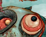
As well as feeling the emotion from the pose, the most important key is from the character’s eye. I emphasize the eyes expression, I want to make his eyes feel more anger and make them bigger.
虽然角色的姿势能传达感情,但眼睛更为重要。我着重绘制眼部,让他的眼睛睁大,表现更多的愤怒。
I also chose a red color (the highest saturation in the whole image) for the eye makeup. This is to attract the audience directly to his eyes first!!
我选择红色(全图饱和度最高的颜色)为眼睛上妆。这样做是为了第一时间用角色的眼睛抓住观众的眼睛!


石头、骨骼、金属笔刷

THE HAND MAGIC LIGHTING 手上的魔法环
I chose the Magic Brush in the FX Brush category, to create the lighting effect that surrounds his hands. I duplicated the layer a couple times and turn the upper layer into Linear Dodge or Color Dodge mode. That way, I can get the bright lighting effects like the image below
我选择特效笔刷分类下的魔法笔刷,来制造手上的光环效果。我复制了几次这层,把最上面的层混合模式改为 Linear Dodge 或者 Color Dodge。这样就得到下图的效果。


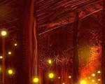
THE BACKGROUND 背景
Here I did two background color palettes. One with a brighter background and one darker background. Now I have to choose what is the best way to let people read the character. I stand back away from the screen to watch this two images. In both mages I can see the eye but when I narrow my eyes, the dark background one is hard to see the whole figure and pose, and the hand magic light gets more contrast compared with his eyes. That is not my wish. So I choose the brighter background image for the final composition.
我画了两种不同颜色的背景,一种背景颜色更亮,另一种更暗。我得二选一,以便能帮助读者读懂这个角色。我远离屏幕看了看这两张图,都能看到角色的眼睛。但我仔细看的时候发现暗色背景把角色身形和姿势藏起来了,手上的魔法环对比度也太强了。这可不是我想要的效果,所以我选择了亮一点的背景。


I wanted to accentuate the abstract shape on the background. I used two brushs to make the basic abstract shapes, then used the Wrap tool to change to another shape. The Smudge tool was used here to break out the shape and create spatter shapes ( All these brushes you can find in ‘Blur’s Good Brush’ as mentioned above.)
我想强调一下背景抽象图形的画法。我用两种笔刷绘制基本的图形,之后用包裹工具改变其形状。用涂抹工具打乱外形,制造泼洒的效果。(这些笔刷都可以从之前提到的“Blur’s Good Brush”笔刷组中找到)

FINAL COMPOSITION 最终合成
I add more blue Flow Effects to enhance the armor, to create a little more excitement in the image. I also employ the Color Balance tool to correct the color palette. I give it more contract between warm (bright value) and cold (dark value).
我为铠甲应用更多蓝色流线效果,加强作品视觉。我还用色彩平衡工具调整整体颜色,增加冷暖色调的对比度。
And finally it done!!
搞定!

译注:笔刷组下载
http://features.cgsociety.org/storie…20pro%20en.rar
译注:作者靓照一枚


推荐相关中文教程

电影MATTER PAINTING基础实战案例教学
马良老师将通过一个精美的实例,来教你如何使用Photoshop结合After Effects软件完成动态Matter Painting场景的制作,从而带你踏入专业MP行业的大门。构图绘画完全教学
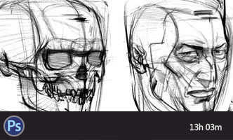
本套课程的内容重点是学习绘画艺术的构图规律和方法。在绘画学习过程中,构图是一个重要的组成部分,学习它对于提高绘画练习和创作水平有显著的促进作用。特指纯艺和插画,海报。艺用人体解剖实用教学 下集 四肢篇
本套“四肢篇”教学是王九斤老师的《艺用人体解剖使用教学》系列教程中的下集部分,主要讲解了四肢的结构绘画要点,以及部分人体动态的基础讲解。艺用人体解剖实用教学 上集 躯干篇
本套“躯干篇”教学是王九斤老师的《艺用人体解剖使用教学》系列教程中的上集部分,主要讲解了躯干的结构绘画要点,以及部分人体动态的基础讲解。

推荐课程


推荐教程
3回复“刑天”的制作流程"