
本教学为翻译教学,转载请注明来自aboutcg.net,以及注明翻译者
原教学出自cgarene网站,原始链接如下:http://www.cgarena.com/freestuff/tutorials/photoshop/transformer/index.html
作者:Alon Chou(台湾)
网站:www.alon.tw
翻译:cwws(www.aboutcg.com)
转载请写明出处和翻译者为cwws,谢谢。

Introduction
简介
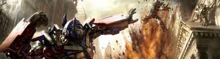
This summer when Transformers hit the big screen, it soon raised up the heat in theaters all over the world. I even went to see the film again particularly for this artwork, in order to get a more vivid feel of the scene, as well as searching for ideas. It is very crucial for a creator to foresee the image in his own mind, and knowing if it would make a good artwork or not. I want to create a scene filled with tension and drama, just like a still photographs from the film.
这个夏天变形金刚们冲击着大屏幕,它快速在全世界的剧场掀起热浪,为了获得一种更鲜活的场景感受,我甚至为了 这幅作品专门去再看了一次电影,同时也为了寻找创意。对于一个艺术家来说,在脑子里有事先想好的图景至关重要,这可以决定作品的成败,我希望创建一个充满 戏剧性与紧张感的场景,就像电影里的静帧照片。
Concepts
概念
Design the Movement – By starting to plan the work, I wanted to bring out the tension and conflict as priority, which led me to an explosive dueling scene that would draw audiences into the work. It troubled me a lot when deciding the duel should happen during daytime or nighttime. In the end I picked daytime which can have a strong contrast and variation of lights as my background. First I started a sketch, designing actions.
设计动作-在开始计划作品的阶段,我希望优先表现出紧张与冲突,这让我想到一个激烈的决斗场面将会吸引观众的 注意力,但决斗究竟是在白天还是在夜晚发生让我颇费思量,最后我选择的白天场景,因为这能包含强烈的对比度与充满变化的灯光作为我的背景,首先我开始画草 图,设计动作。

Because the first design of poses were not very good, I decided to redesign the composition and drafted the sketch of the surrounding building. At this moment I begin to think of where is the source of lighting.
由于初次的姿态设计不尽如人意,我决定重新设计构图,并速写了周边的建筑物,这一刻我开始考虑周边的灯光该是怎样的。

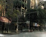
Architectures – I redesign the poses, as well as polished buildings. Even though Transformers were based on science fiction and they came from outer space, the story happened on Earth. So I wanted to bring in architectures that have a traditional feeling, something like a museum, in order to emphasize the contrast between high tech machines and classical images.
建筑-我重新设计了角色姿势,同样优化了建筑,即使变形金刚是科幻小说而他们来自外太空,但故事还是在地球发生的。因此我希望导入建筑物以获得一种传统的感觉,比如一个博物馆,这是为了增加高科技机器与传统图景的对比。

Dramatic Element – In the film, Megatron is pictured as the destroyer, and Optimus Prime as the protector. Therefore, if Optimus Prime is placed closer to the camera defense the attack, it would create the feeling of “being protected” for the audiences.
戏剧性元素-在电影中,危震天被描绘为毁灭者,而擎天柱则是守护者,因此,如果将擎天柱放在摄像机近端抵御攻击,那会给观众造成一种“被保护”的感觉。
I was imagining: Megatron dashes out from the explosion, lunging at Optimus Prime with a crackdown. Optimus Prime is prepared for the attack; he raises his fist, slides forwards causing the ground with burning flakes, ready to give Megatron a death blow. The aim of this composition is to create a complete frame filled with drama and action.
我想像着:威震天从爆炸中猛冲出来,对擎天柱实施压迫性打击,擎天柱则对攻击做好了准备,他抬起他的拳头,朝前滑行,导致地面扬起燃烧的尘土,准备给威震天致命一击。整个构图试图充满戏剧性与动态。
Composition
构图
To enhance the tension of the scene, I chose a radial composition that was similar to the basic perspective. The whole composition would look like an explosion itself, or an extending radiation
为强调场景的张力,我选择了一个放射状的构图,它与基本的透视吻合,整个构图看上去就像是一场爆炸本身,或是一种扩展中的辐射。

Painting and Progression
绘画与进程
On color-wise, it took me a long time to consider the color of the sky, and it also went through a lot of changes. Originally it was sky blue. However after many adjustments, the color of the sky is now closer to yellow, which makes the whole tone of the picture more unified.
单色方式,这花去了我许多时间来定义天空的颜色,并经历了许多的变化。基本上是蓝天,然而在经过许多次调整之后,天空的颜色更接近于黄色,从而使整个画面的色调更加统一。
Coloring – First I polished up the sketch a little bit, and change the position of Megatron from lower place to the higher, that’s for strengthen the feeling of crackdown in the composition.
上色-首先我对素描稿做了细化,改变了威震天的方位,将它放得更高,这加强了整个构图的压迫感。

Then painted on the base color with brush under brush mode “color”. This was to create the basic tone of the color.
然后使用基本画笔工具上色,并应用“color”(上色)画笔模式,这将给素描覆盖上颜色。

Then detailing OPTIMUS PRIME preliminary, and pay attention to the reflection of the flake, it should be strengthen.
再然后细化擎天柱,注意火花的反射刻画,它应该被增强些。

Altering the Arms – Since the pose was designed by me, it was a difficult job to make sure Prime’s parts were true to his original design. I did a lot of researches through Internet; some were public still photographs from the film, and some were character designs for propaganda use. But these sources were all done in various stages, so there were a lot of differences. For instance, Prime’s head and arms already had many different versions; I had to pick the most suitable one that would look good from the angle I designed, and of course added up some imaginations. So Prime’s arm went through many adjustments before it was completed..
改变手臂-因为擎天柱的姿势是我设计的,要确保主要部分与它的原始设计相匹配时间很难的事情。我在互联网上做 了很多搜索,找了一些公开的电影剧照,和一些宣传用的角色设计图片,但是这些资源都是在不同场合完成的,因此他们也各有差异,比如,擎天柱的头与手臂就有 许多不同版本,我必须选择最合适的版本,从我设计的角色姿势的角度看上去效果好,当然还加了一些想象的成分,因此擎天柱的手臂在完成之前经历了许许多多的 调整。

Adding the Flake – Then I worked on the flakes under Prime’s feet – be sure to pay attention to the reflection on the feet, and make it like spurting in a high-speed.
添加火花-然后我开始绘制擎天柱脚下飞溅的火花-确保关注脚上的反射表现,看上去是在高速喷射什么。

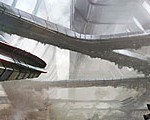
Making of the Architectures – When drawing the buildings on the right side, it has to be notice the perspective, the farther the smaller. About the small square under temple roof, I draw a oblong then erased the Interval, then I made a column head and copy it, the column is made by the same way. Then I increased the brightness and contrast of the building, in order to enhance the lightness.
建筑物的制作-当绘制右边的建筑物时,你必须要注意透视,在教堂屋顶下的小方块要越远越小,我用一个椭圆笔刷擦去间隔,然后我制作了一个廊柱头,并复制它,整个圆柱使用类似的方法完成,然后我提高了建筑物的亮度与对比度,为了增强整体的轻盈感觉。

The leftest image is only the basic sketch of the building in higher right corner for me, then I use the Polygonal Lasso Tool to lasso the area of the pillar, then I copy many of that and polish the details, the architecture is almost finished.
最左边的图像仅仅是右上角建筑的简单素描,然后我使用索套选择工具,选择了梁柱区域,并大量复制来获得细节,这样建筑基本上就完成了。

Explosion – After all the other buildings were basically done
爆炸-当所有其他建筑基本完成之后。


I painted the explosion, and added the reflects of the flame onto the car in lower right corner. The buildings in the far background and the sky were also dyed with color of the flame
我开始绘制爆炸,在右下角的车上,远处的建筑物上添加火焰的反射,天空也被火焰染上相关的颜色。

To Add Texture – To add more texture to the picture, I added many brush strokes, more like a foggy or dusty kind of stroke. This thickened the feeling of battle flied, also made the perspective more distant.
添加纹理-为了给图像添加更多纹理,我增加了许多笔触,类似于烟雾朦胧或者灰尘类的笔触,这增强了战场的感觉,也让透视更有距离感,


This is the brush made by myself.
这是我自制的笔刷。

Composition Adjustment – The center of attention should be more in the middle of the picture, so I moved Prime and Megatron a little to the right.
构图调整-视觉焦点需要更趋向于画面正中,因此我将擎天柱与威震天往右移了一点。

Problem Solving for Optimus Prime
解决擎天柱的问题。
The biggest problem I came across with Optimus Prime was handling his appearance and comparing my design to the originals. I took two pictures for comparison, the left one was before and the right one was after. Originally Prime was not as eye catching as I wanted him to be, and that really bothered me. Except moving him closer to the middle, there were a lot more problems needed to be solved:
创建擎天柱时最大的问题就是处理他的外观并与原始设计作比较,我制作了两张图来比较,左边这张是之前设计的,右边是之后的,原始的擎天柱不像我期望的那样吸引眼球,除了把它移到接近画面中间的位置之外,还有许多问题需要解决。

he Look – First was the look. Prime’s outline was definitely the key point, it would determine whether he looks like Prime or not. His waist and thigh on the left side are thicker. His broad shoulders thin waist, the curves of his thigh, these are also need to be indicated. His ears seemed a little short, so in the right picture I did some adjustments, which became closer to the original design.
外观-首先是外观,擎天柱的外轮廓刻画是关键点,这将决定他看起来是否像擎天柱,他的腰与左边的大腿有点粗,他宽阔的肩膀,细腰以及大腿的曲线都需要考虑,他的耳朵看上去有些短,因此在右边的图片我做了一些调整,更接近近于原始设计。
The Lighting – Secondly was the design of light and shadow, the shadow has to effectively push the main character out from the background. I purposely painted a white highlight on Prime’s left side, not only giving him a more 3-dimensional look, but also adding the metal tone to it. Also pay attention to the reflection under the feet, which is another key point. The head was too dark before, so I increased the brightness, also brought in the light of the flame from explosion to add more contrast, making his head more noticeable. The glass on Prime’s chest should have a more brighter reflect, and I emphasized the contrast more on the chest, giving it a better
perspective.
灯光-第二幅画面着重设计了灯光和阴影,阴影有效地从背景中突出了主要角色,我特意在擎天柱左边画了一道白色的高光,不仅给了他更三维的外观,还添加了金属感。另外也请注意脚下的反射,是另一个关键点,之前设计中,头部太暗了,因此我提升了亮度,还添加了爆炸中火焰的光以增强对比,让他的头部更引人注目,擎天柱胸部玻璃应该有更明亮的反射,我在他的胸部更加强调了对比度,给他更好的立体感。
The Flame Tattoo – On the flame tattoo part, the character designs for propaganda use was different from the public still photographs from the film, and even the designs of the tattoo were not always the same. In the film Prime has the tattoo on his arm, but on the poster he doesn’t. Some flame tattoos have white outlines and some don’t, so I picked the one with white outline to make the picture more interesting.
火焰纹身-在火焰纹身部分,电影宣传部分的角色设计与电影剧照里的不同,甚至火焰纹身的设计也总是不一样的,在电影里擎天柱的手臂上有火焰图案,但在海报里却没有,一些火焰纹身有白色外轮廓,而一些没有,因此我选择了有白色外轮廓的设计,来使画面更有意思。

Polishing up the Details
打磨细节
When working on the details, I used very small brush from the scratches on the metals. Adding stains would also make objects more realistic. And by filling objects with brush strokes would enrich the picture, also catches audiences’ attention. Usually default brushes would be enough for me
当绘制细节时,我使用很小的金属刮痕类的笔刷,添加污渍也让物体更加真实,用各种笔画填充物体能丰富画面,同样也吸引观众的注意力,通常来说,Photoshop的默认笔画对我就足够了。


On the flakes part, except using small brush for the jumping sparks, I would also use brushes that have many tiny dots to give it a spurting feeling in motion.
在火花部分,除了对四溅的火花使用小笔刷之外,我还使用有很多细小点的笔刷来创建一种运动中的溅射感。

Final Adjusment
最终调整
In order to make the scene more tense and stressing, in the end I changed the shape of the explosion, as well as Megatron’s pose. He is now looking more like jetting out of the flames, making him and the explosion more related
为了让场景更紧张与充满魄力,在最后阶段我改变了爆炸的形式,以及威震天的姿势,他现在看起来更凌驾于火焰之上,使它与爆炸看起来更加紧密联系。

I also moved the role on the right side to the right a little, and changed his pose so it would not interrupt audiences’ focus
我还将右侧的角色往右移动一点点,并改变它的姿势,使它不会打搅观众的注意力。

On the lighting and shadow parts, I strengthened the reflect from the flame on the left building, making them both carry the color of the environment, so that the whole tone became more consistent. Comparing to before, the saturation was also brought up more in all. Now it is completed, and thanks you all for viewing.
在光影部分,我增强了左边建筑商火焰的反射,还使它们同时带上环境的颜色,这样整个色调就更加一致了,与之前相比,饱和度也被增强了一些,现在这幅作品完成了,感谢你的观赏。

About the Artist – Alon (阿龍) Chou (Freelancer/ 2D artist, illustrator) graduated from National Taiwan University of Art. Drawing to him is like a single frame of a movie, it is dramatic. In his angle, a drawing should be a complete presentation of plot, the emotion, the atmosphere…etc. and he would like to include all these elements into his drawings, and make it better, this is what he would like to do.
关于艺术家本人- Alon (阿龍) Chou(自由职业/2D艺术家,插画家),从National Taiwan University艺术系毕业,绘画对他来说就像是电影的一帧,非常有戏剧性,在他看来,一幅绘画需要完整的构思,感情,环境….等等,他喜欢将所有这些元素都放入他的作品中,精益求精,是他的一贯追求。
有问题可以参与答疑


推荐相关中文教程

电影MATTER PAINTING基础实战案例教学
马良老师将通过一个精美的实例,来教你如何使用Photoshop结合After Effects软件完成动态Matter Painting场景的制作,从而带你踏入专业MP行业的大门。构图绘画完全教学
本套课程的内容重点是学习绘画艺术的构图规律和方法。在绘画学习过程中,构图是一个重要的组成部分,学习它对于提高绘画练习和创作水平有显著的促进作用。特指纯艺和插画,海报。艺用人体解剖实用教学 下集 四肢篇
本套“四肢篇”教学是王九斤老师的《艺用人体解剖使用教学》系列教程中的下集部分,主要讲解了四肢的结构绘画要点,以及部分人体动态的基础讲解。艺用人体解剖实用教学 上集 躯干篇
本套“躯干篇”教学是王九斤老师的《艺用人体解剖使用教学》系列教程中的上集部分,主要讲解了躯干的结构绘画要点,以及部分人体动态的基础讲解。

推荐课程


推荐教程
0回复变形金刚的绘制流程"