
本教学为翻译教学,转载请注明来自aboutcg.net,以及注明翻译者
原教学出自Vector Tut Plus网站,原始链接如下:
http://vector.tutsplus.com/tutorials/text-effects/create-colorful-layered-paper-type-in-illustrator/
Author: Diana Berg
My name is Diana Berg, I am a graphic designer from Donetsk, Ukraine. I work as an
illustrator at my brother’s web studio, and I’m also a design teacher at the IT academy. I sincerely believe that good design and creativity will make the world a better place.
作者:戴安娜伯格
我的名字是戴安娜伯格,我是一名来自乌克兰顿涅茨克平面设计师。我是一名插画师在我哥哥的网络工作室,我也是IT设计学院教师。我真诚地相信,良好的设计和创造性,使世界变得更美好。
翻译:雏田 (www.aboutcg.com)
关于译者:

请尊重互联网道德,转载请注明转载出处和翻译者,谢谢!
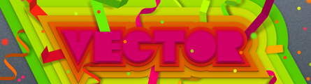
Create Colorful, Layered Paper Type in Illustrator
在Illustrator中创建多彩,分层纸张字体

In winter, here in the Ukraine it’s rather cold and snowy, I oftentimes find myself creating colorful illustrations that compensate for the cold weather. Today I will show you how to brighten your mood by creating vivid illustrations with layered paper text and ribbons. We’ll create custom type and use Illustrator effects extensively to optimize our work.
在冬季,在这里,在乌克兰是比较寒冷和多雪,我通常情况发现自己创造丰富多彩的插图弥补了寒冷天气。今天,我将告诉你如何通过建立明亮层次纸彩带生动的文字和插图你的情绪。我们将创建自定义字体和使用Illustrator中的特效,以优化我们的工作。
Introduction
Today we will create a multi-layered effect of custom type. We’ll also learn a few of the easiest ways of making ribbons and folded paper. We’ll be using Pathfinder, Illustrator effects and graphic styles extensively – this way we optimize our work and avoid routine with plenty of repeating elements. Also we’ll utilize the transparency panel and symbols to add detail, and more importantly, we’ll learn how to avoid productivity issues when dealing with multiple effects.
导言
今天,我们将建立一个多层次的自定义字体的特效。我们也将学习制作丝带,使纸张折叠几个最简单的方法。我们将使用路径查找工具,插图和图形样式的影响广泛 -这样,我们优化我们的工作,并避免大量的重复元素常规。此外,我们将利用面板的透明度和符号添加细节,更重要的是,当我们处理多种效果时,我们将学习如何避免生产力的问题。
Step 1 – Creating Custom Lettering
Open Illustrator and create a new document 1000 pixels by 600 pixels. Let’s create a background first – draw a rectangle (M) covering your canvas, fill it with a vertical, linear grayish-blue gradient that goes from lighter hue (#808A96) to a darker shade(#454C54). We’ll cover it with texture later on, but as long as every effect applied reduces the program productivity, we’ll leave it for final touches. Lock this layer for now and rename it to “BG.”
第1步-创建自定义字母
打开Illustrator和创建一个新文件1000像素*600像素。首先让我们创建一个背景-绘制一个矩形(M),覆盖画布,填充垂直,线性灰蓝色的渐变,从较轻的色调(#808A96)到一个暗的阴影(#454C54)。我们将它覆盖纹理稍后,但只要每一个被应用的影响降低应用程序的效率,我们将留它到最后。锁现在这一层,并命名为“BG”。

Step 2
Create new layer, name it “Type.” Now turn on the grid by going to View > Show Grid. You won’t see the grid with default settings, so you’ll have to either uncheck Grids in Back option in Guides & Grid Preferences (Command + K), or turn off the background layer visibility for a minute. I suggest you do the latter, as it might be not easy to get used to grids on top of all objects.
The grid is not essential for this step, but I find it rather helpful for this process. You
might want to specify your grid settings in Edit > Preferences > Guides & Grid, mine is 100 px with 10 subdivisions. Lastly, you can turn on the Snap to Grid option (View > Snap to Grid) for more precise construction. I chose 90 px for the letter height – so drag two horizontal guides from the rulers (Command + R) that indicate baselines.
When all preparations are made, we can start creating the type. I chose to write “VECTOR” – this word does not only have meaningful sense, but also very nice and simple letter shapes. We’ll create letters that font designers usually love to start their career with – bold, simple, type, which is based on geometric shapes. Create a rectangle (M) 90×90 pixels, copy it 3 times – these are our letters “V,” “E,” “T,” and “R.” Now draw a circle (L) 90×90 px and make one copy – these are our “C” and “O.” Position future letters on the lower guide according to their sequence in the “VECTOR” word, as shown below.
第2步
创建新层,命名为“类型。”现在要打开网格通过视图>显示网格。你在默认设置下不会看到网格,所以你必须在指南的返回选项取消网格或取消参数选项(alt+ K键),或关闭一分钟的背景图层的可见性。我建议你做后者,因为习惯对所有对象上的网格这可能是不容易的。
网格是没有必要这一步,但我觉得这为进程是有帮助的。您可能希望指定您的网格设置在编辑>首选项>参考线和网格,我的是100像素10细分。最后,您可以打开网格对齐选项(视图>对齐到网格)为更准确的建设。我选择的字母高度90像素-所以拖动尺子的两个水平指南(命令+ R)的指示基线。
当所有准备工作被做好,那么我们就可以开始创建字体。我选择写的“VECTOR” -这个词不仅有意义上,也非常好,简单的字母形状。我们将创建字母,字体设计师通常喜欢开始——大胆,简单,字体,它是基于几何形状。创建一个矩形(米)90×90像素,将它复制3次-这是我们信的“V”,“E”,“T”和“R”。现在,画一个圆(长)90×90像素,使一个拷贝-这是我们的“C” 和“O”将来字母位置在较低的指导位置,根据它们在词”VECTOR”中的序列,如下所示。

Step 3
Let’s modify the letters now. First, choose the Direct Selection Tool (A) and select the two bottom points of the first rectangle, now press Command + Alt + J (or right-click and choose Average), select the Vertical option. The letter “V” looks more triangular now.
Now create a rectangle 10 px by 50 px, with any color, and position it over the “V” to form it’s shape. To make sure the rectangle and the letter are aligned, select both figures and click the Horizontal center alignment either on your options panel, or in the Align palette (Shift + F7). If you want to keep the position of a particular figure while aligning (for example I did not want the V-shape to move), click inside it after selecting both shapes – now the other figure will be aligned to it. Now open the Pathfinder panel (Shift + Command + F9) and click the subtract button (but don’t click Expand button yet).
For the next letter “E,” create another small rectangle, this time create it 10px by 60 px. Now make a copy of it and position it exactly 20 px below the original. If Snap to Grid is on, simply Alt + Shift-drag it two gridlines down, or press Enter with the Move Tool chosen (V) and insert 20 px for vertical move and click Copy.
Now select both small shapes and press Command + 8 to make a compound shape – this way we can align figures properly. Position them on the second large rectangle to form an E letter, select both large and compound shapes, now click the big one to assign the alignment object, and align them Vertical center. Again, Subtract in Pathfinder – but don’t expand now.
第3步
让我们现在修改这些字母。首先,选择直接选择工具(A)和选择第一个矩形的底部两个点,现在按Command + ALT键+J(或右键单击并平均选择),选择垂直选项。字母“V”形看起来更三角了。
现在创建一个矩形10像素*50像素,用任何颜色,放置在三角上,形成V的形状。为了确保该矩形和文字对齐,选择这两个数字,然后点击或者在您的选项面板,或在对齐面板水平居中对齐(按Shift + F7键)。如果你想保持一个具体数字的位置,同时调整(如我不想 V -移动),在选择两个形状后点击里面-现在的其他数字点击将被调整。现在打开的路径查找面板(Shift +alt+ F9键),然后按一下按钮,减去(但不要单击扩展按钮)。
在接下来的字母“E”,创建另一个小矩形,这一次创建它10像素*60像素。现在做一个它的副本,位置正好低于原来的20像素。如果对齐网格在,只需按Alt + Shift,是将它拖到了两个网格线上,或按输入用移动工具选择(V),插入20像素垂直移动和单击复制。
现在既选择小的形状有又按ctrl + 8作一个复合形-这样,我们能够正确对齐数字。放置它们在第二大矩形上,形成E字母,选择大和复合形状,现在全选,将它们垂直中心对齐。同样,在路径选择工具中 用减少命令-但现在不执行 扩展命令。
Note: You may want letters to appear more soft, simply replace small rectangles in this and the next step with rounded rectangles that have a small radius and the same measurements.
注意:您可能想字母显示的更柔和,简单地取代这里的小矩形,下一步就用有一个小半径和相同的测量圆角矩形。

Step 4
For the “C” letter, create a rectangle 50 px by 30 px (although feel free to use one with a smaller 10 px width if you like). Again, position it over the second circle, select both shapes, click the large circle and align to vertical center. Press the Subtract button in the Pathfinder.
Now we need two shapes to form the “T” letter – I took a rectangle 40 px by 70 px and made one copy. Now position them to hide the large rectangle parts, so that the letter looks proportional – I made both vertical and horizontal strokes in the “T” letter 30 px. I did not use alignment here as the Snap to Grid option helped me position shapes precisely. Finally, again select all three figures and subtract.
第4步
对于“C”字母,创建一个矩形50 像素*30像素(尽管放心使用更小的10像素宽度如果你喜欢)。同样放置在第二圈上,选择两个形状,单击大圆圈,垂直中心对齐。在路径查找工具里按减法按钮。
现在,我们需要两个形状形成的“T”字母-我做了70像素*40像素的矩形,在做一个副本。现在放置他们隐藏大矩形的局部,因此该字母看起来是成比例的- 我做“T”字母30像素纵向和横向的笔画。我没有使用这里的对齐到网格对齐选项,帮助我准确放置形状。最后,再一次选择所有3个数字并用减法.

Step 5
We have the last two letters left. I was choosing between leaving the “O” letter solid or making a hole in it. Both results look nice, but a solid “O” looks much more harmonious in this particular design, so I decided to keep it intact. Still, if you want to modify it – feel free. Create a square 30 pixels by 30 pixels, position it over the “O” and align them vertically and horizontally. Now, press the Subtract button in the Pathfinder.
For the “R” letter, select the last rectangle and add one anchor point in the middle of its right-vertical side with the Pen Tool (P) – the pen cursor will turn to Add points. Now select the new point along with the upper-right corner point with Direct Selection (A) move the points to the left about 30 pixels. Now create a circle (L) 50 px by 50 px and position it to form the “R” shape – the circle should touch the upper-right figure point with its top point. Now you can combine these to shapes in the Pathfinder panel by pressing the Add button.
第5步
我们剩下最后两个字母了。我选择它们中的“O”字母固或在它上里面做一个洞。这两项研究结果看起来都不错,但一个“O”看起来更和谐在这种特殊的设计中,所以我决定保持不变。不过,如果你想修改它-这是自由的。创建一个正方形30像素* 30像素,放置它在“O”上和调整他们的垂直和水平对齐。现在,在路径查找工具里按减法按钮。
对于字母“R”,选择最后一个矩形,并用钢笔工具(P)在它的右垂直线中间添加一个锚点。现在选择这个新点和右上角的点,用直接选择工具(A)向左移动这些点大约30像素。现在,创建50像素圆(长)*50像素,并放置它在“R”形上-这个圆的最高点应当接触R的右上角的数字点。现在您可以组合这些形状按添加按钮,在路径查找面板里。

Step 6
Now it’s time to adjust the type. First, the “E” and “R” letters are too wide. Let’s correct that. Select the left side of each of them with the Direct Selection (A) and move it to the right, while holding Shift (or simply hit Shift + Right Arrow key). Now, make sure you are satisfied with all the gaps we just made in the compound shapes. If you want to move or transform small rectangles, select it with the Group Selection Tool (white arrow with +) and adjust the position. When letters look good, select each one and click Expand in Pathfinder panel to convert it into single shapes.
Change the letter-spacing now by moving letters closer to each other. We won’t implement any strict rules of font design, we’ll rather adjust kerning visually until we like the result. Lastly, select all six letters and combine them into a compound path in the Pathfinder panel by pressing the Add button and then Expand. Move the “VECTOR” word to the center of the canvas and change its fill to fuchsia (#ED0072). Turn off the Snap to Grid option now (Shift + Command + ‘), as it will only disturb us from now on.
第6步
现在是时候调整字体了。首先,“E”和“R”字母是太宽了。让我们来改正。用直接选择工具(A)选择它们的左边向右移动,按住Shift键(或干脆按 Shift +右箭头键)。现在,确定您满意我们做的复合型里的所有的缺陷。如果你想移动或改造小矩形,选择同组的选择工具,(白箭头带有+),并调整位置。当字母好看的时候,选择每一个,然后在路径查找面板里点击 扩展 转换成单一的形状。
现在更改字母间距使字母彼此更加接近。我们将不执行任何的字体设计严格的规则,我们将适当调整字距,直到我们喜欢视觉效果。最后,选择所有六个字母,用路径查找面板结合成一个复合路径,按添加按钮,然后再扩展。移动的“VECTOR”这个词到画布中心并填充紫红色(#ED0072)。关闭对齐网格选项现在(Shift +ctrl键+’),因为它从现在起只会扰乱我们。

Step 7 – Creating a Layered Effect
You can switch the “BG” layer visibility on now (make sure it’s locked though). We have two options at this point for creating the layered effect. We could work on one single object we just created, adding multiple fills to it with effects applied. This way, however, all the paper stripes and ribbons that lie between the type layers will have to be partially masked. Or we can create separate objects for every type layer, and then simply position the ribbons between them. I chose the second way, as positioning paper stripes will be easier this way, and we’ll have certain flexibility with separate type objects.
Select the type, go to Effects > 3D > Extrude and Bevel. For the rotation options, enter 4 for X-axis rotation, and 0 for Y and Z axes rotation. For extrusion, enter 30 and apply.
Now, with type still selected, go to Effects > Stylize > Shadow, change X-shift to 0 px and Y-shift to 2 px, change the color to K=50%. Leave the blending as Multiply, Opacity as 75%, and blur as 5 px, and apply the effect. You’ll see a subtle 3-D effect. With the type selected, open the Graphic styles panel and add a new style, name it “Type” – this way you’ll always have a backup of this object (although we may not need it, I still prefer to have it saved).
第7步-创建一个特效层
你现在可以打开“BG”图层的可见性(确保它虽然锁定)。在此,我们创建分层效果有两种选择。我们可以在我们创建的单一物体上工作,用应用效果添加多个填充给它。这种方式,但是,所有位于字体层之间的纸带将要被部分掩盖了。或者,我们可以为每一个字体层创建分离的物体,然后简单的在它们之间移动绸带。我选择了第二种方法,因为定位纸带会比较容易,我们将有分离的字体对象,有一定的灵活性。
选择类型,去特效>三维>挤压和斜面。对于旋转选项,输入 4 X轴旋转,Y和Z轴旋转0。对于挤压,输入30,应用。现在,仍然选定字体,执行>特效>“风格化”>阴影,改变的X转移到0像素和Y 转移到2像素,改变颜色到K = 50%。混合模式为相乘,不透明度为75%,模糊为5像素,并应用效果。您会看到一个微妙的三维效果。用被选择的物体,打开图形样式面板,并添加一个新的风格,将其命名为“字体” -这样,你将有这个物体的备份(尽管我们可能不再需要它,我还是喜欢将它保存) 。

Step 8
Now, with your type selected, go to Object > Path > Offset Path, enter 5 px for offset and apply. You’ll see a parallel shape behind the original lettering, and it will have the same effects if you combined the letters correctly. If you didn’t, there is a possibility that this figure will consist of six separate shapes or will have no effects applied. In this case, select all of them (except the original top, compound shape) and again combine them into a single one in the Pathfinder panel by pressing the Add button and then Expand button.
Now click the new graphic style we just created in the Graphic Styles panel – and that’s it! The second shape has the same effects applied. Check your layers panel – both shapes must be titled as Compound path. All we need to do is change the fill color of the bottom shape to #FF0051.
第8步
现在,你继续选择字体,执行对象>路径>偏移路径,输入5像素,应用。您将看到在原来的字母后面有一个平行的形状,如果你正确地结合起来字母,它也有同样的效果。如果你没有,这个数字有可能是包括6个不同的形状,或将有不同的应用效果。在这种情况下,选择所有这些(除了原来的顶端,复合形),并再次用路径查找面板里的添加按钮,将它们合并成一个单一物体,然后按扩展按钮。
现在单击新的图形样式,我们刚刚在图形样式面板里创建的-这就是它!第二个形状具有相同的效果适用。检查您的图层面板-两个形状必须作为复合路径被加标题。我们需要做的就是改变底部的形状填充颜色为#FF0051。

Step 9
We need to repeat the previous step six times, every time offsetting the bottom shape 5 px more, enter: 10, 15, 20, 25, 30, and 35 pixels. After running the Offset Path command, make sure you select the new bottom shape (as both shapes will be selected by default) and change its fill color. Below you can see eight swatches for this work. Create new swatches folder in the appropriate panel and add these colors to it, as we’ll use them again many times later. Apply these colors to each new shape. That is what you’ll have for now.
第9步
我们需要重复上一步6次,每次扩展底部的形状5像素多,请输入:10,15,20,25,30和35像素。在运行偏移路径命令后,请确保您选择新的底部的形状(如两个形状通过默认将被选中),改变填充颜色。下面你可以看到这项工作8色块。在适当的面板里创建新的面板文件夹,添加这些颜色,正如以后我们将再次多次使用。每一个新的形状应用这些颜色。这是现在您将有的。

Step 10
If you open your Layers panel, you’ll see eight objects on the “Type” layer – this means you did everything properly. You may want to move all the shapes a little bit – adjusting their position. You may also want to change colors at this point, if you aren’t happy with how your colors look, as Extrusion effect distorts colors a little. In this case, select every shape separately and change its color, and then create a new swatch to save it for later.
I’d like to give you advice on a productivity issue. Multiple effects may slow down
Illustrator – every time you move objects the program will render effects, this may reduce your productivity significantly. To avoid it, I suggest that you use Symbols. Simply drag every shape into the Symbols panel (or select it and press the New button in the Symbols panel) and name them from “1” to “8.” Graphic symbols are very compact objects, and they need less memory. If you want to edit the shape – select the symbol instance and press the Break Link icon on the Symbols panel.
第10步
如果您打开图层面板,您会在“字体”层看到八个对象-这意味着你做的一切正常。您可能希望稍微移动所有形状-调整它们的位置。您可能还需要改变这一点的颜色,如果你不太喜欢你的颜色,因为挤出效应使颜色有点扭曲。在这种情况下,分别选择单独的形状并改变其颜色,然后创建一个新的样本保存,以后用它。
我想给你一个生产率问题的意见。多重效应可能会放缓插图——每次移动对象的程序将渲染的效果,这可能会大大降低您的速度。为了避免它,我建议您使用符号。只需拖动各种形状到符号面板(或选择它,按下面板中的新建符号按钮)和名称从“1”到“8”。图形符号是非常紧凑的对象,他们需要较少的内存。如果你要编辑的形状-选择元件的一个实例,然后在符号面板中按断开链接图标。

Step 11 – Making Paper Stripes
Let’s create folded paper stripes. I’ll show you the easiest way to make them. You can remain on the same Type layer, as you’ll need to position new objects between the shapes from the previous section. But you better lock eight type shapes for now. So, take a Pen Tool (P) and draw a shape consisting of 3-6 points – don’t drag the handles, as we don’t need smooth points. Make the shape no fill and 0,5 pt stroke, choose a stroke color from our folder – for example, pink. Now go to Effects > 3D > Extrude & Bevel, check Preview, and rotate the preview cube to get the result you like, make the extrusion between 30 and 50, then apply the effect.
步骤11 -造纸条纹让我们创建折叠纸条纹。
我会告诉你最简单的方法做它们。您可以保留在同类型层上,应为您需要把新对象放在上一节做的形状之
间。但是你现在最好锁定8个字体。因此,用钢笔工具(P)和绘制由3-6点组成的形状-不要拖动处理,因为我们不需要平滑点。做不填充边框为0,5像素的形状,从我们的文件夹里选择一个边框颜色-例如,粉红色。现在去特效>三维>挤压和斜面,检查预览,旋转预览立方体得到你喜欢的结果,使用 30至50挤压,然后应用效果。

Now open the Graphic Styles panel and add a new style, name it “Paper_stripe.” OK, you can expand the object now – go to Object > Path > Expand Appearance. Now press Shift + ctrl+ G to ungroup the shape four times, and then press Command + G to group it (this is the way it works, unfortunately, and ungrouping three times does not work). You can easily transform and move the shape now. Find the best position for it. All you have to do now is drag it somewhere between the type shapes – it’s easy to do in the Layers panel.
现在打开的图形样式面板,并添加一个新的样式,命名为“Paper_stripe。”好了,你现在可以扩大对象-到对象>路径>展开外观。现在,按Shift +ctrl+ G以取消组合形状四次,然后按下ctrl+ G来组它(这是它的工作原理,不幸的是,解组组三次不工作)。您可以轻松地转换和移动现在的形状。找到它的最佳位置。所有你现在要做的就是该类型之间拖动到某处形状-这很容易做到,在图层面板。

Step 12
Now we’ll add a shadow beneath our stripe. This step is optional, so if you like the ribbon as is you may skip it. Still the shadow adds realism, so I recommend you create it. Select the stripe, copy and paste to back (Command + C and Command + B), now press Command + Shift + G to ungroup it and combine it into a single shape pressing Add button in Pathfinder panel.
You can’t see the shape below the ribbon, so rotate it slightly. Now change its fill color to K=60% and blur it (Effects > Blur > Gaussian blur) about 15 pixels. Go to the Transparency panel now (Shift + Command + F10) and change the shadow blending to Multiply. Now, again add a new style in the Graphic Styles panel and name it “Shadow.”
第12步
现在,我们将添加下面的条纹阴影。这一步是灵活的,所以如果你喜欢你就创建它,否则你可以跳过它。阴影增加了写实性,所以我建议你创建它。选择条纹,复制并粘贴(ctrl+ C和ctrl+B),现在按ctrl+Shift + G来取消组合,并组合成一个单一的形状用路径查找工具。
您无法看到图形下面的丝带,所以稍微旋转它。现在,改变其填充颜色到K = 60%和模糊它(特效>模糊>高斯模糊)约15像素。现在到透明度面板(Shift +ctrl+ F10键),并更改阴影混合模式为滤色。现在,又添加了新的图形样式面板类型,命名为“影子。”

The shadow looks too harsh, so we’ll make it subtle. Now select the shadow, go to the Transparency panel and click the empty place to the right of shadow icon twice, uncheck “Clip.” The Mask icon will get a thick black border indicating the opacity mask mode – you can also see changes in the Layers panel.
Create a rectangle that entirely covers a shadow, fill it with a linear white to black gradient. Use the Gradient Tool (G) to change the direction of the white to black transition, so that the white is where the shadow touches the ribbon, and black goes to where you want it to disappear. White shows the object entirely, while black masks it. Changes will be seen on the mask icon of the Transparency panel. When the mask is ready, click the shadow icon on the left of the mask – the border around it will mean you entered normal mode. Now select both the ribbon and its shadow and group it (Command + G), name the group “Stripe-pink” and lock it, which keeps all elements organized.
阴影似乎过于粗糙,所以我们将使它微妙。现在选择阴影,到透明面板,并点击阴影图标右侧空地两次,
取消选中“剪辑。”遮罩图标将得到厚厚的黑色边框,显示不透明遮罩模式-您还可以看到在图层面板的变化。
创建一个矩形,完全覆盖了一层阴影,填充线性由白到黑的渐变。使用渐变工具(G)去改变白色到黑色的过渡方向,所以白色的地方就是影子触及色带的地方,黑的地方是你想让它消失的位置。白色完全显示对象,而黑色则遮罩它。变化将在透明面板的遮罩图标里看到。当面具准备就绪后,点击遮罩左侧的阴影图标-围绕它意味着你进入正常模式下的边界。现在,无论是选择色带和它的阴影,组(ctrl+ G),命名组“条纹—粉红色”,并锁定,这使所有元素有组织的。

Step 13
The rest of the paper stripes are created the same way. Draw a path with the Pen Tool that represents a side view of a future stripe, make it no fill and any color, with a 0,5 pt stroke, the apply the “Paper_stripe” graphic style. Now you can rotate the path to get the desired shape, or change the extrude settings by clicking it twice in the Appearance panel (Shift + F6). Change the stroke color to one of our color swatches, expand the appearance, ungroup it four times and group again. That’s it, now position the stripe between the type shapes using the Layers panel.
For the shadow – again, select your stripe, copy and paste to back (ctrl+ C and ctrl+ B), ungroup and Alt-click the Add button in the Pathfinder panel, and click the “Shadow” style in the Graphic style panel – the shadow is ready!
You have to position it properly by rotating and moving, and adding a gradient opacity mask. To remind you again – with shadow selected, click on the right of its icon in the Transparency panel, uncheck “Clip,” and draw a rectangle with a white to black gradient fill. Adjust the gradient transition and exit mask mode by clicking the shadow icon, group the stripe and its shadow, lock the group and name it appropriately.
步骤13
其余的条纹都是相同的方式创建。用钢笔工具绘制路径,代表了未来条纹的侧视图,路径使它没有填充任何颜色,用0,5像素的轮廓,运用“Paper_stripe”图形样式。现在您可以旋转的路径来获取所需的形状,或改变在显示面板里点击挤压设置两次(按Shift + F6键)。在我们的色板里更改轮廓的颜色,扩大外观,取消组合4次,再合组。就是这样,现在使用图层面板在字体间放置条纹。
对于阴影-再次,选择你的条纹,复制并粘贴(命令+ C和命令+乙),取消组合和在路径查找工具里Alt -单击添加按钮,然后单击图形样式面板中的“阴影”风格-阴影准备好了!
你必须通过旋转和移动恰当的定位它,并增加一个渐变不透明遮罩。再次提醒各位-选定阴影,点击其在透明度面板的右侧图标,取消选中“剪辑”,画一个白色黑色渐变填充的矩形。调整渐变过渡通过点击阴影图标推出遮罩模式,群组条纹和它的影子,锁定组并将其适当命名。

Step 14
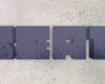
Add several more stripes – 7-8 will be OK. Use the guidelines above from Steps 11-13 to create them properly. Position them between the type shapes in various directions, and add shadows below every stripe after it. Again, if you feel that effects slow down your program, simply drag every stripe to the Symbols panel to increase productivity. After creating all the paper stripes you’ll have this image.
步骤14
添加了更多的条纹- 7-8个差不多。使用上面的步骤11-13上做参考来创建它们。用不同的方向放置它们在字体型之间,并在下面添加各个角落的阴影。同样,如果你觉得效果减慢你的进度,只需将各个条纹拖到符号面板以提高生产率。在创建所有纸带后,您将有这样的图形。

Step 15 – Creating Ribbons
Let’s move to the ribbons now. There are a few ways of making them. The first one is obvious- using a wavy line and the extrude effect just like we did for the paper stripes. However,there are some issues in this method – you’ll get too many shapes after expanding, not tomention that expand adds too many unnecessary points. Tons of objects you get when expanding a shape is caused by gradients that come from the shading method chosen for Extrusion.
One good method to avoid it is using no shading at all. This way, after the “Expand appearance” command, the amount of shapes will be rather low, which makes it easier for recoloring the ribbon. You can go on and try it: draw the wavy line with smooth points using the Pen Tool (P), give it no fill and 0,5 stroke, the apply the “Paper_stripe” graphic style. Now after adjusting the settings, expand the appearance and look at the shapes amount. Then do the same, but change the Shading method to none – and you can add colors manually.
第15步-创建色带
现在让我们移动缎带。有几种制作它们的方法。第一个是明显的-使用波浪线和挤出效应,就像我们做纸纹。但是,这种方法有许多问题-扩大后你将得到太多形状,更不用说扩大形状增加太多太多的不必要的点。当你扩大一个形状得到的正常物体时,你的形状是从挤压选择着色方法来渐变造成的。
一个很好的方法,以避免它使用无阴影的。这样,经过“展开外观”命令后,形状的数量将相当低,这使得它更容易重新着色纸带。你可以继续尝试:用钢笔工具(规划)绘制波浪线,不给它填充和0,5的边框应用“Paper_stripe”图形风格。调整现在的设置,扩大外观和看形状的数量。然后,做同样的,但是改变阴影的方法没有-你可以手动添加颜色。

Step 16
You can use the described Extrude method for ribbons if you like it, but I still want you to try a different approach that results in cleaner shapes and fewer objects. However, you’ll need to create them manually without any effects.
Use the Pen Tool to draw a wavy line with four smooth points. The main rule here is that anchor points must lie at the top-most and bottom-most points in relation to the horizontal axis, see the image below. Now take the Scissors Tool (C) and cut the shape at every point.
步骤16
您可以使用挤压带所描述的方法,如果你喜欢它,但我还是希望您能够尝试不同的方法,结果更清洁的状和更少的对象。不过,您需要手动创建他们没有任何影响。
使用钢笔工具绘制一个平滑分四个波浪线。主要规则是,定位点必须处于相对于横轴最顶层和底层,请参考以下图片。现在采取剪刀工具(C)和在每一个点上剪切这个形状。

Step 17
Now select all parts and Alt + Shift-drag them to the right to copy. The distance depends on the width of the future ribbon. Now with the Direct Selection Tool (A), select the two left-most open endpoints and press Command + J to join them (or right-click and select Join). Do the same with the right-most endpoints.
Now with the Selection Tool (V), select the new figure on the left and hit Command + J again, do the same with the right one. The only open parts are in the middle, so select them both and press Shift + Up Arrow key, so that we can see the open points. Now, again, join the two upper endpoints and then select the shape and Join again to close the path. Bring the shape back in place by pressing Shift + Down Arrow key.
步骤17
现在选择每一部分,按Alt + Shift向右拖动他们的副本。距离取决于未来的丝带宽度。用直接选择工具(A),现在选择两个最左边的开放端点,ctrl + J来加入他们(或右键单击并选择加入)。用右边的下部端点做相同事情。
现在用选择工具(V),在左边选择新的数字,再次用Ctrl十j,做与右边相同的事。唯一开放的部分在中间,所以按Shift +向上箭头键选择他们两个,这样我们可以看到开放点。现在再次参加底部端点较上的点,然后选择形状,再来关闭路径。按Shift +向下箭头键使形状回到原地。

Step 18
You can choose one color for all three shapes now from our swatches folder. Now we must add
dimension to do it and change the middle color to a darker shade. A good way of doing it is by opening the Color panel (F6), choosing HSB from the flyout menu, and moving the brightness slider to the left. You may also need to arrange parts by bringing them forward (Command + Right Bracket key) or backwards (Command + Left Bracket key).
When the ribbon looks good, group all the parts and rotate or transform them to your liking, and position the ribbon between the type shapes. This method is very good for ribbons, as it produces clean shapes with only a few anchor points compared to the Extrude-Expand method.
第18步
现在你可以从色块文件夹中为三种形状选择一个颜色。现在,我们必须补充的方面是改变中间颜色改成较暗的阴影。这样做的一个好方法是通过打开颜色面板(F6键),从弹出菜单中选择HSB,并向左移动亮度滑块。您可能还需要向前(ctrl+右中括号键)或向后(ctrl+左方括号键)移动调整局部。
当剪彩看起来不错的时候,群组所有部件并旋转或移动它们到你喜欢的位置,放置丝带在字体形状之间。这是一种做丝带很好的方式,因为它相对于挤压,展开法用少数的锚点相比挤压,展开法,创造了简洁的形状。

Step 19
Now you can add as many ribbons as you want using the method from Steps 16-18, varying line
shape, length, and color. The last thing to do with the ribbons is add shadow under each of them, just like we did with the paper stripes using the “Shadow” graphic style and a transparency mask (follow the guides in Step 12). Then just group the ribbon and its shadow and rename it to “Ribbon_color-name,” according to its color. Again, you may choose to save the ribbons as a graphic symbol if you like. Lock the “Type” layer, when you are finished with the ribbons.
步骤19
现在,如果你想利用步骤16-18的方法您可以添加许多带,不同线形,长度和颜色。最后要做的是给每一个彩带加阴影,就像我们处理纸带使用“阴影”图形样式和一个透明遮罩(按照第12步的指导)。然后,只需群组彩带及其阴影,重新命名为“Ribbon_color_name”,根据它的颜色。同样,你可以选择保存为图形符号的缎带,如果你喜欢。当您完成彩带的时候,锁定“类型”层。

Step 20 – Making the Final Touches
While the basic composition is ready, let’s add another folded piece of paper below our type objects. Make a new layer named “final_touches.” Create a rectangle around 270 px by 60 px,choose a the Direct Selection Tool (A) and move its points to get a little irregular shape (or you can draw it with the Pen Tool). Make it no stroke and give it a lime color fill.
Now open the Appearance panel (Shift + F6) and add a new fill to this shape, select a white to black gradient. Modify the gradient adding two more sliders, so that it becomes a black to white to black to white gradient (you can easily duplicate the slider by dragging it with Alt), so that two white and black sliders in the center are at the same point. This way we imitate the paper fold. Now go to the Transparency panel, reduce the gradient opacity to 25% and change the blending to Multiply.
步骤20 -制作进行最后的润色
随着基本组成准备好了,让我们在我们的字体物体下添加另外一些折纸。创建一个新的层命名为“final_touches。”创造大约270像素*60像素的矩形,选择直接选择工具(A)和移动它的点得到一些不规则形状(或者您可以用钢笔工具画)。使它没有边框,给它一个石灰颜色填充。
现在打开外观面板(按Shift + F6键),并给此形状添加一个新的填充,选择白色黑色渐变。修改梯度增加了两个滑块,使之成为一个由黑到白到黑再到白的渐变(你可以很容易地重复使用Alt拖动它的滑块),所以连个黑白滑块在中心的相同点上。这样,我们模仿了纸文件层。现在去透明面板,渐变的不透明度降低到25%,改变混合滤色。

Step 21
I decided to finalize the “Vector” phrase, so type “tutsplus.com” with the Text Tool (T). I’ve chosen Trebuchet MS bold font face, 44 pt size, and a black color. Position this type over the new paper piece. Now we should make the text transparent, so the background shows through, as if letters were cut in the paper. There are many ways to do it while leaving the text editable. I’ll show you three methods:
1.Select the paper and text, open the Pathfinder panel and click the Subtract button. This creates a compound shape with both objects editable separately – until you expand it.
2.Select both shapes, go to Transparency panel and choose Make Opacity Mask in the flyout menu (uncheck Clip). The black text will become the opacity mask for the paper piece.
3.Select the text and reduce it’s Opacity to 0% in the Transparency panel. Now select both paper pieces and the invisible text, then group them (Command + G), now check the Knockout group option in the Transparency panel (text knocks paper out).
第21步
我决定最后确定“向量”一词,因此用文字工具(T)键入“tutsplus.com”。我选择了 Trebuchet MS粗体,44像素的大小,黑色。放置它在一张新的纸张。现在,我们应该做文本的透明,所以通过背景显示,仿佛字母在纸上被切开似地。有许多方法可以做到这一点,同时使文本编辑。我会告诉你三种方法:
1.选择纸张和文字,打路径查找面板,并点击减去按钮。这里用两个可单独编辑的对象创建了一个复合形-直到你展开它。
2.选择两个形状,去透明面板,选择弹出菜单中(取消选中剪辑)设置透明度遮罩。黑文将成为一张纸透明遮罩。
3.选择文本并在透明面板里减少它的不透明度为0%。现在,选择纸张和隐形文字,然后群组他们(ctrl+G),现在检查透明度面板里面群组选项(文本打在文件内)。

Step 22
As a final touch, let’s add some confetti. They are very easy to make. Create a small circle (L) 10 px by 10 px, with no stroke, and an orange fill. Make another circle 20 px by 20 px with the same orange fill and blur it to about 10-15 px (Effect > Blur > Gaussian Blur). Drag both separately to the Symbols panel to save as graphic symbols, name them “Confetti_small” and “Confetti_blurred”.
Now, with the Symbol Sprayer Tool (Shift + S) on low density, flow spray some blurred circles around the main composition. Select some color from our swatches folder, now click the selected symbol group with the Symbol Stainer tool – it may take a few clicks for circles to change color. Change other circles to red, pink, yellow, lime, and green colors. You can also resize circles with the Symbol Sizer Tool (click to enlarge, Alt-click to reduce), or move them with the Symbol Shifter. Now spray smaller symbols the same way, then recolor them as well.
第22步
作为最后的接触,让我们添加一些糖果。他们非常容易的。创建10像素*10像素的小圆圈(长),没有轮廓线,橙色填充。再作另一个20*20像素相同的橙色填充并模糊到大约10-15 px(特效>模糊>高斯模糊)的圆。拖动两个分开的进符号面板保存为图形符号,命名为“Confetti_small”和 “Confetti_blurred”。
现在,用较低密度的符号喷枪工具(按Shift + S),到处喷一些模糊的圆圈。选择一些颜色从我们的色板文件夹里,现在,用符号着色工具单击选定的符号组-这可能需要点击几下改变圆圈颜色。该其它的为红色,粉红色,黄色,灰,绿颜色。您还可以用调整工具调整圆圈的大小(点击放大,按住Alt键缩小),或用符号移动工具移动它们。现在,以同样的方式喷涂小符号,然后修改它们的颜色。

Step 23
The only thing left now is a background texture. Go back to the “BG” layer, unlock it and copy the rectangle in front (Command + C and Command + F), fill it with a gray color (K=50%).
Now go to Effects > Texture > Grain and enter parameters you like. Mine were 70 for both Intensity and Contrast, and Clumped for grain type. Then simply change this texture blending
mode to Soft light, and you may want to adjust the opacity. That is it, here is the final effect.
第23步
现在剩下的唯一一件事是背景纹理。回到“BG”层,解锁并复制前面的矩形(命令+ C和命令+ F)条,填充的颜色是灰色(k= 50%)。现在去特效>纹理>颗粒并输入你喜欢的参数。我的是70强度和对比度,成群的颗粒。然后,只需改变这种纹理混合模式为柔光,您可能要调整不透明度。就是它,这里是最后的效果。

Conclusion
We’ve done a lot today, from custom lettering, to multi-layered effects, to ribbons and folded papers stripes, to confetti. We’ve implemented plenty of Adobe Illustrator tools, like symbols, graphic styles, effects, transparency, pathfinder and so on, and we also found a way to avoid productivity issues due to extensive effects.
This paper effect is good for many types of design – go on and try it. As usual, here is an example of the same effect in a different context – a simple, but nice image created in 5 minutes. I hope you enjoyed the tutorial!
结论
我们今天做了很多工作,从普通的字体,到多层的效果,到带条纹和折叠的文件,到五彩碎纸。我们已经用到了大量的工具,如Adobe Illustrator中的符号,图形样式,特效,透明度,路径查找等,我们也找到了一种方法,以避免因扩展效果而降低效率的问题。
本文的效果对于很多字体设计是很好的设计-继续和尝试。像往常一样,这里是一个在不同情况下同样的效果的例子-一个简单的,在5分钟内创建但不错的形象。我希望你喜欢这个教程!


推荐课程


推荐教程
0回复AI 创建多彩分层纸张字体"