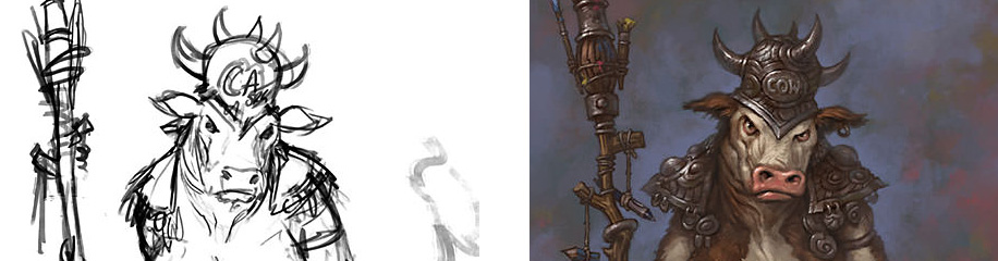
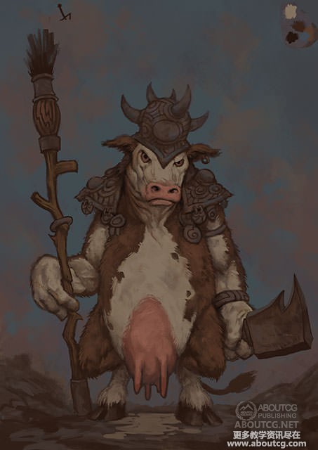
“奶牛”插画绘制流程教学
原文来自:http://www.3dtutorials.com/
作者: Matt Dixon
翻译: cwws
有问题可以参与答疑
“This image was painted in Adobe Photoshop. I’m often asked about my brushes and painting technique; I hope the steps below go some way to explain how I approach a painting. I use my own custom brushes, but there’s nothing particularly unusual or clever about them – most of the painting is done with brushes very similar to the ‘Natural Brush’ set that ships with PS v.7 and above.”
这图是用Adobe Photoshop绘制的。常有人问我是使用什么笔刷有什么绘画技巧;我希望一步步地说明下我是怎么着手开始绘画的。我使用自定义的笔刷,并没有特别或者高明的地方。大部分绘画是在PS v.7 以及更高版本里用正常笔刷设置完成的。
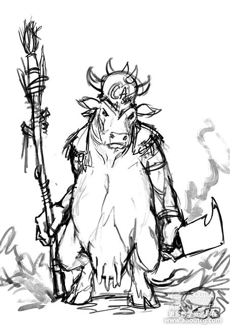
1) Rough lines. This is a fairly simple image, so I’m not really concerned with working out any details at this point. If the pic were more challenging, with multiple characters in action, tricky anatomy or complicated costume for example, I’d spend a little more time trying to tackle any areas that might cause problems during this stage.
1)粗线稿
这是张很简单的画,我并不会在这步里画出任何细节。为了让画要有更多的激情,以角色的动作,复杂的结构或者适当的服饰为例,这个阶段我花了不少时间把握这些问题。
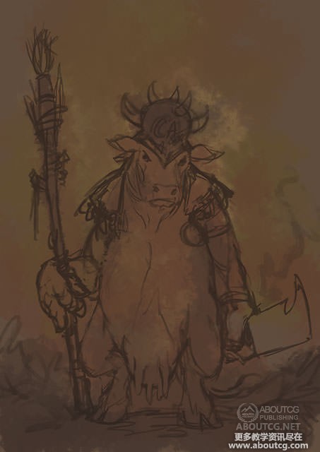
2) Underpainting. With the linework established ( this step shows some minor tweaks to the sketch in step 1 ), I move it onto a second layer set to multiply and drop the opacity a little. Then I apply a very loose underpainting to the layer below using a large soft brush – once again, the pic dictates how much time I spend on this, here it’s not very long at all! For me, the most important part of this stage is to dispose of the scary white canvas and to give something interesting to paint against but the colours used at this stage can have a dramatic impact on the finished piece, so they should be chosen carefully. Once this step is finished, the pic is flattened again – that’s the last time I’ll use layers until the very final tweaks. Painting on a single layer really seems to help keeping the image looking organic – I always end up working on the wrong layer if I have more than two or three active anyway..!
2)底色
线稿完成后(第1步已经画出了大概的草稿),我复制一层后降低点透明度。然后我用一个很大的软笔刷应用一个很模糊的底色绘制底层,这一步我并没有花太多时间!最重要的是要处理白色画布并加写有趣的东西,但使用的颜色在这个阶段可以在完成的画面上引人注目点,所以需要选择得仔细点。一旦这个阶段完成后,画再次被变暗了。我用了些图层直到最后。在一个图层上绘制时要保持画面的有机结合。如果我有两三个以上的,我总是会在错误的图层上绘制。
3) Partial lay in. Here I’m trying to lay down the basic colours to render against and define the significant forms. Even though the background is going to be a simple abstracted sky, I’m working this up as I go along in the same way as the rest of the image. You can see some little swatches drawn on the left which I use to pick up basic colours – as the painting develops I’ll be colour picking from colours already in use on the canvas.
3)局部刻画
我尽力放弃基本颜色并定义姿势。然而背景是一个抽象的天空,我以相同的方法画省下的部分。你可以在左边看到一些我使用的基本颜色的样本。这样我可以很方便地在画布上提取它们。
4) Completed lay in. Most of the pic is now tidied up and painted with fairly flat mid to dark tones, ready for rendering. I’m using a variety of sizes and shapes of brush here and making bold, opaque marks – I find that helps to build of texture and gives me something to work into as I proceed.
4)完成刻画
大部分图现在需要整理并降暗画面准备。我用了多种大小和形状的笔刷来绘制脸皮,我找了帮助绘制的纹理并使着手我的绘画。
5) Modelling. Painting in lighter and darker tones to give things more solidity, and to further define the lighting. You can see the remains of an arrow drawn during the lay in near the top left corner to remind me of the direction of the lightsource.
5)塑造
绘画明暗来使东西更有体积感,并要进一步设计光照。你可以在左上方看到残余的箭头,这样可以提醒我光源的方向。
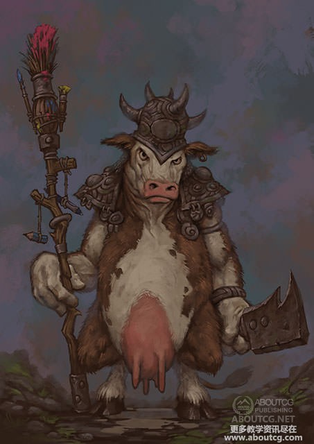
6) Detailing. Almost ready to go for the finish now, so it’s time to make sure all the details are in place. I’ve also softened some edges to try and push focus to the more important areas and add a bit of depth. I knew I wanted something hanging from the totem she’s carrying, but it’s only at this point that I decide on a stubby pencil and Wacom pen; in this case the finished pic actually looks a lot like my first sketch, but I’m much more comfortable reacting to what’s happening on the canvas than trying to force my initial thoughts to appear exactly as intended, so there are usually a lot more of these little changes and additions in my work than you see in this image.
6)细节
现在几乎要完成了,所以这个时候决定下画面里的所有细节。我总是尝试软化一些边并集中精力给更重要的地方增加深度。我知道我想要在奶牛拿着的图腾上悬挂写东西,但我决定用一指粗短的铅笔和Wacom笔;既然这样完成看上去像我第一的草稿,但我会让画布上看上去比我开始的想法更为舒适,所以你可以看到我的这个有更多的改变。
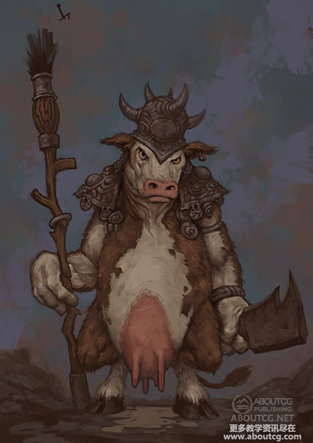
7) Rendering. Nearly there now. Here I’m trying to emphasize the difference between the materials with the application of some soft highlights – in step 6 there are some differences in texture, but everything has the same matt surface – here you can see how the beginnings of how those surfaces are responding to light, hopefully suggesting areas of metal, fur, wood etc.
7)
现在几乎。我试图强调材料和高光的不同。在第6步有不同的纹理,但每个东西有着相同的无光泽的表面。你可以看到那些表面怎么反射光的,比如金属、软毛、木材等等这些区域。

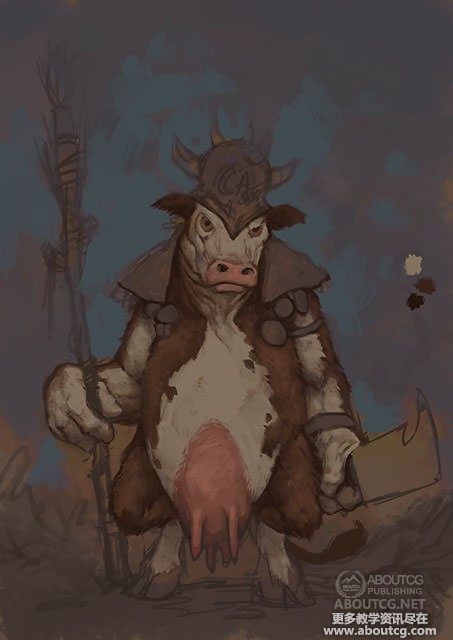
8) Finishing touches. A final round of highlights and detailing, and I’ve worked some reds and some very subtle ellow / greens into the background to try and balance up with the primary-coloured paint on the totem brushes. Here’s where I called it done.
8)完成
高光和细节范围,我用图腾笔刷在背景上画了一些红色和精巧的绿色试图平衡下原来颜色的画面。到这里我就完成了。


推荐相关中文教程

场景美术绘画进阶教程 光影渲染篇
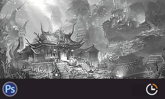
本教程作为场景概念设计绘画方面的进阶教程,着重讲解了如何应用自定义的Photoshop笔刷和素材,讲解照明与场景绘画的关系,光线的反射定律,场景构图的固定模式,如何使用进行概念设计的创意思路方法,以及使用案例来讲解如何按照游戏项目的需求完成一个场景的绘画过程。场景概念设计实战教学之玉门关场景绘制
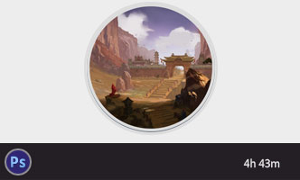
本教学将通过一个从零开始的玉门关场景绘制案例,带你了解如何进行场景概念设计。手绘游戏特效制作实用案例教程 闪电篇
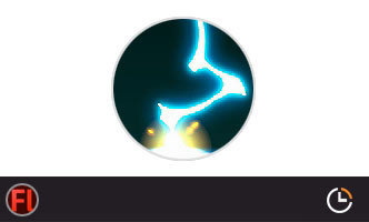
本套教学使用具体的案例,演示了多个闪电类手绘特效的绘制流程,专门针对手游,2D游戏,手绘影视动画的液体特效制作需求设计.场景美术绘画基础教程 中国建筑篇
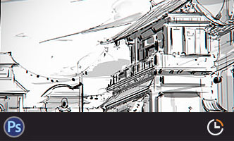
场景绘画和设计是漫画绘画,游戏设计生产环节中不可或缺的一环,本教学将从最基础的原理开始,教授用户如何理解和学习场景绘画,如果把握场景绘制的设计技巧,讲解场景如何控制透视,从基础的几何体开始学习空间的管理和建筑的摆放。人物角色表情表现绘画教程
本套教程从人类基础的简单表情入手,讲解不同种类的笑容,焦虑,生气,愤怒,咀嚼,吃惊,惊恐,沮丧,哭泣等等不同的表情是如何表现的,帮助学习者能够通过夸张生动的表情变化理解人类丰富的表情绘画所能传达出来的含义。构图绘画完全教学
本套课程的内容重点是学习绘画艺术的构图规律和方法。在绘画学习过程中,构图是一个重要的组成部分,学习它对于提高绘画练习和创作水平有显著的促进作用。特指纯艺和插画,海报。艺用人体解剖实用教学 下集 四肢篇
本套“四肢篇”教学是王九斤老师的《艺用人体解剖使用教学》系列教程中的下集部分,主要讲解了四肢的结构绘画要点,以及部分人体动态的基础讲解。艺用人体解剖实用教学 上集 躯干篇
本套“躯干篇”教学是王九斤老师的《艺用人体解剖使用教学》系列教程中的上集部分,主要讲解了躯干的结构绘画要点,以及部分人体动态的基础讲解。

推荐课程


推荐教程
0回复“奶牛”插画绘制流程教学"