教学来源:http://www.3dtotal.com/
翻译:zivix(ABOUTCG)
Introduction
I started working on this image sometime back in 2010. My original intention was to create a sci-fi portrait, but as you can see the scene eventually evolved into a much bigger project. Although I usually try to work with sketches and designs, on this project I let my imagination flow and the scene literally formed itself. Fortunately this was my own personal project and this meant there was no pressure on me to finish it, so I had as long as I wanted to make sure I was happy with it.
我的工作开始于2010年,我打算做一个科幻的肖像作品,幸运的是这是我自己的个人项目,这意味着没有压力在我完成它,所以我只要我想要确保我很满意它。
Because I didn’t have a set concept I could add and alter things whenever I wanted to. This was good as it gave me the opportunity to try out new things, which made the project more fun to complete.
因为我没有什么概念设计,所以我很机会来尝试新东西,这使得项目很有趣.
Stylization and Modeling
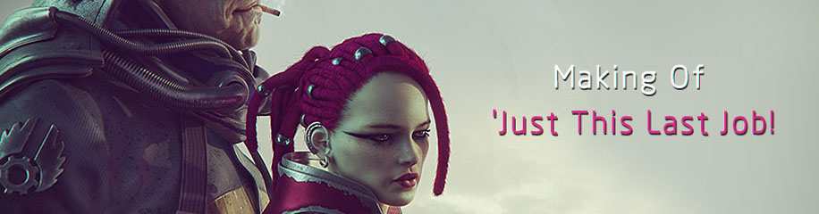
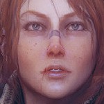
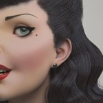
Although my aim was to stylize the characters and avoid having them look too human-like, I did want to make them look technically realistic. When designing the appearance of the two main protagonists I tried to avoid genre clichés. I tried to think more about their personality, history and motives, and keep that in mind for their design. It was important to me that Gregor and Fixie had their own personalities that were obvious to anyone at first sight. This is why they both have distinctive traits. Gregor eventually turned into a stubby frowner and Fixie became a freckled athletic swashbuckler (Fig.01).
最然我的目标是使得角色看起来比较科幻,但是我确实也想他们看起来比较写实,设计这两个角色的时候,我避免使他们看起来太普通,我试图想更多关于他们的性格、历史和动机,和记住他们的设计。它对我来说非常重要,Gregor和Fixie有各自的性格,任何人乍一看。这就是为什么他们都有独特的特质。Gregor是一个短粗胖的壮汉,而Fixie是有雀斑的小混混.

Fig. 01
Whilst modeling the characters I began with the cruder forms, which I gradually softened and added more detail to. It was important to have a functional base before moving on to the details. I have learned in the past that if you neglect the smaller steps at the beginning you will pay for it later in the process when you create unnecessary work for yourself.
建模从基础模型开始,逐渐的添加细节,如果你制作的时候忽略这个步骤而直接做细节,你就要完蛋了.
Most of the character models were created in ZBrush. I used ZSpheres to create the base mesh from which the rough model was created. From this point I used the Move and Clay Tubes brushes to get the shape I wanted. The whole process was very intuitive and creative, and didn’t involve any unnecessary hold-ups because of topology. Once the basic shape was functional I thickened the mesh and began to refine the model. Usually I use the Clay Tubes brush, which I gradually alter as I develop the model (Fig.02).
角色基本是在ZBrush中完成的,我是用Z求制作模型基础,然后使用clay笔刷出大型,过程很方便和直观,一旦模型确定下来,我就进行细节工作.

Fig.02
The moment it wasn’t possible to add any more detail to the model due to missing polygons, I retopologized the model directly in ZBrush. I then projected the resulting model onto the base and could continue with the sculpting.
有时候因为拓扑结构,无法再添加更多的细节,这时候我会重新拓扑,在这个模型基础上继续雕刻.
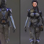
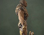
One of the most complicated parts was to pose the characters in a natural fashion. Because I knew this would be tricky I began posing the characters early in the process in ZBrush. Thanks to ZBrush I didn’t have to deal with technical issues like rigging and could pose the characters with the Transpose Master. This wonderful tool enabled me to move the characters into their final pose, but also meant I could return to a T-pose whenever I needed (Fig.03 – 04).
最复杂的是让角色看起自然时尚,因为我知道这个很棘手,所以再开始的时候我就开始考虑这个问题,多谢ZB,我不用再考虑很多技术问题,比如绑定之类,我直接使用Transpose Master,这个工具叼爆了可以用来制作很多酷毙了的姿势.

Fig.03

Fig. 04
Texturing and Shading
The bases for most of the maps were generated in ZBrush (Cavity map and Normal map), to which various layers, details and colors were added in Photoshop in order to reach the desired result.
贴图是在ZB中创建的基础,然后在PS中加工.
When I started to think about the materials and textures I decided that I would adopt the same approach as I did when modeling. By this I mean that I would adapt everything to create a visually appealing result, rather than focusing on making everything look very realistic.
当我开始考虑材质和纹理我决定采用和建模相同的方法。我的意思是,我会适应一切来创造视觉上的吸引人的结果,而不是将注意力集中在让一切看起来都很现实。
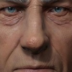
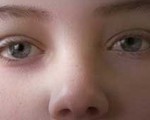
The most complicated material in the scene is, without doubt, the skin and its settings, to which I dedicated a significant amount of time. You can see all of the different maps in Fig.05. In this image you will be able to see the Overall Diffuse, Reflection, Epidermal, Subdermal, Normal, Bump and two Specular maps. You can also see the final render before I did any post-production (Fig.06). I also used masks for the Subdermal and Epidermal maps. By using reflection color textures I was able to isolate the color of the Specular highlights on the skin and adjust them. I mainly used azure blue and light pink at this point as I found they worked perfectly. I also combined the Specular, Reflection and Bump maps with procedural maps to get the very fine detail.
最复杂的部分无疑是皮肤的制作,他花费了我很多的时间,在下面的图中,你能看到各种贴图Overall Diffuse, Reflection, Epidermal, Subdermal, Normal, Bump 和 2张 Specular maps.你还能看到最后渲染的还没有后期的图片.我也会制作Subdermal和Epidermal贴图,通过使用高光贴图,我可以控制高光效果,我还是用蓝色的光源,我结合法线贴图,高光贴图和反射贴图来得到细节.

Fig.05

Fig. 06
I used mental ray Arch & Design materials, which are really excellent, highly versatile and permit me to create any surface I want. Creating correct textures for the other objects was not that complicated. For the majority of the other items I only needed to apply Diffuse, Specular and Reflection maps as Glossiness Samples were used for the metallic surfaces (Fig.07 – 08).
我是用了MR的Arch & Design材质,真的很赞,能制作任何需要的效果,对于这个项目,我只需要使用diffuse贴图,高光贴图,反射贴图和光泽贴图用来创建金属表面.

Fig.07

Fig.08
Tweaking, Detailing, Background and Post-production
I love the part where the work is more or less finished and I can begin to tune all the details. Towards the end of the process I go through all the materials and add details here and there, adjusting the color and light intensity. My aim was to have the image function as an individual illustration and not simply a model presentation.
我最喜欢部分基本都完成了,现在开始去调整细节,最后我在材质上添加一些小的效果,调整光感和色彩,我希望图片能看起来是一个完整的作品,而不是模型展示.
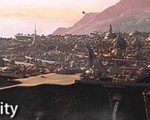
I began thinking about the background early in the process, but without spending too much time on it. In the end I chose the simplest method that I could think of. I was happy with the character, but the city in the background needed to convey a similar feeling so I had to make sure it was done well. Using photos of houses as references I created some simple box-like models in 3ds Max, which I duplicated. It was important that I put these together carefully as they needed to look as though there were streets in between the buildings.
我开始考虑用什么样的背景,但是我没多少时间来弄背景,我想通过一个城市的背景来传达和角色搭调的效果,所以我得确保能做好,我参考照片制作了一些简单的box物体,然后我复制出了一个城市的效果,同时我仔细的摆放,确定能看出有街道的感觉.
The 3D models served as a good base and most of the background was created in Photoshop. The main colors and overall atmosphere was very important, as they needed to show both detail and depth. Because of this I suppressed the housing detail with fog (Fig.09). The far distance is entirely painted in Photoshop.
3d模型虽然好,但是远处背景我还是使用了PS,因为突出主题是很重要的,所以远处的背景就让他隐藏在雾效中,也无需添加过多的细节.远景是PS中绘制的.

Fig. 09
Given the amount of time I spent on this image one of the most important things to me was the opinion of family, friends and colleagues. They always come up with new ideas and constructive criticism. Without them this image would not be what it is today.
最后感谢我的家人,同事,和朋友,没有他们的帮助,我无法完成这个作品.


推荐相关中文教程

arnold for maya渲染器完全教学
Arnold渲染器是基于物理算法的电影级别渲染器,正在被越来越多的好莱坞电影公司以及工作是作为首席渲染器使用。与传统用于CG动画的Scanline(线扫描)渲染器(Renderman)不同,Aronld是照片真实,基于物理的光线追踪渲染器。Mentalray for maya实战教程
本教程共包含超过32小时的视频教学内容,共20章 128课,通过大量实例,详细讲解了Maya平台下的Mental Ray1渲染器的使用基础和方法。
推荐课程


推荐教程
很帅的作品。谢谢ZIvix。
非常不错的教程!!!谢谢zivix的翻译!!!
谢谢!